BREAST CANCER: CHECK YOURSELF
Print / Creative Direction / Correspondence Art
ROLE: Designer
COMPLETED: Fall 2020
PRINTED ON: 20” x 30” cardstock;
5” x 7” postcard embossed with silver foil
SPEACIAL THANKS: Audra Hubbell
COMPLETED: Fall 2020
PRINTED ON: 20” x 30” cardstock;
5” x 7” postcard embossed with silver foil
SPEACIAL THANKS: Audra Hubbell
BRIEF
Designers often find themselves at the center of change. Over the past months, millions of people have peacefully protested, donated, and shared online for various causes and movement.How do you see potential to use your design to shape the future? This project focuses on the future and how I can contribute to an improved future for myself and others.
SOLUTION
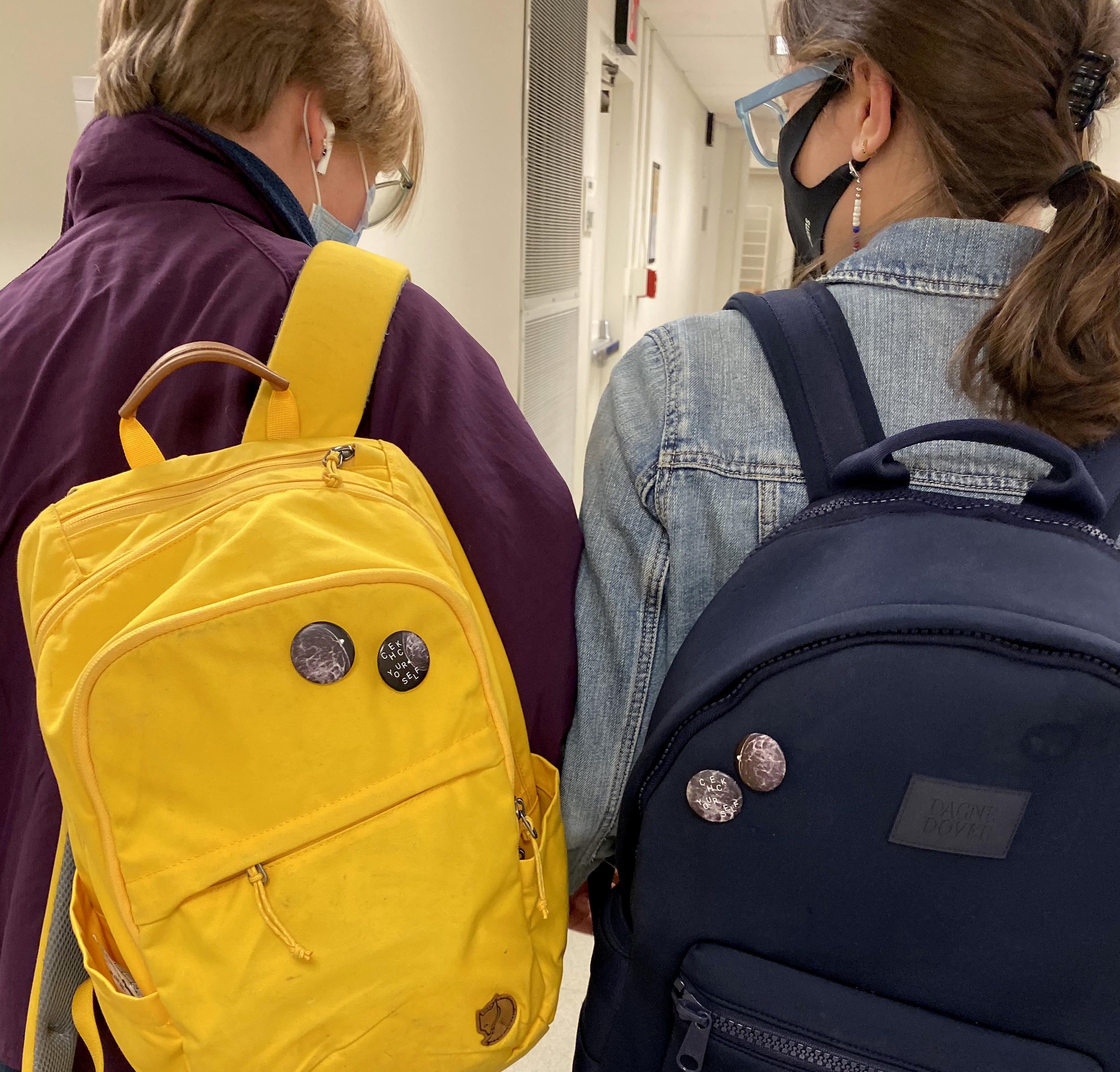
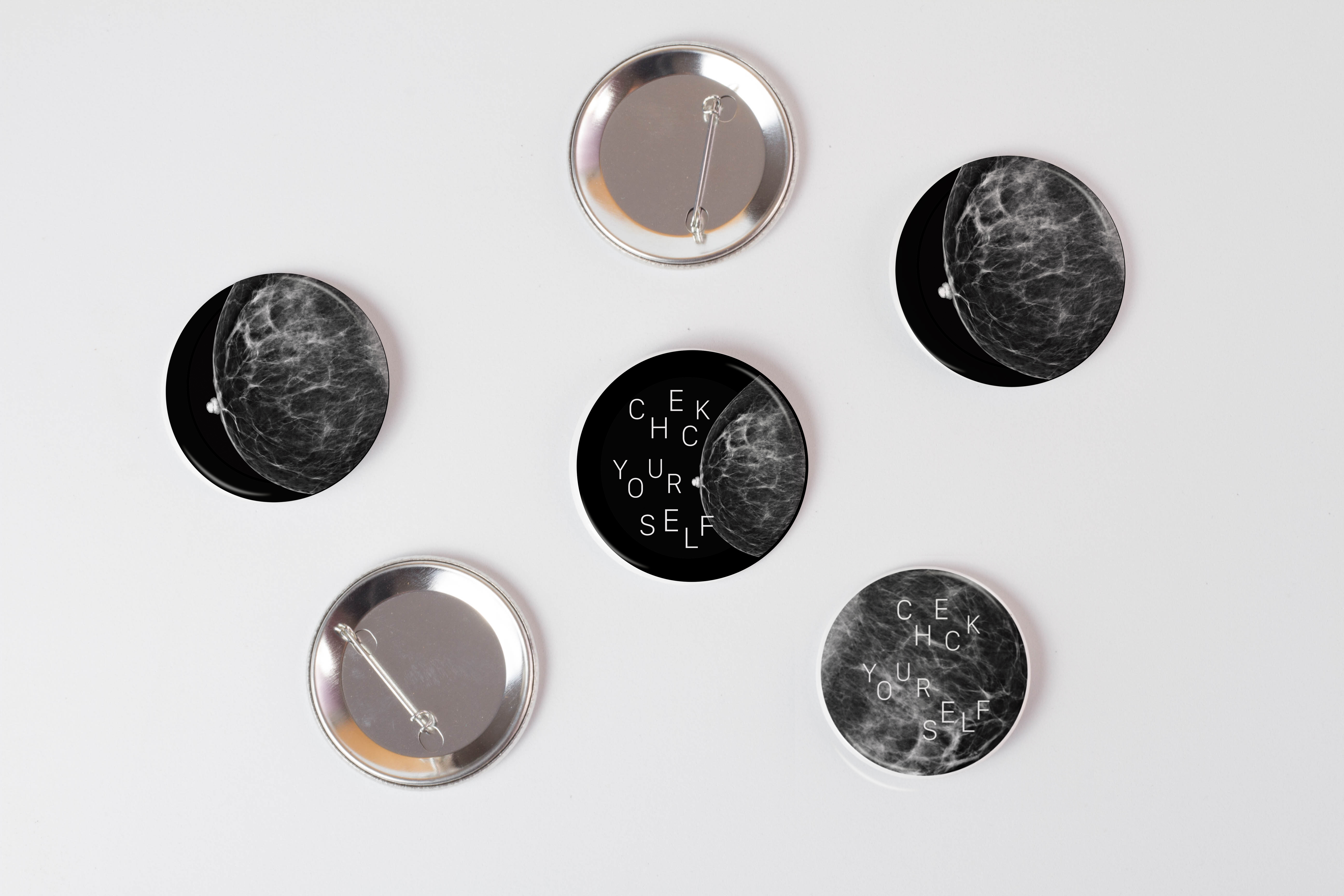
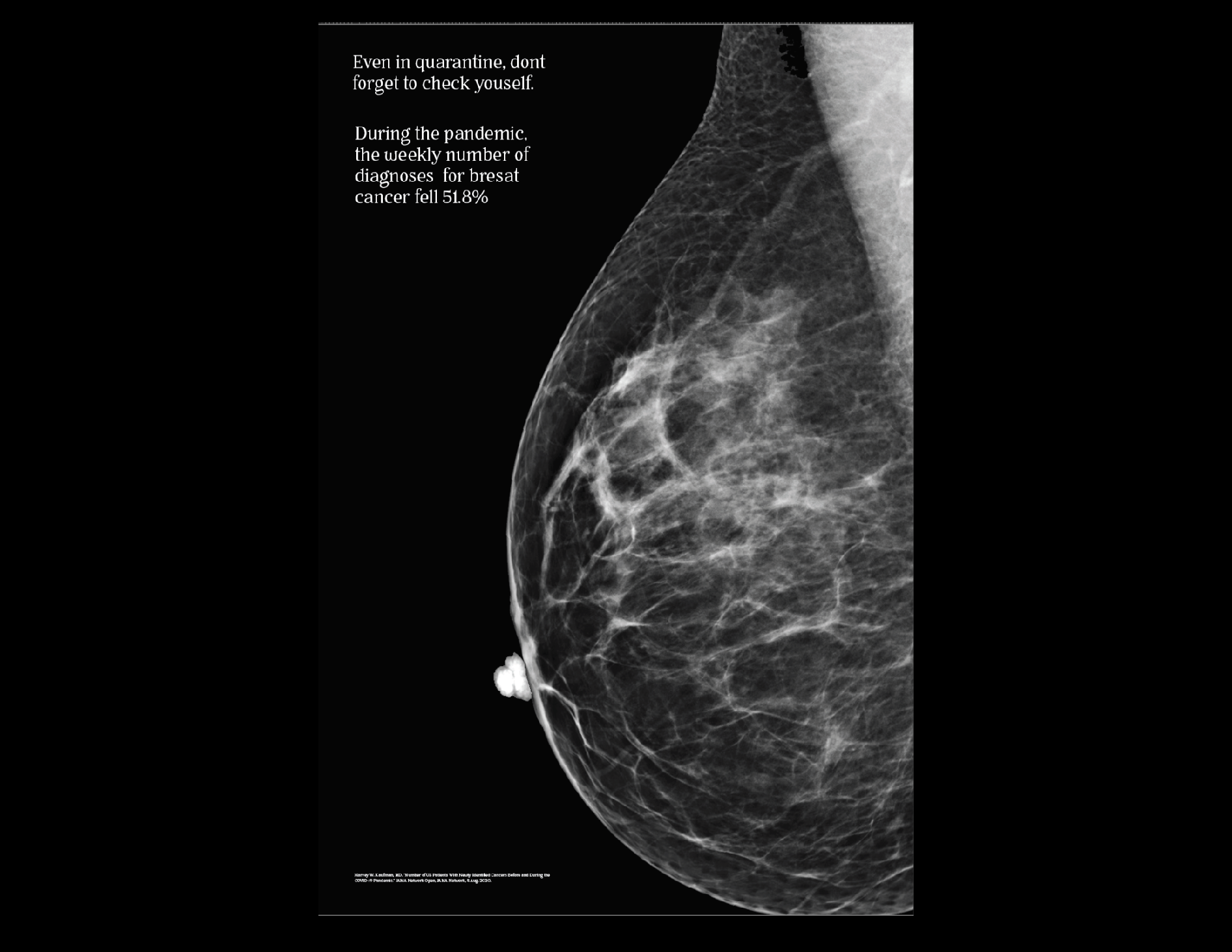
During the pandemic, Breast Cancer diagnoses have fallen 51.8% — because people are not being checked by doctors and clinics. The breast cancer market is saturated with pink, frilly, dehumanizing and gender specific graphics. The collateral speaks to the seriousness of cancer and reinforces an individual’s ability to check oneself. I created a poster and buttons to raise awareness about breast cancer and provide information on self-examination as a step for early detection.
![]()
Designers often find themselves at the center of change. Over the past months, millions of people have peacefully protested, donated, and shared online for various causes and movement.How do you see potential to use your design to shape the future? This project focuses on the future and how I can contribute to an improved future for myself and others.
SOLUTION
During the pandemic, Breast Cancer diagnoses have fallen 51.8% — because people are not being checked by doctors and clinics. The breast cancer market is saturated with pink, frilly, dehumanizing and gender specific graphics. The collateral speaks to the seriousness of cancer and reinforces an individual’s ability to check oneself. I created a poster and buttons to raise awareness about breast cancer and provide information on self-examination as a step for early detection.

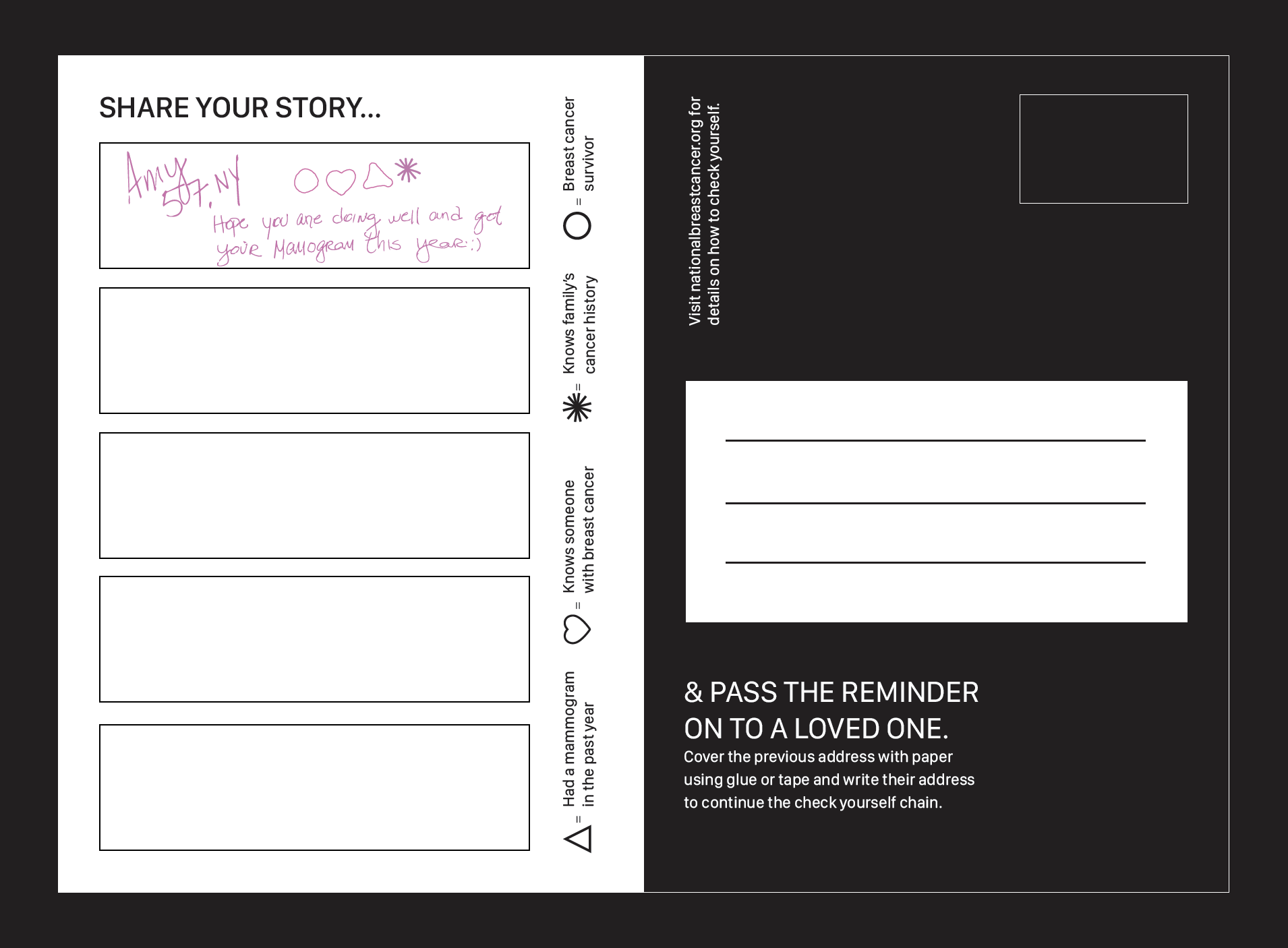
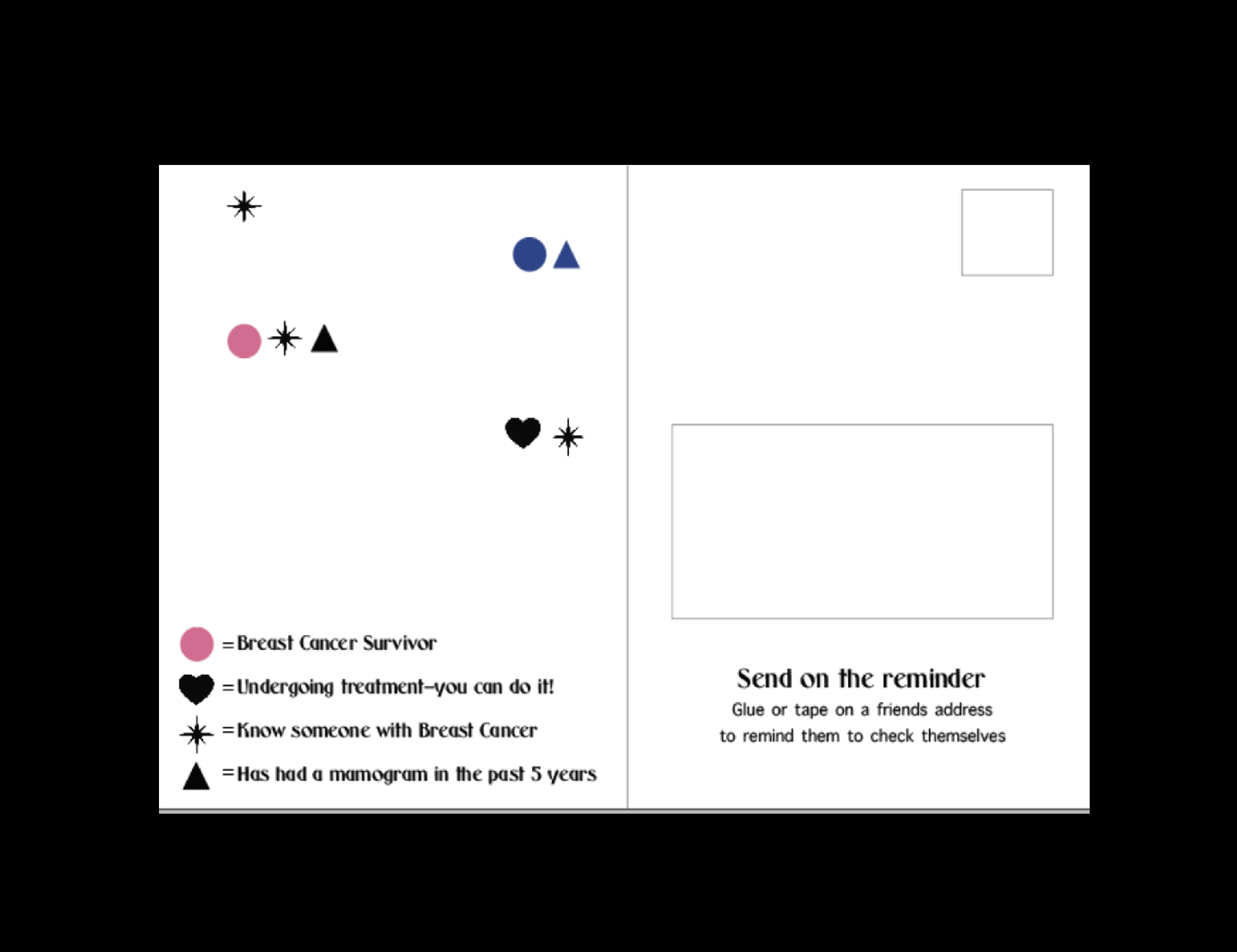
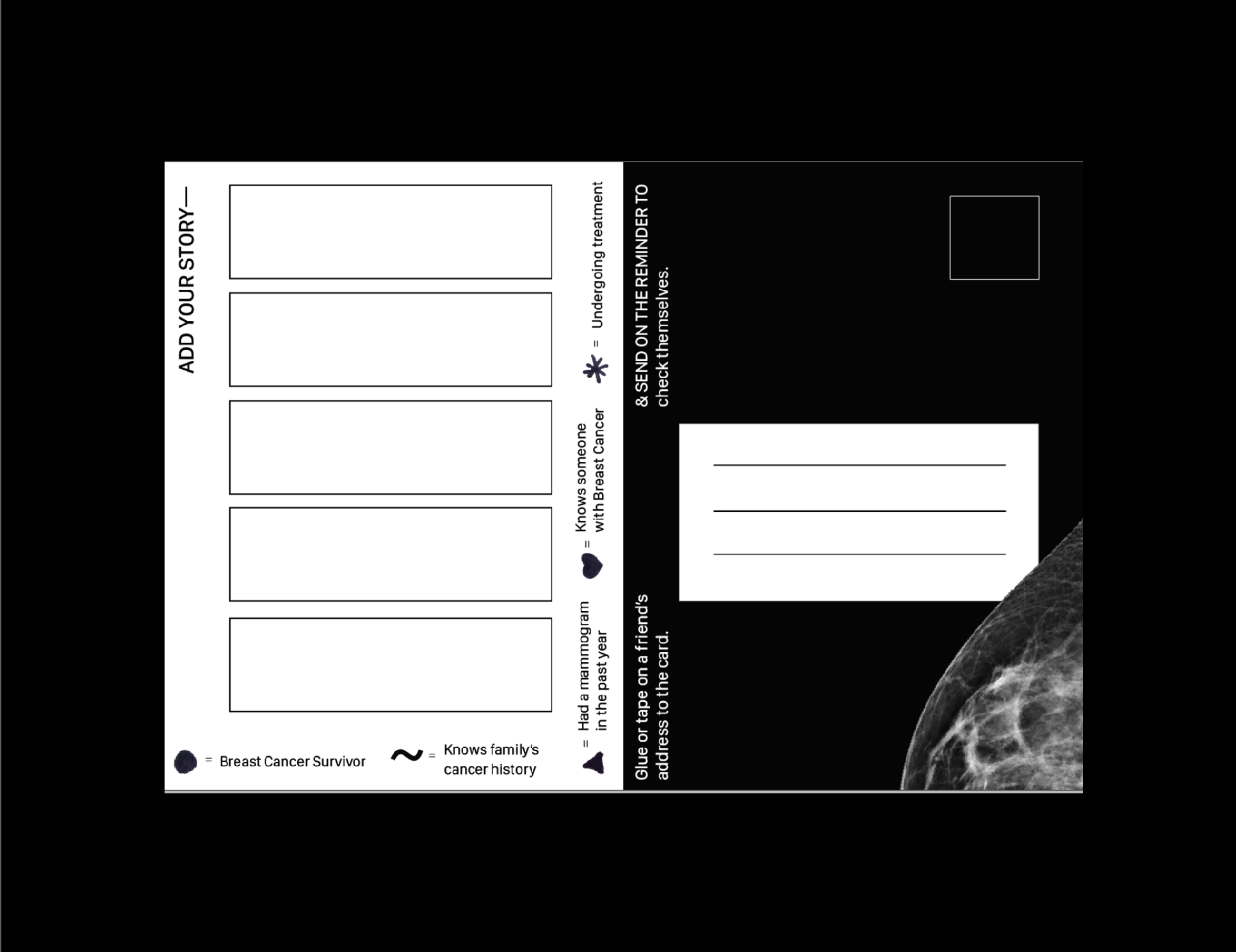
The mailer will act as chain mail for people to send to their loved ones to remind them to check themselves. It is embossed with silver foil to enhance the tactile feeling.

The back of the mailer encourages people to send the reminder to loved ones. Each rectangle allows the recipient to add a part of their story before they send on the card. Breast cancer is sadly very common and this is a remembrance that you are not alone.
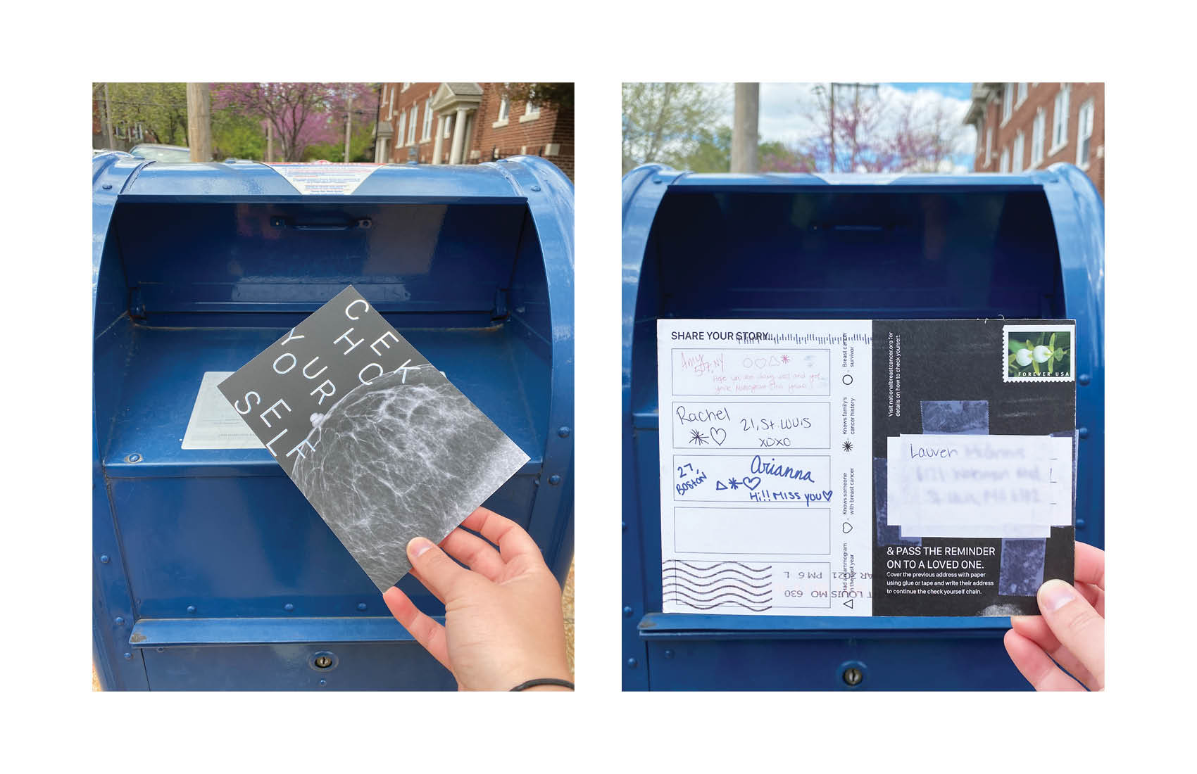
The poster, buttons and postcards were featured in an exhibition on WashU’s campus.

PROCESS
After hearing the staggering statistic that Breast Cancer diagnoses fell 51.8% during the pandemic, I knew I wanted to focus on raising awareness around it and how people can administer checks on themselves.
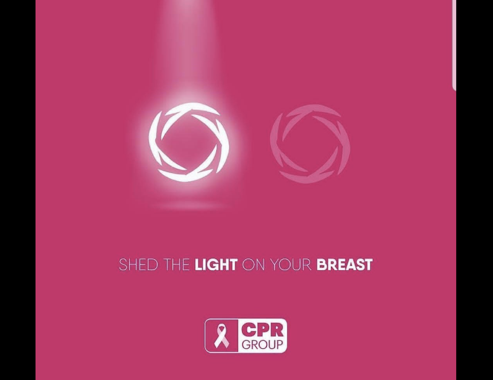
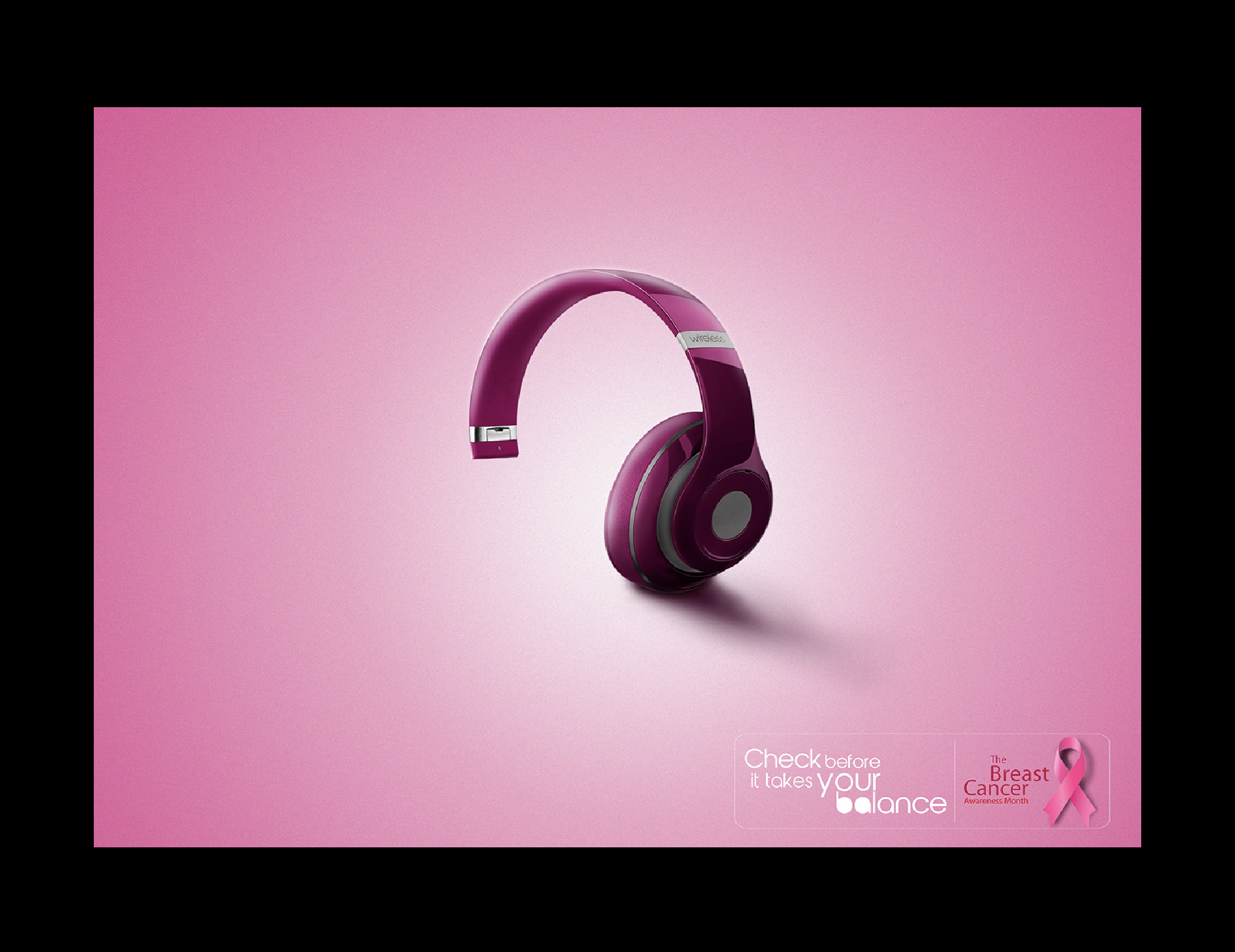
After conducting interviews with 4 Breast Cancer survivors, they all stated that the pink and frilly campaigns were dehumanizing and out of touch with the realities people diagnosed with breast cancer face — simply put, they were sick of seeing dainty drawings of boobs. Not to mention, the majority of breast cancer campaigns are extremely gendered, when breast cancer can effect all types of people.
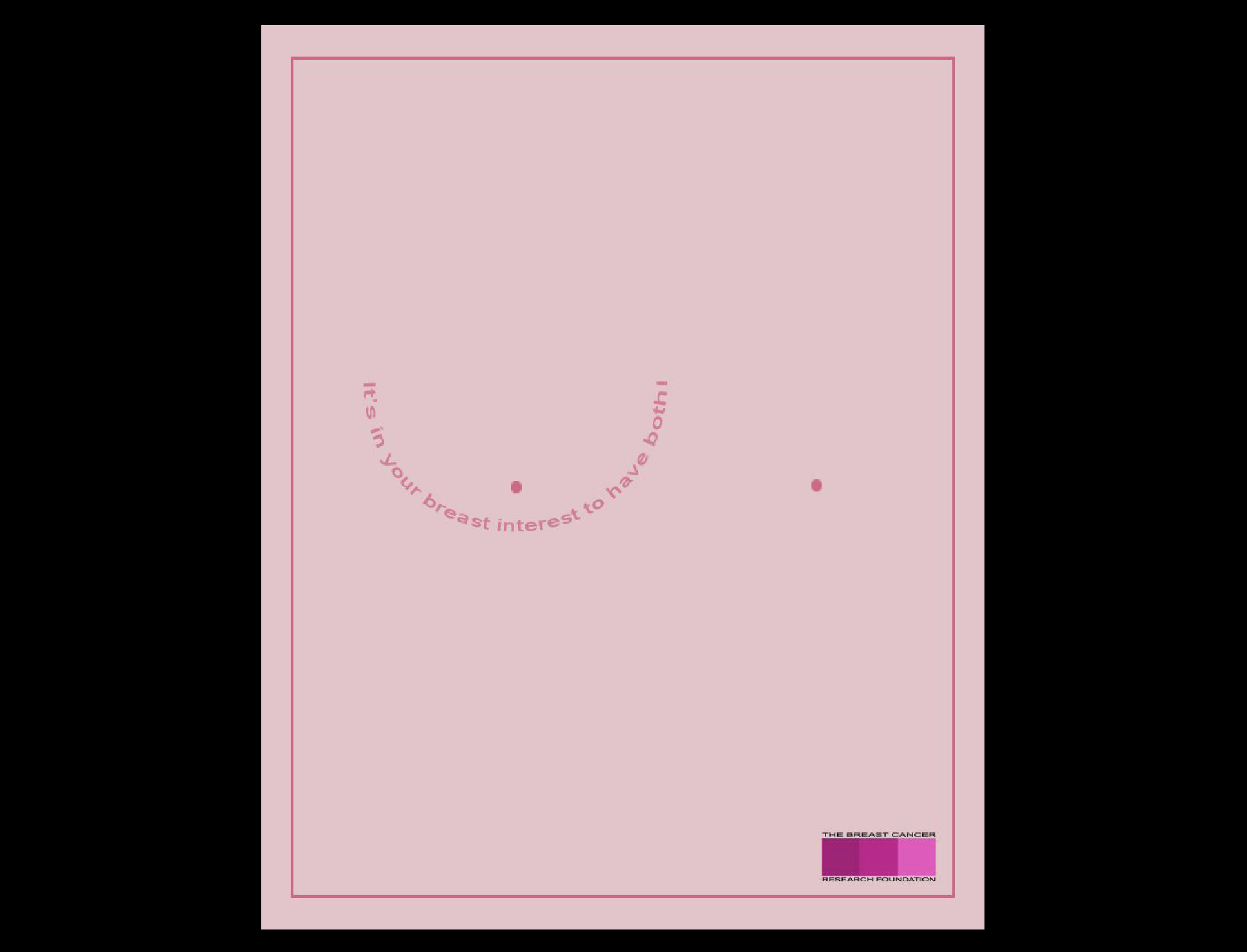
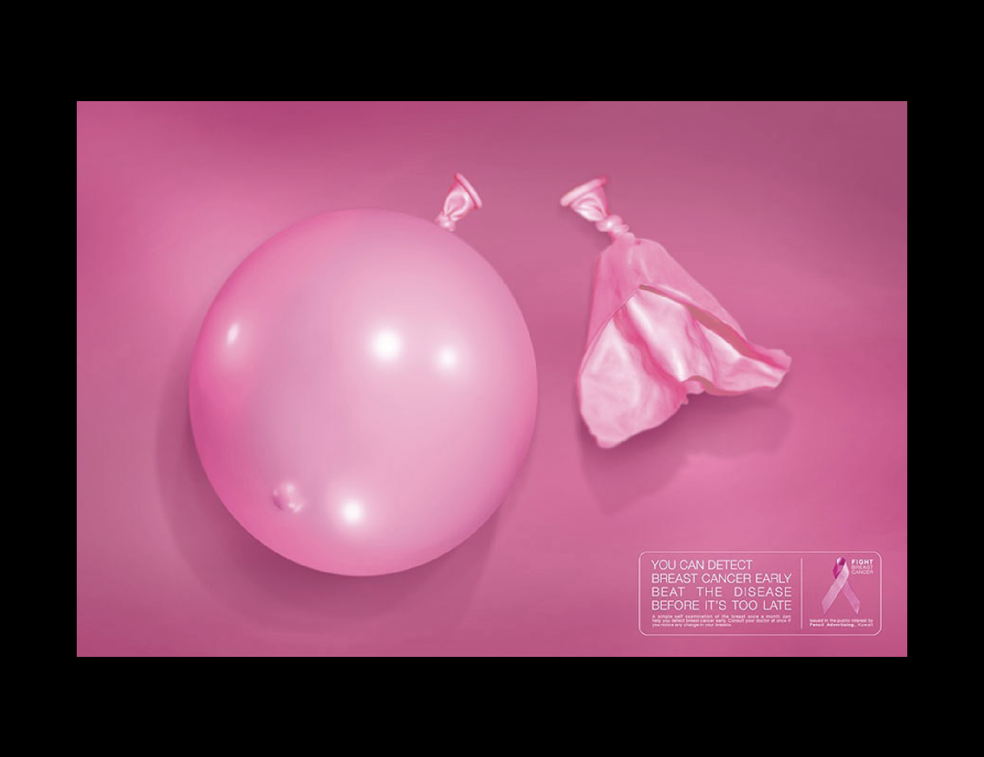
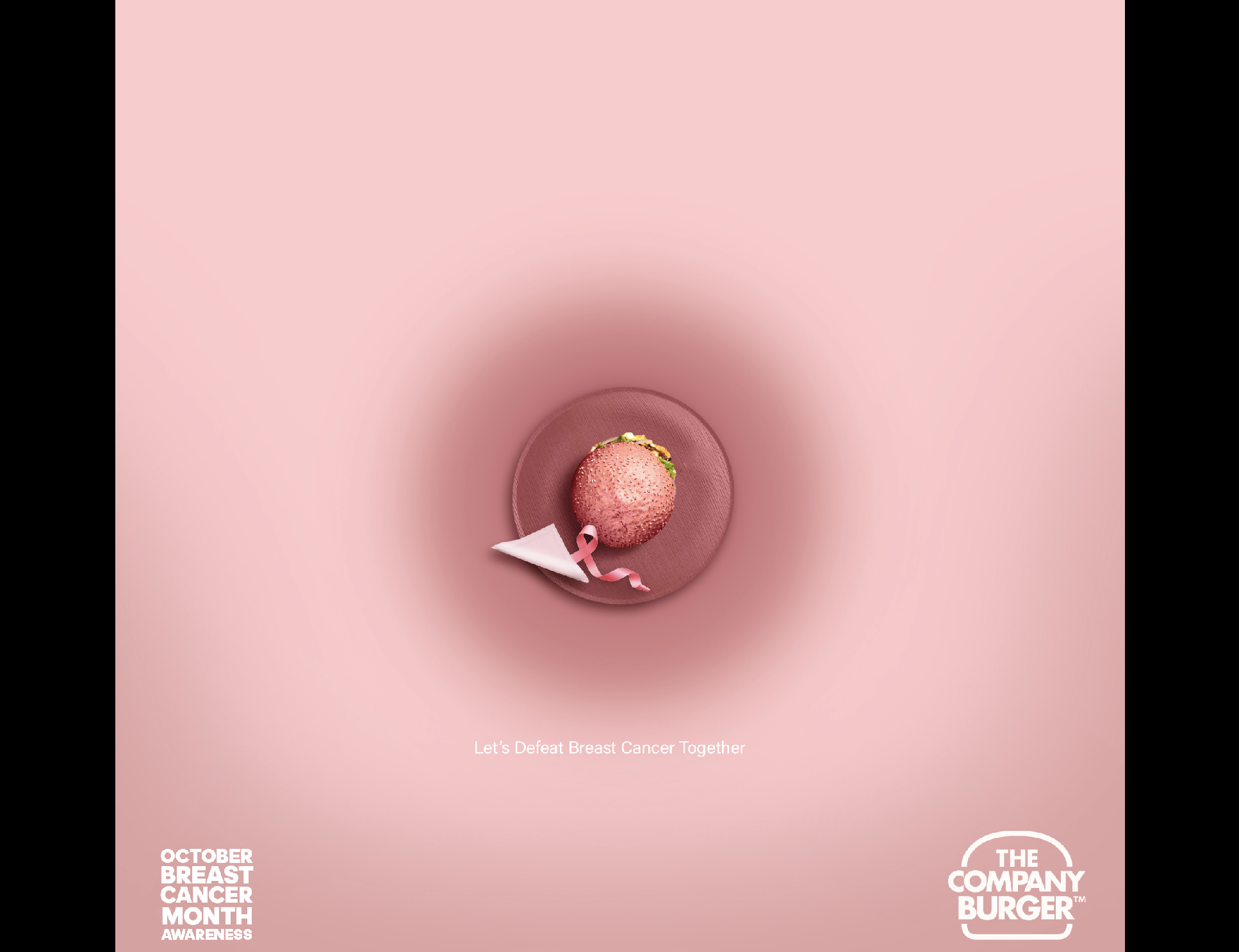
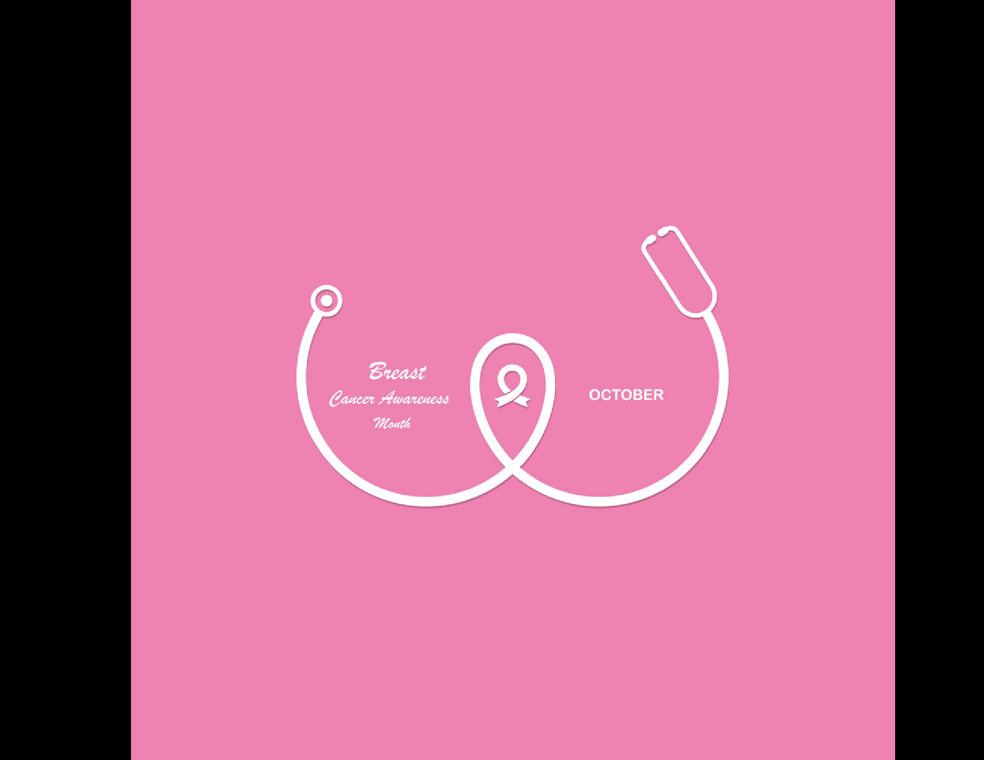

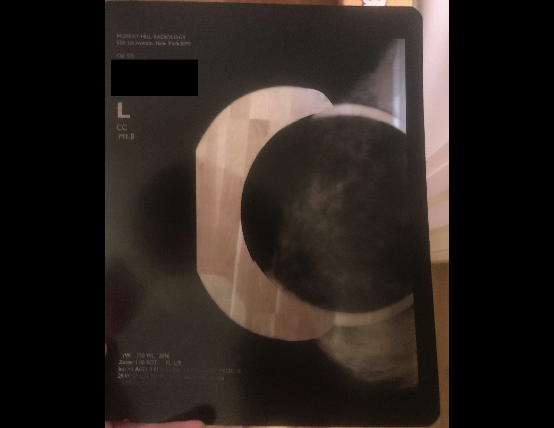
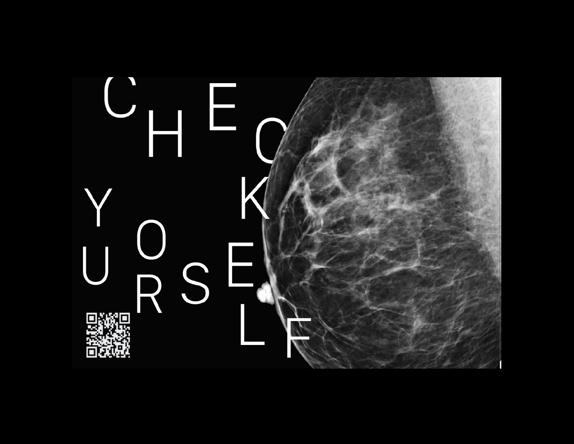
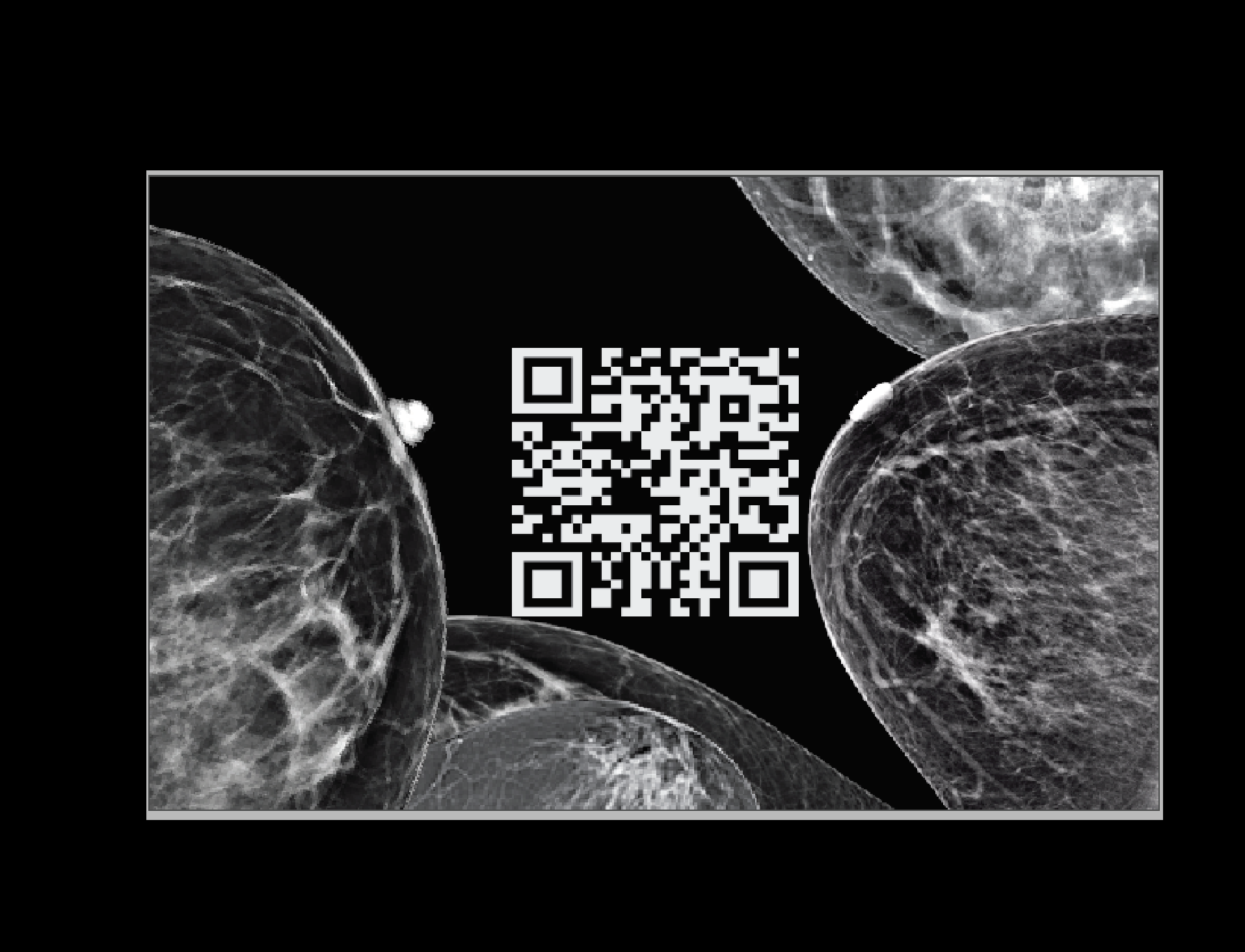
While doing research, I came across mammogram pictures. I found the intricacies of breast x-rays to be quite beautiful in its complexity. Additionally, I found that a lot of people don’t know what the inside of breasts looks like. I used my mother’s mammogram x-ray as inspiration.
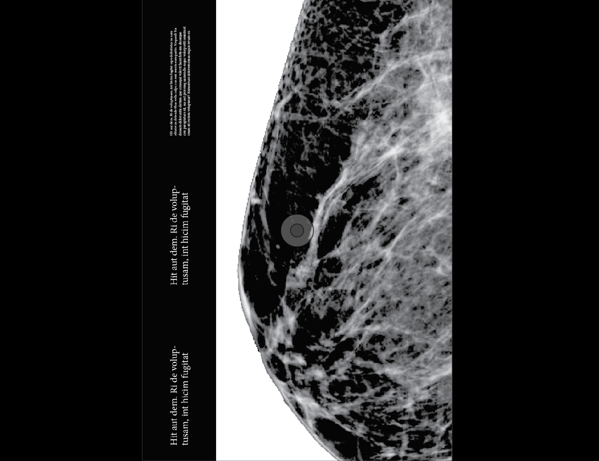
I experimented with numerous ways to incorporate the imagery and seriousness of the mammogram into my designs.
From start, I was playing with themes of discovery, finding and searching.
From start, I was playing with themes of discovery, finding and searching.



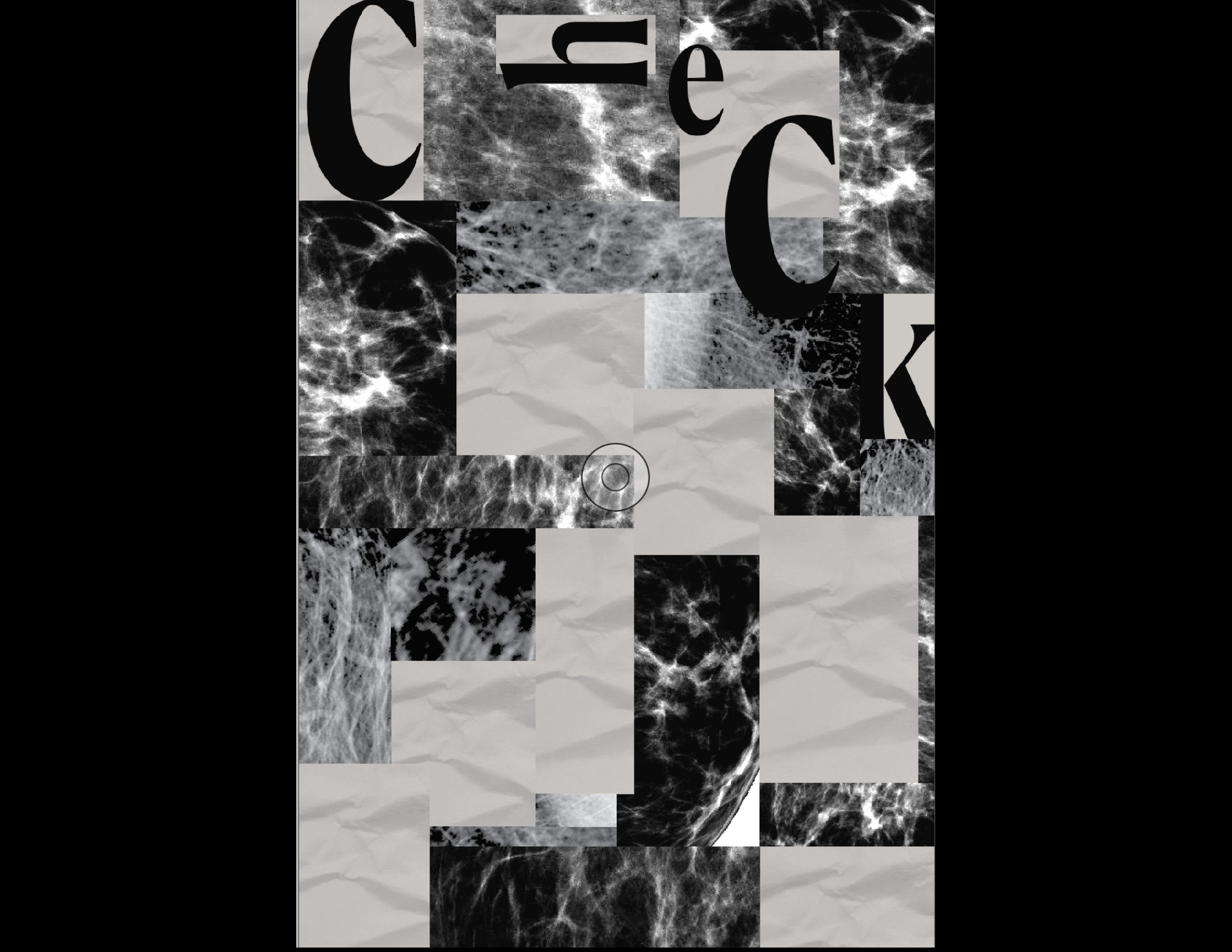
When designing the postcards, I knew I wanted an element of interaction and for it to act as a connecter of people in an ever so distant world. Somehow, I wanted each receiver to leave their make whether that be in a data viz or leaving a personalized note.
I drew great inspiration from correspondence art— an artistic movement centered on sending small-scale works through the postal service.
I drew great inspiration from correspondence art— an artistic movement centered on sending small-scale works through the postal service.
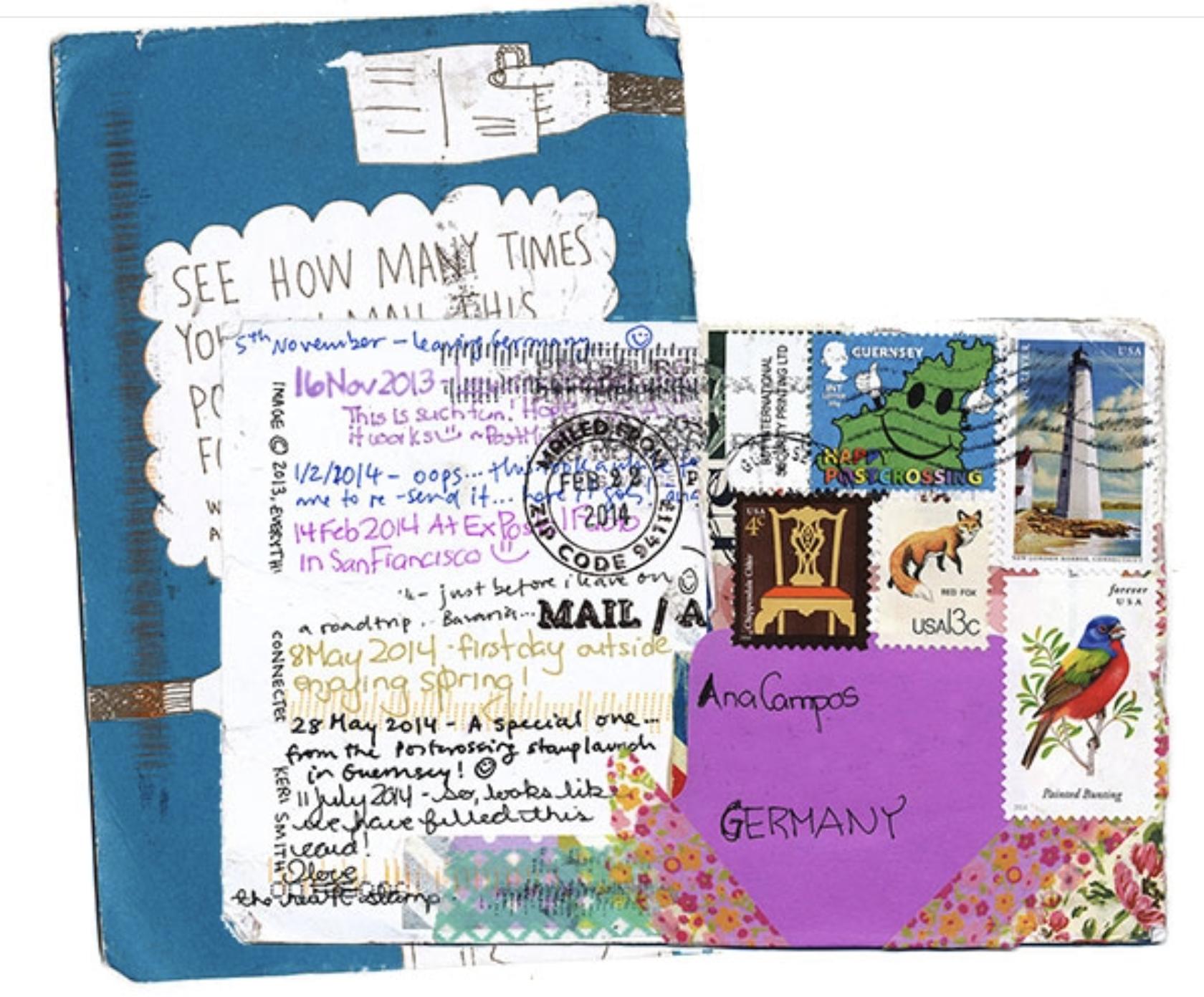
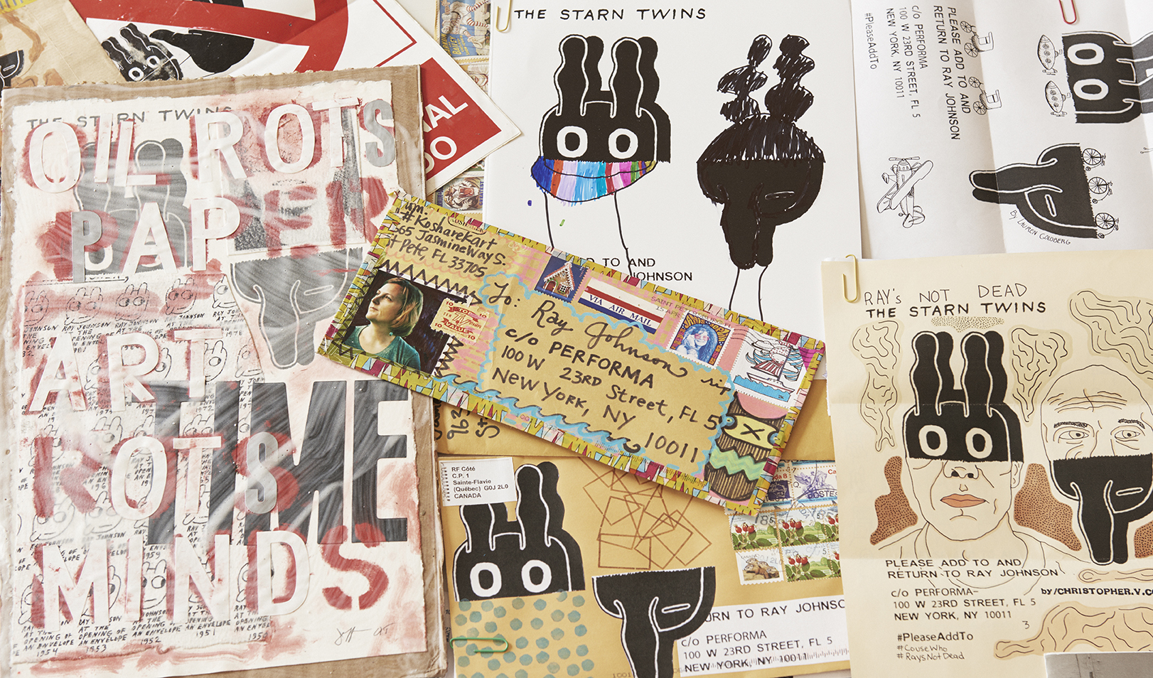
Initially, I had a QR code on the postcard so people could quickly go to a website to check themselves, but figured providing an easy and short link worked just as well.


NEXT STEPS
I hope to spread awareness about breast cancer and people’s ability to check themselves through handing out postcards and buttons.
I hope to spread awareness about breast cancer and people’s ability to check themselves through handing out postcards and buttons.
