BARRIERS TO ENTRY
Print / Publication / Accessibility
ROLE: Designer & Creative Direction
COMPLETED: Fall 2020
PRINTED ON: 70gsm Bright Newsprint
SPEACIAL THANKS: Audra Hubbell
COMPLETED: Fall 2020
PRINTED ON: 70gsm Bright Newsprint
SPEACIAL THANKS: Audra Hubbell
BRIEF
With today’s constant news coverage it has become increasingly difficult to navigate the barrage of breaking stories and social media commentary. From the global stage to local news, it is overwhelming to sift through the never ending stream of content, let alone take the time to consider your own stance in relationship to alternate viewpoints. How as designers do we use our skills to present the content we care about in an empathetic way? How do we connect information to the audience that needs it most? Design a publication that presents a current topic or relevant subject of your choosing.
SOLUTION
A newsprint publication containing excerpts of New Yorker’s first hand experiences navigating the New York City Subway system. The newspaper uncovers the many ways the subway system is inaccessible—physically, visually, audibly, and financially. Growing up in New York, I have seen firsthand how the NYC subway is not “the great social equalizer”. These obstructions have real impacts for its users from getting arrested for not having fare money, to calling the fire department to get lifted up the stairs, to not being able to hear announcements on the train. Pull quotes and first hand accounts aim to build empathy and compassion between the readers and the stories told.

Cut corners resembling metrocards and colors picked from the subway line, the publication sends readers on a journey while learning about how the subway line is inaccessible to so many.

The slanted corner is to help the visually impaired swipe or dip the card in the proper orientation.

The table of contents provides the reader a glimpse of the journey they will be following while reading. These “stops” act as main pain points for riders.

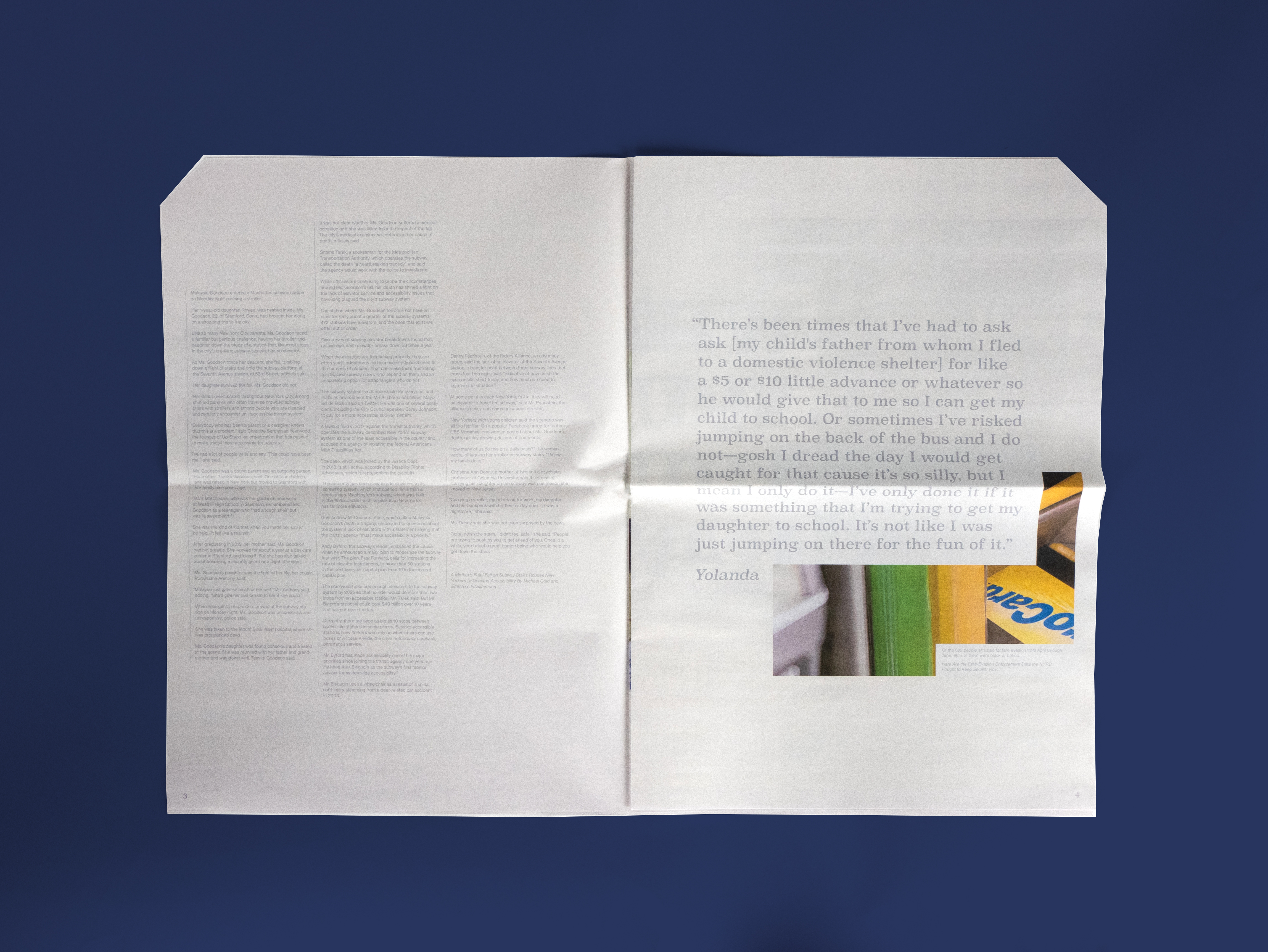
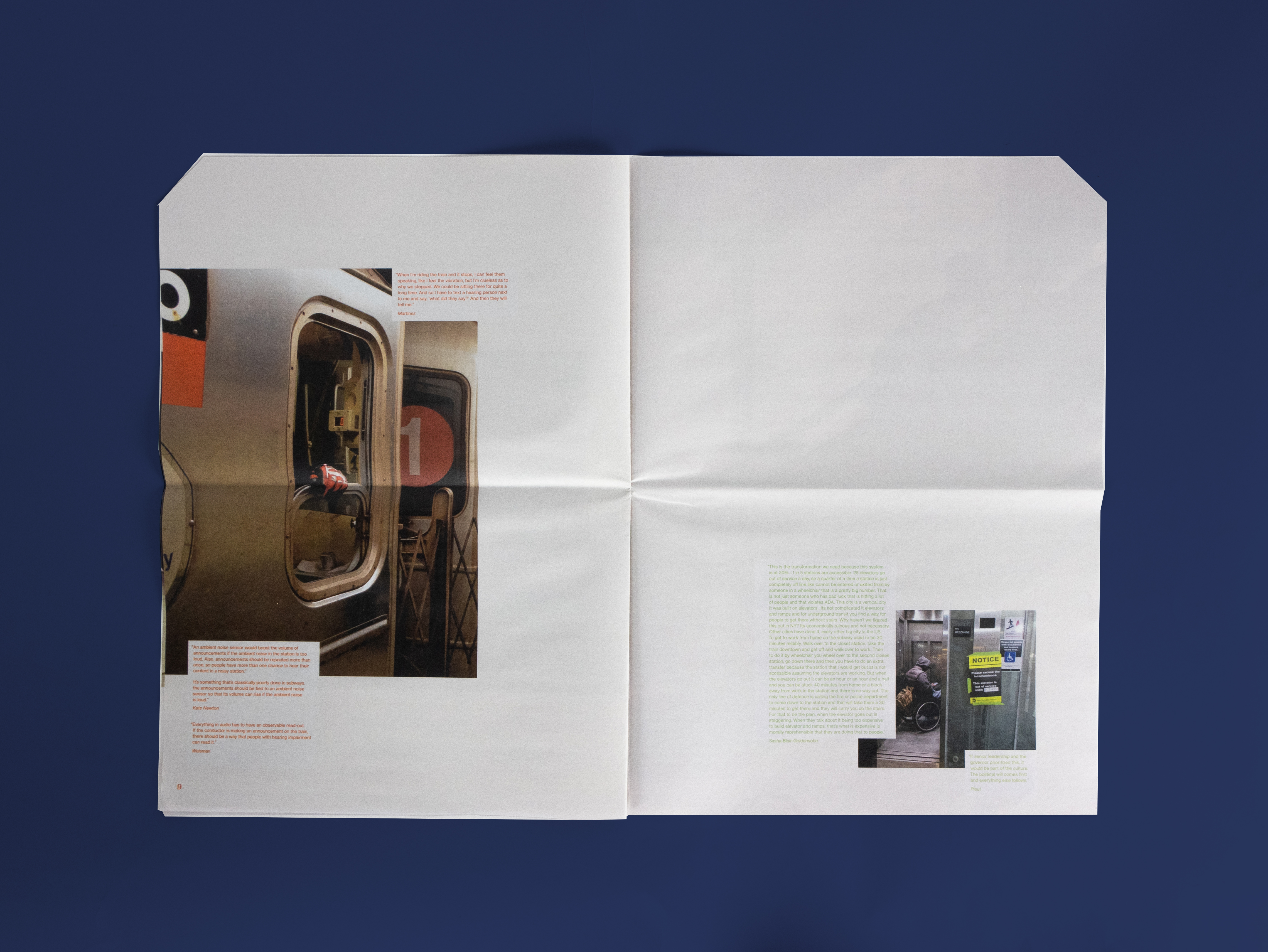
Throughout the publication, quotations cut into the images to heighten the feeling of obstruction and interference. Reading about these stories, readers gain empathy and an understanding for what people not like them experience everyday.
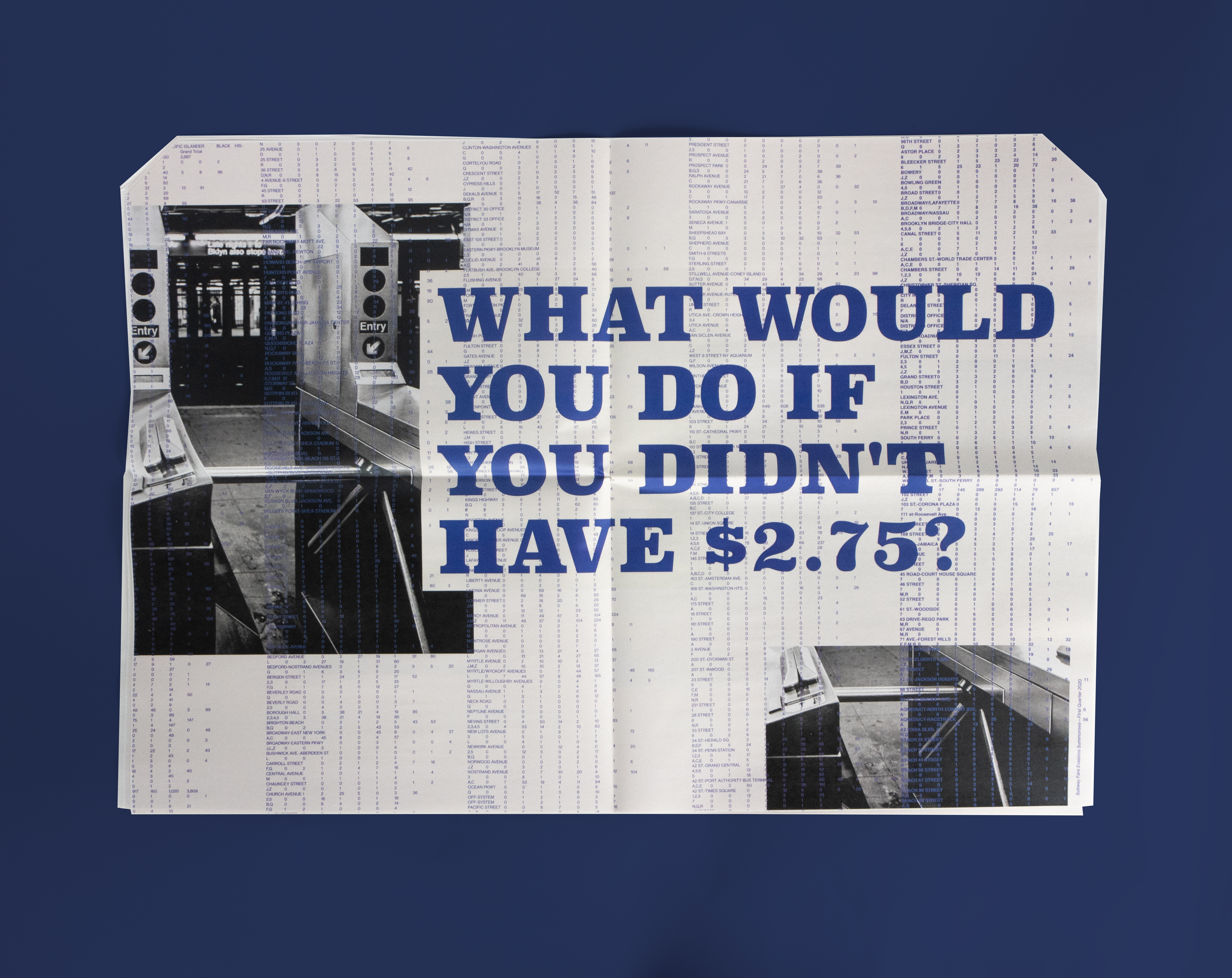
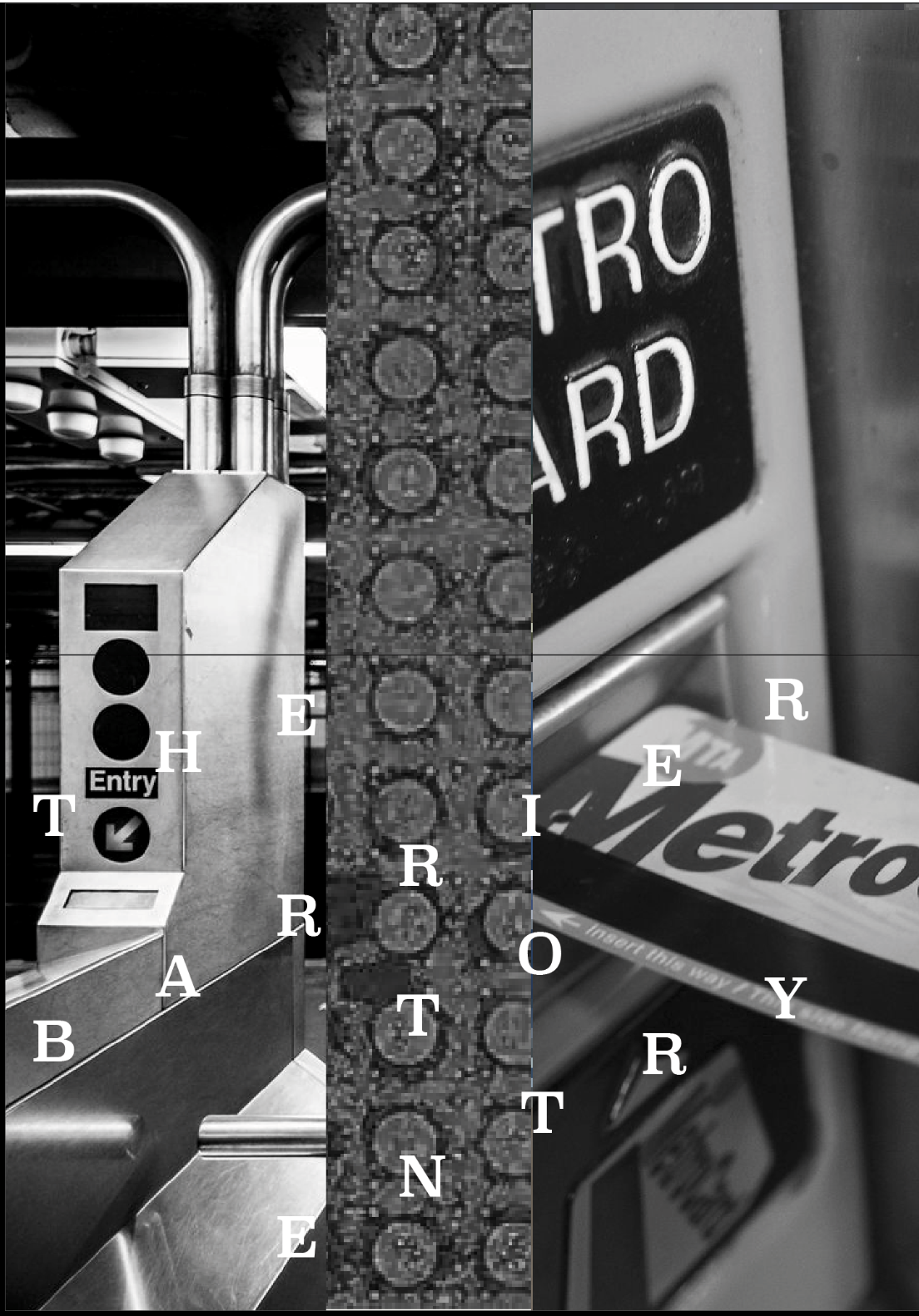
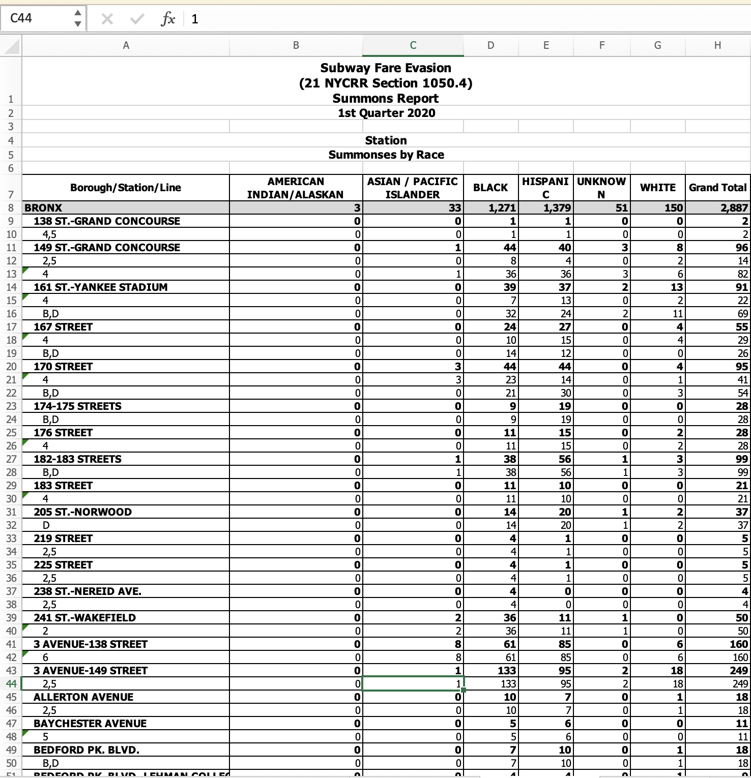
The typographic pattern on the center spread displays the striking data on how many people were arrested and received summons for fare evasion in the first quarter of 2020.
This spread was also intended to be a stand alone poster.
This spread was also intended to be a stand alone poster.
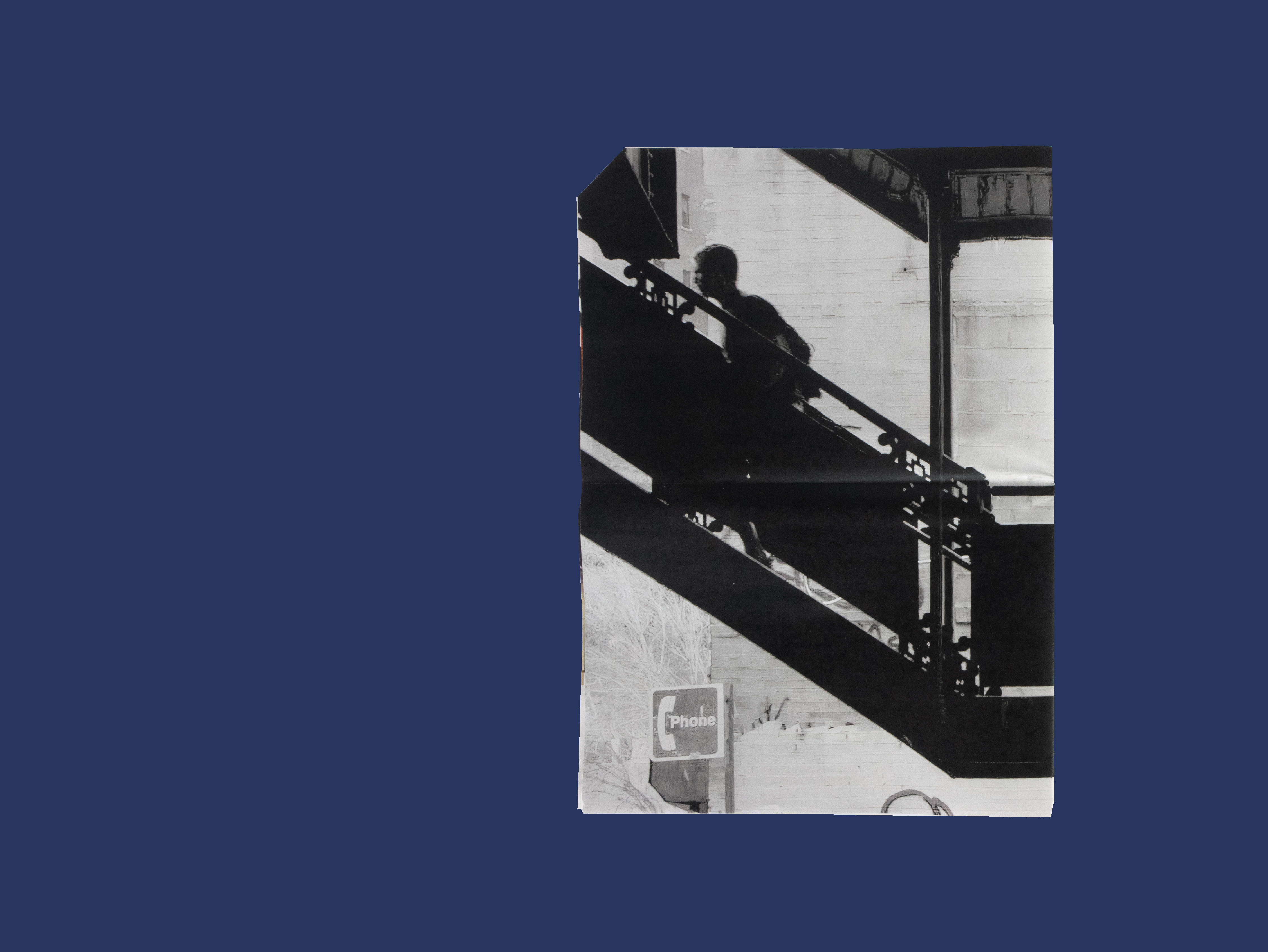
The images provide a glimpse into these obstacles by providing snippets of everyday life.

The majority of images used, are photographs I have on while riding the subway.
The negative space provides heightens the dramatic background while also giving the reader room to reflect on the stories they just read.
The negative space provides heightens the dramatic background while also giving the reader room to reflect on the stories they just read.
TYPEFACES
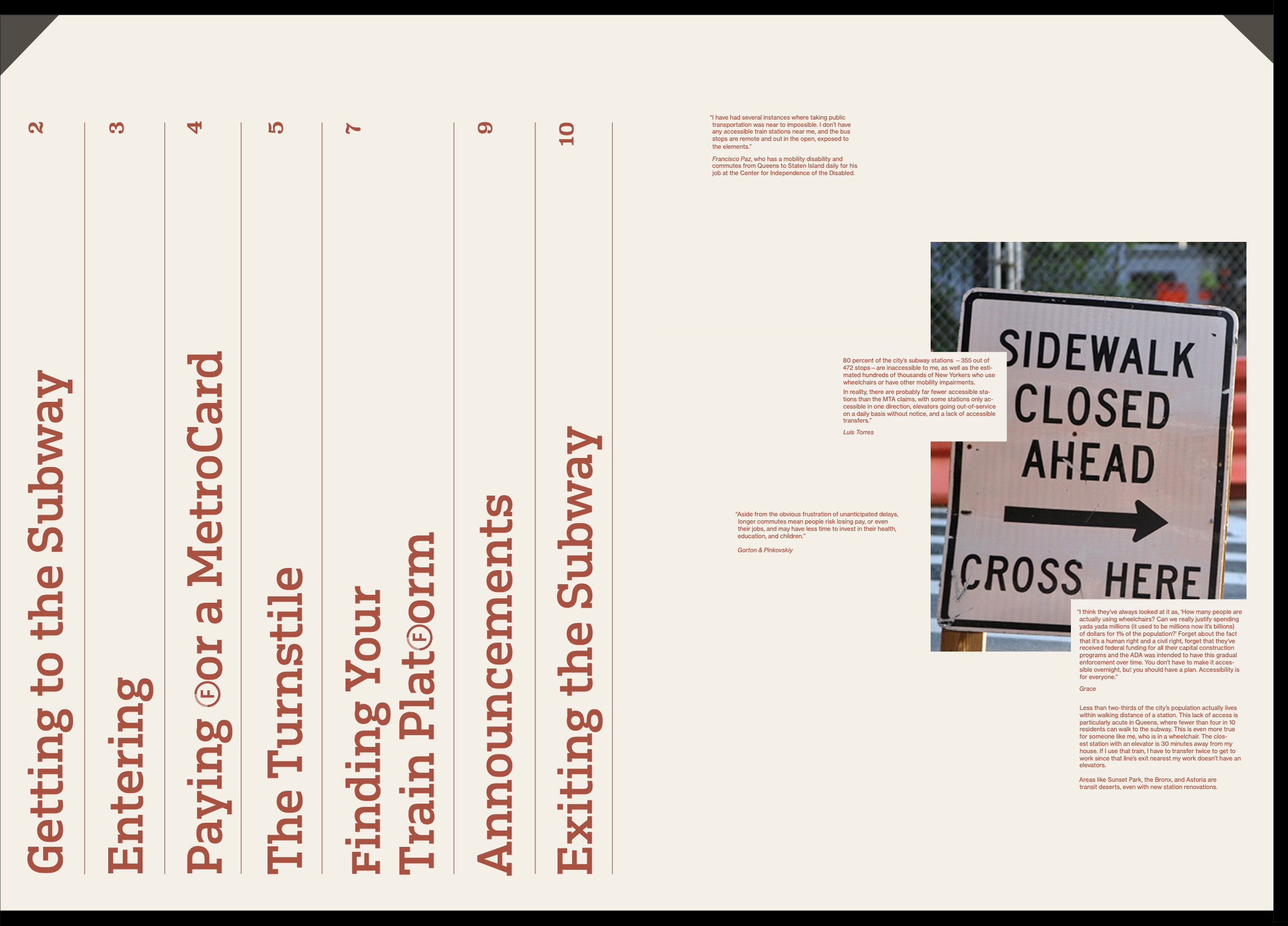
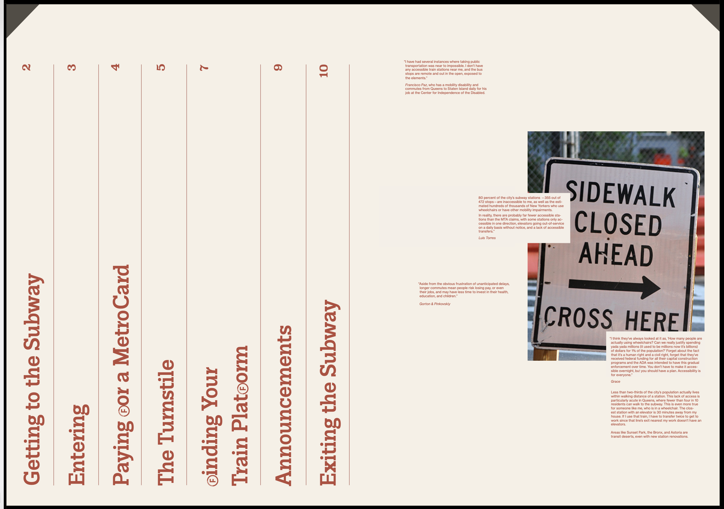
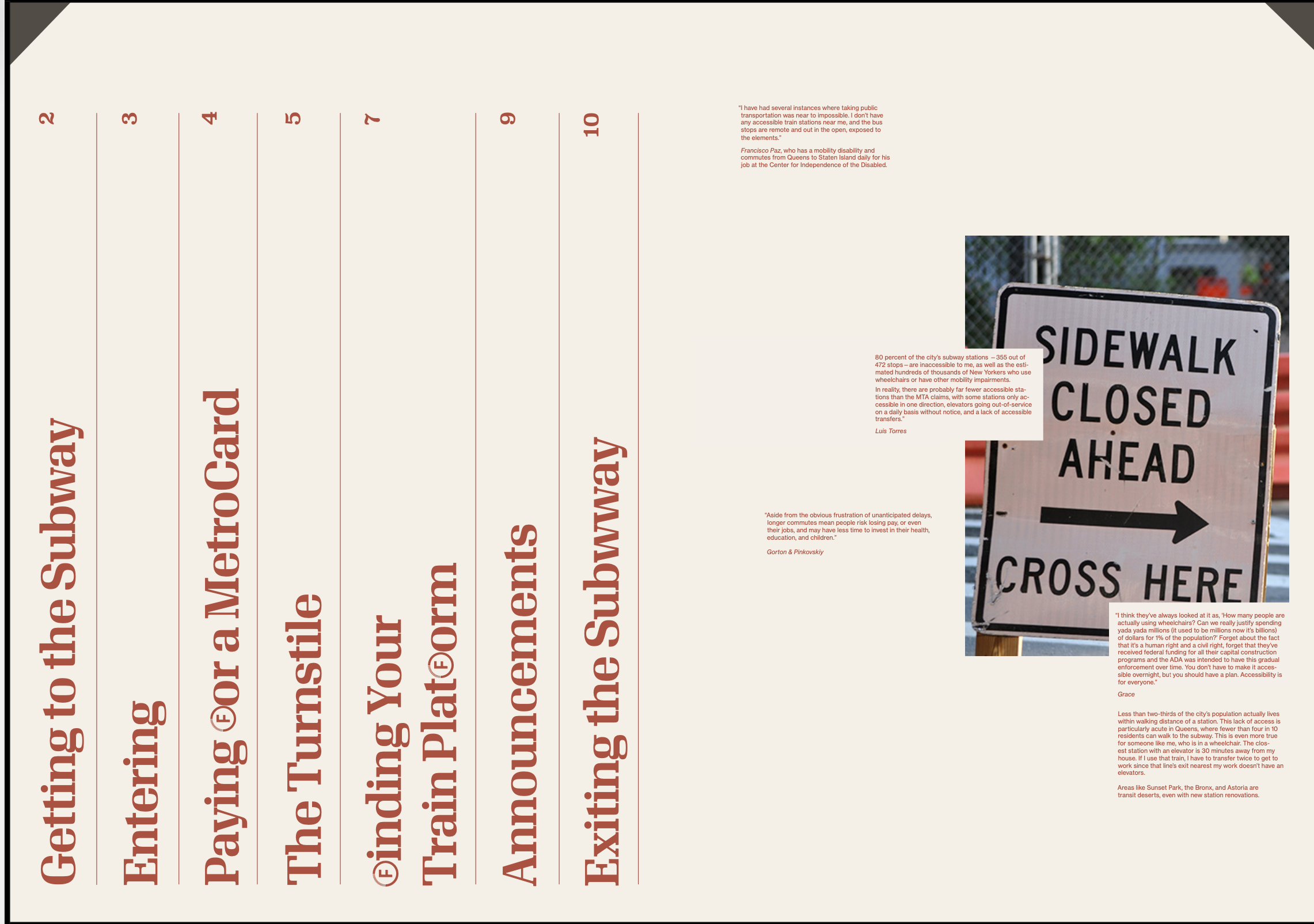
I chose Neue Haas Grotesk as an ode to Helvetica that is used throughout the system. Additionally, I used Superclarendon as the display type for its wood-type feel. The mixture of the two makes the topics discussed feel modern, but also signal to the deep roots of these injustices.
I chose Neue Haas Grotesk as an ode to Helvetica that is used throughout the system. Additionally, I used Superclarendon as the display type for its wood-type feel. The mixture of the two makes the topics discussed feel modern, but also signal to the deep roots of these injustices.
This publication is meant to be distributed on the subway and around New York. It seeks to provide those unaware of these obstacles a new perspective in an attempt to make New York a more empathetic city.

PROCESS
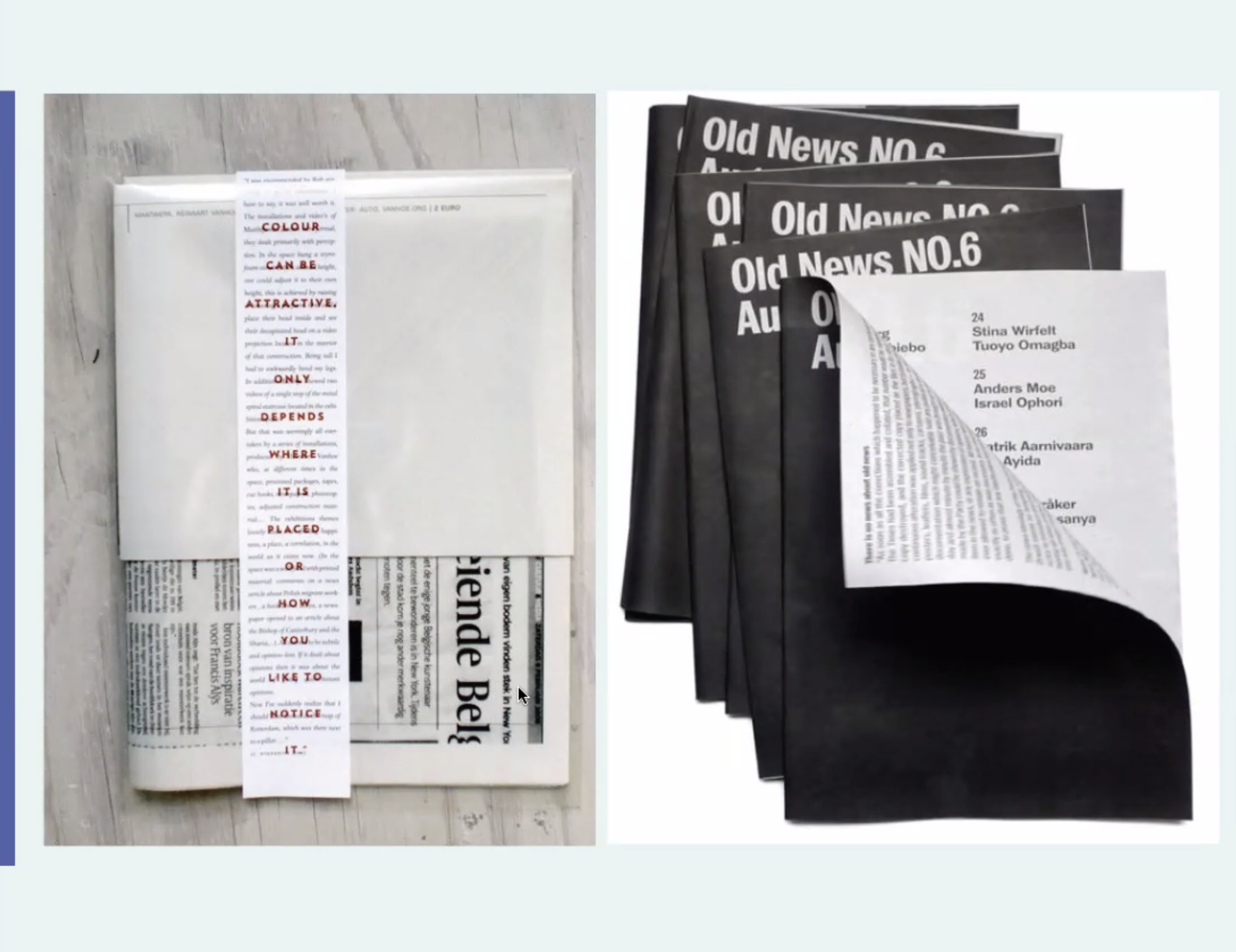
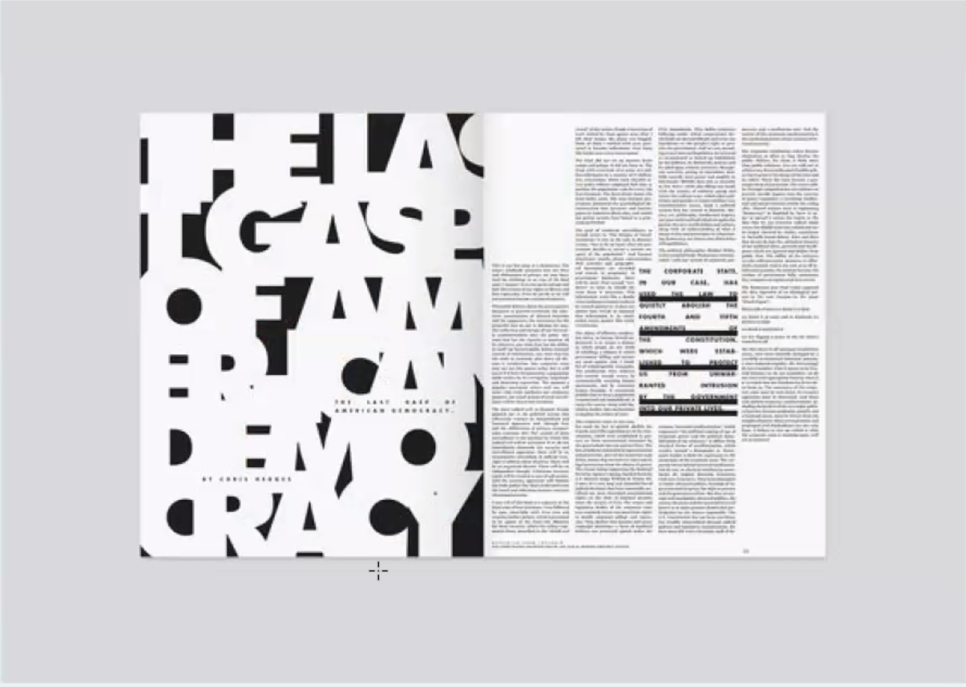
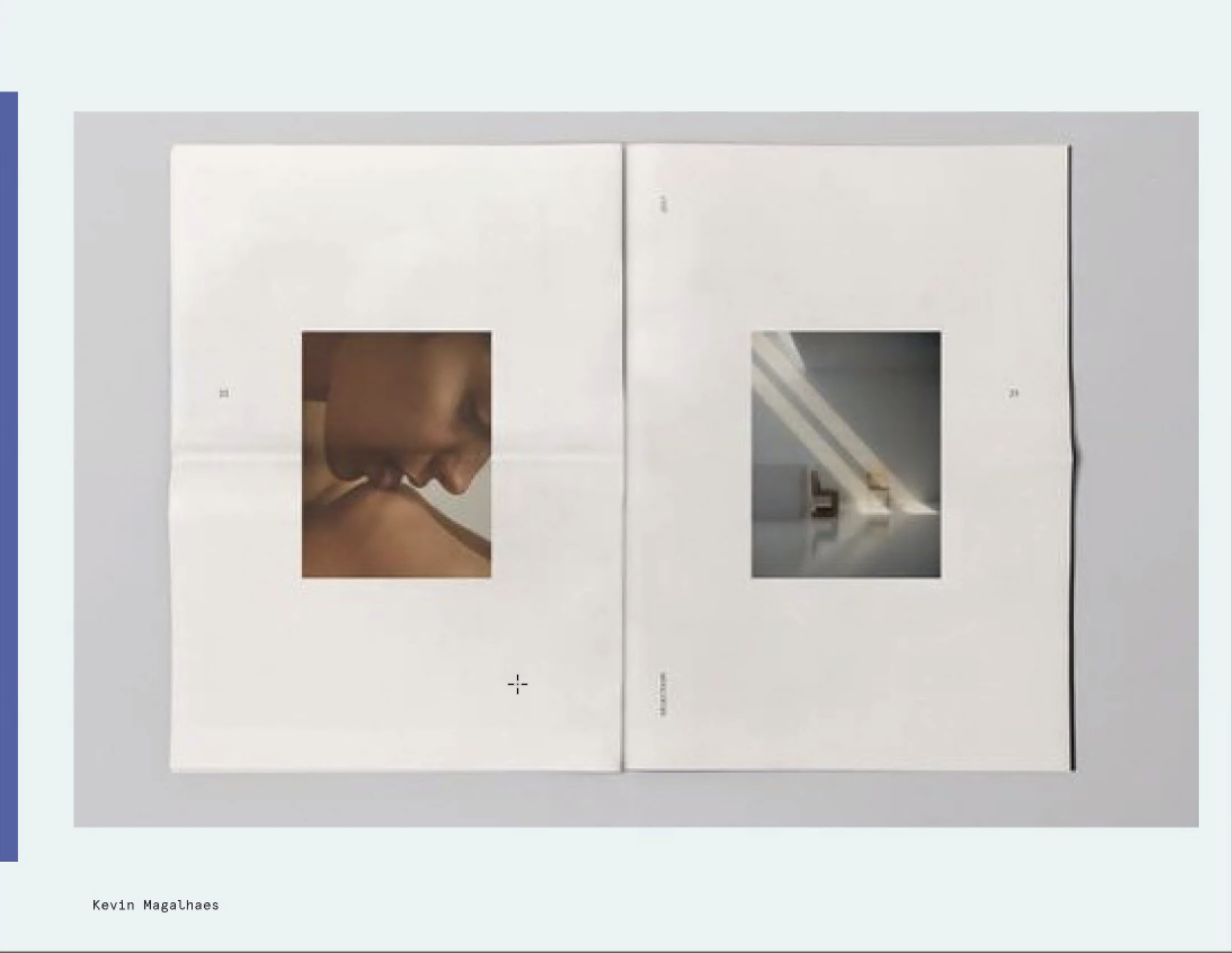
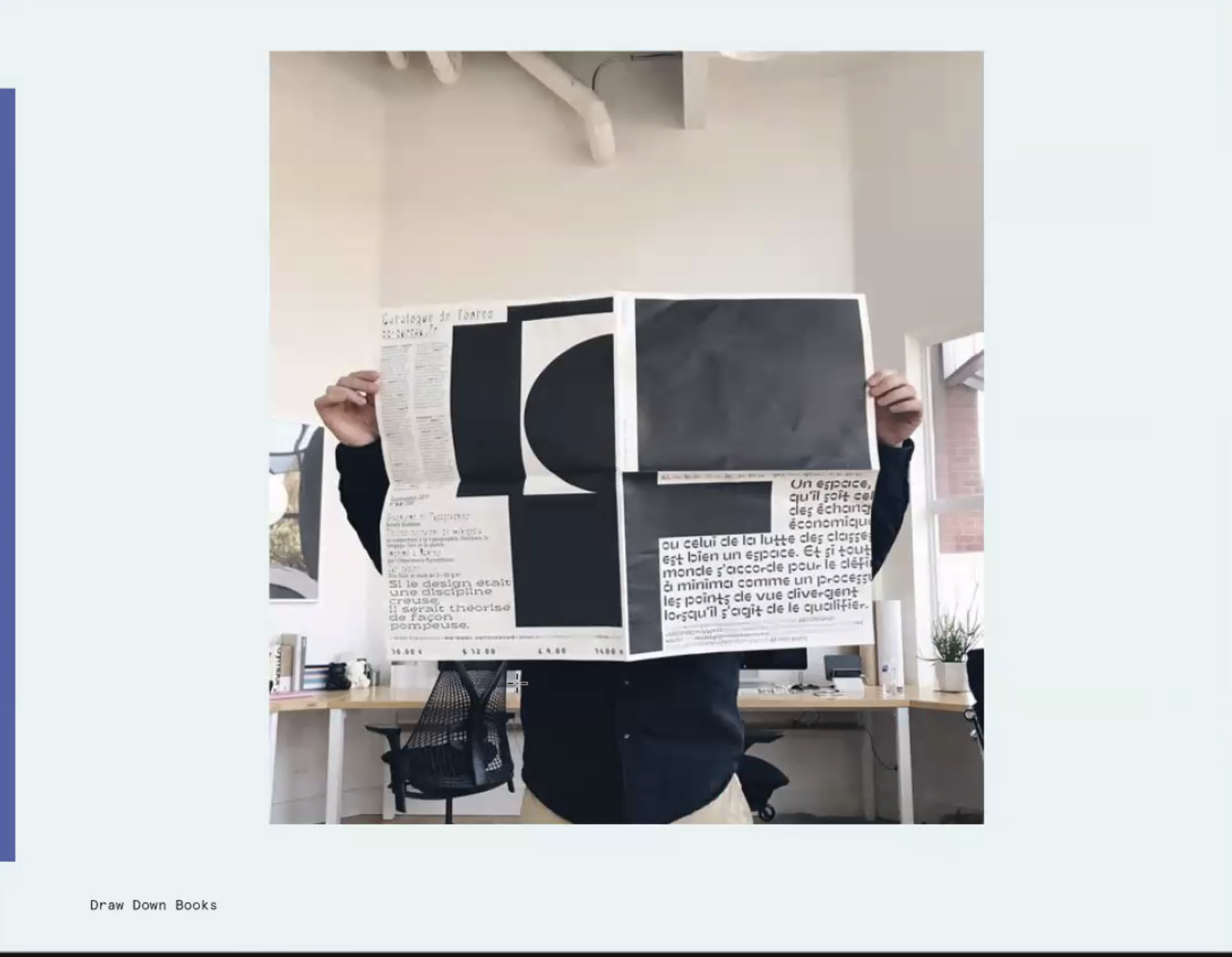
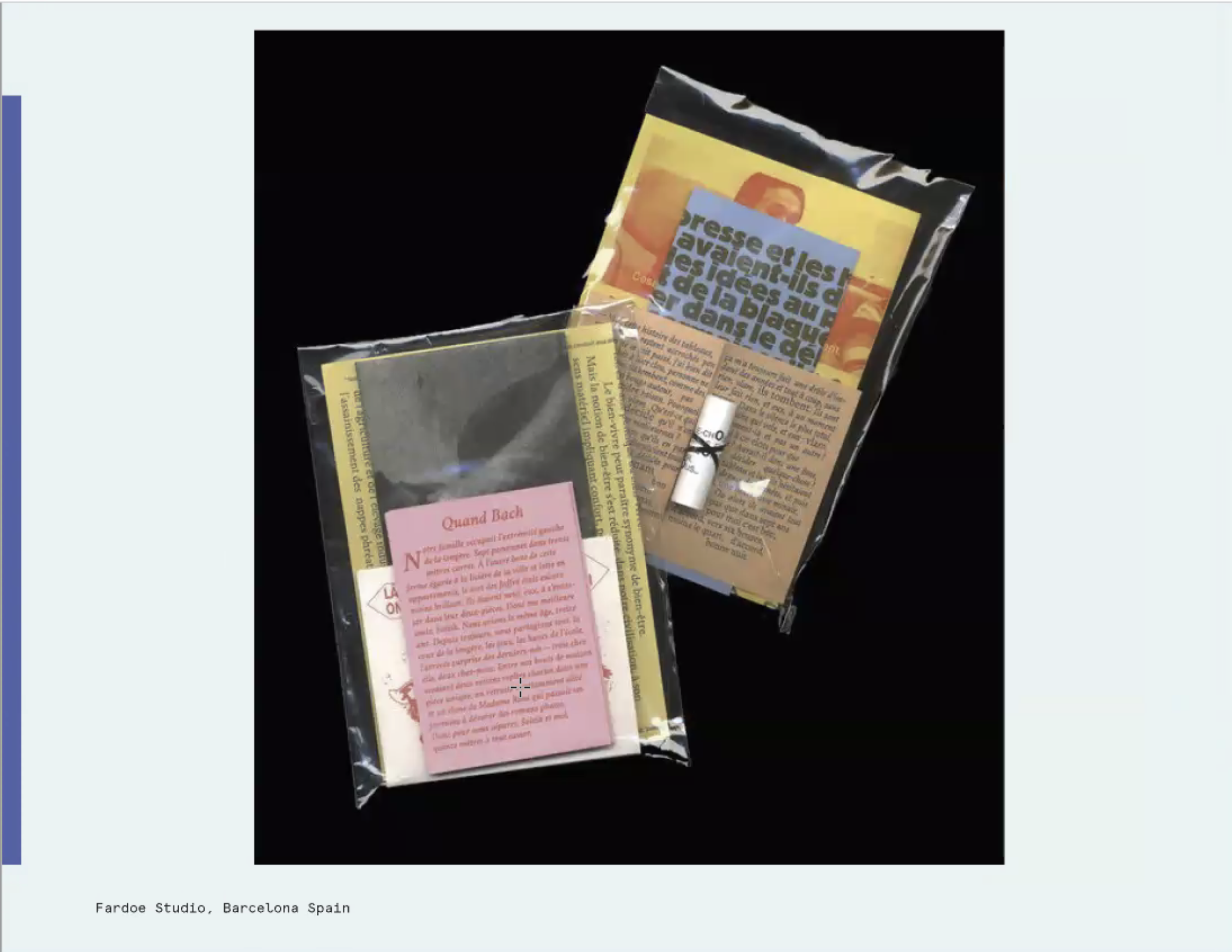
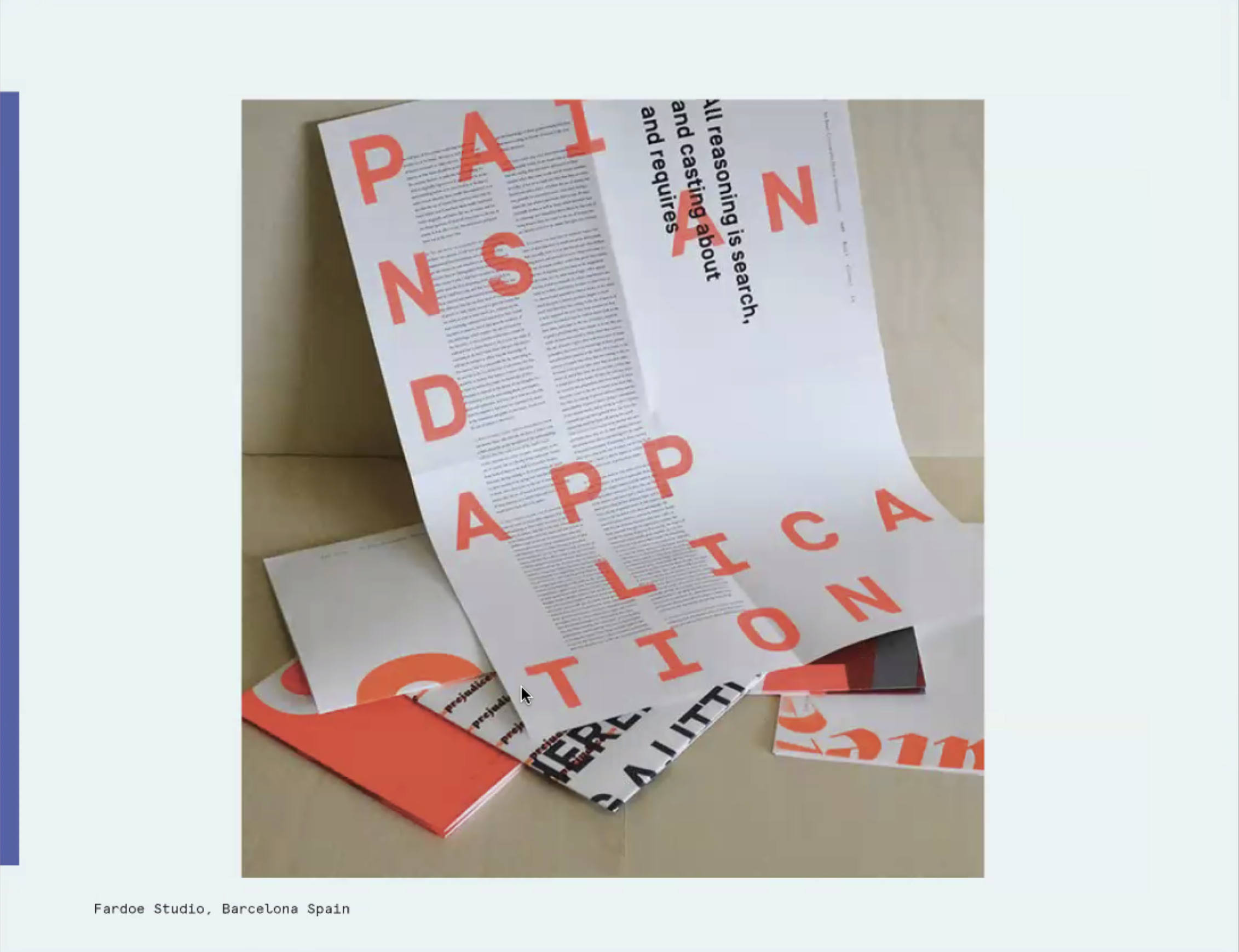
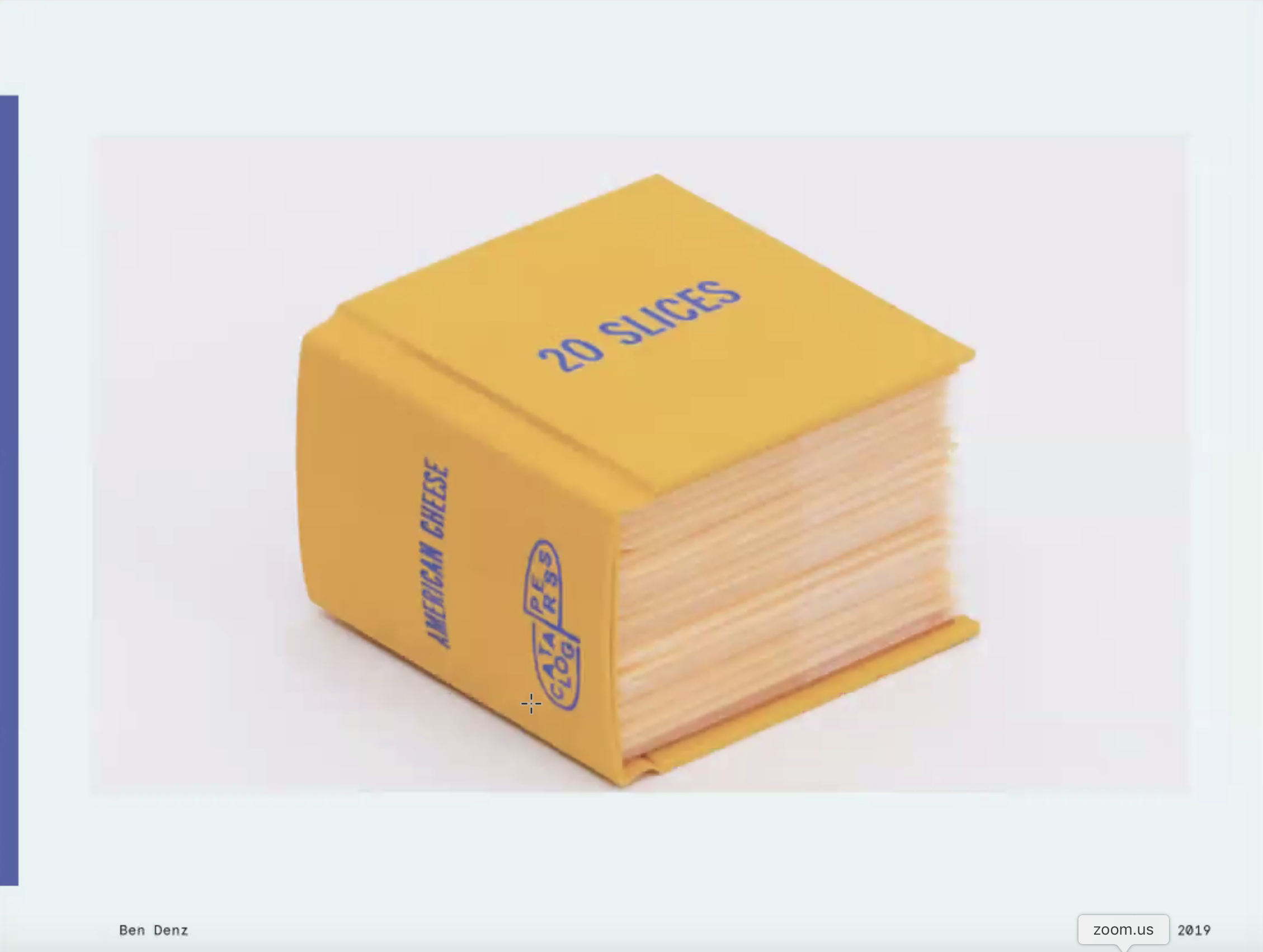
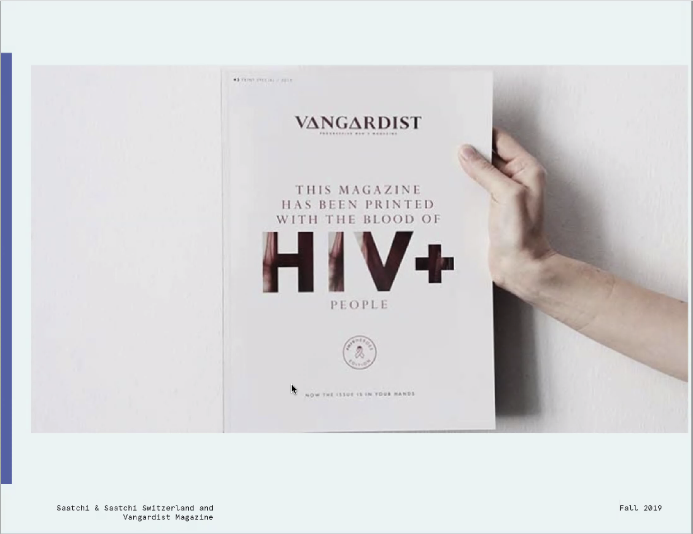
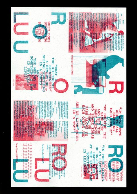
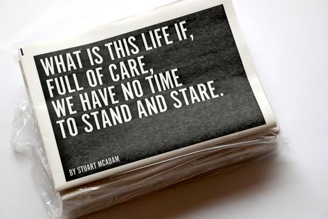
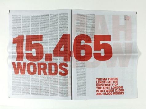
I started by gathering newsprint publications and gaining inspiration.
Thanks to Audra Hubbell.
I started by gathering newsprint publications and gaining inspiration.
Thanks to Audra Hubbell.







The quotations were found from articles, videos, and interviews online.
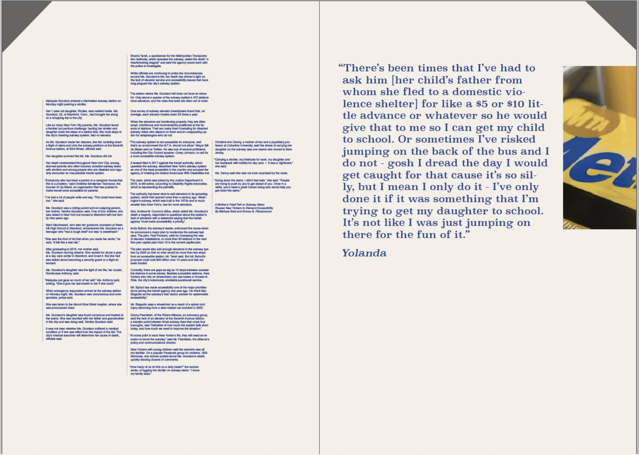
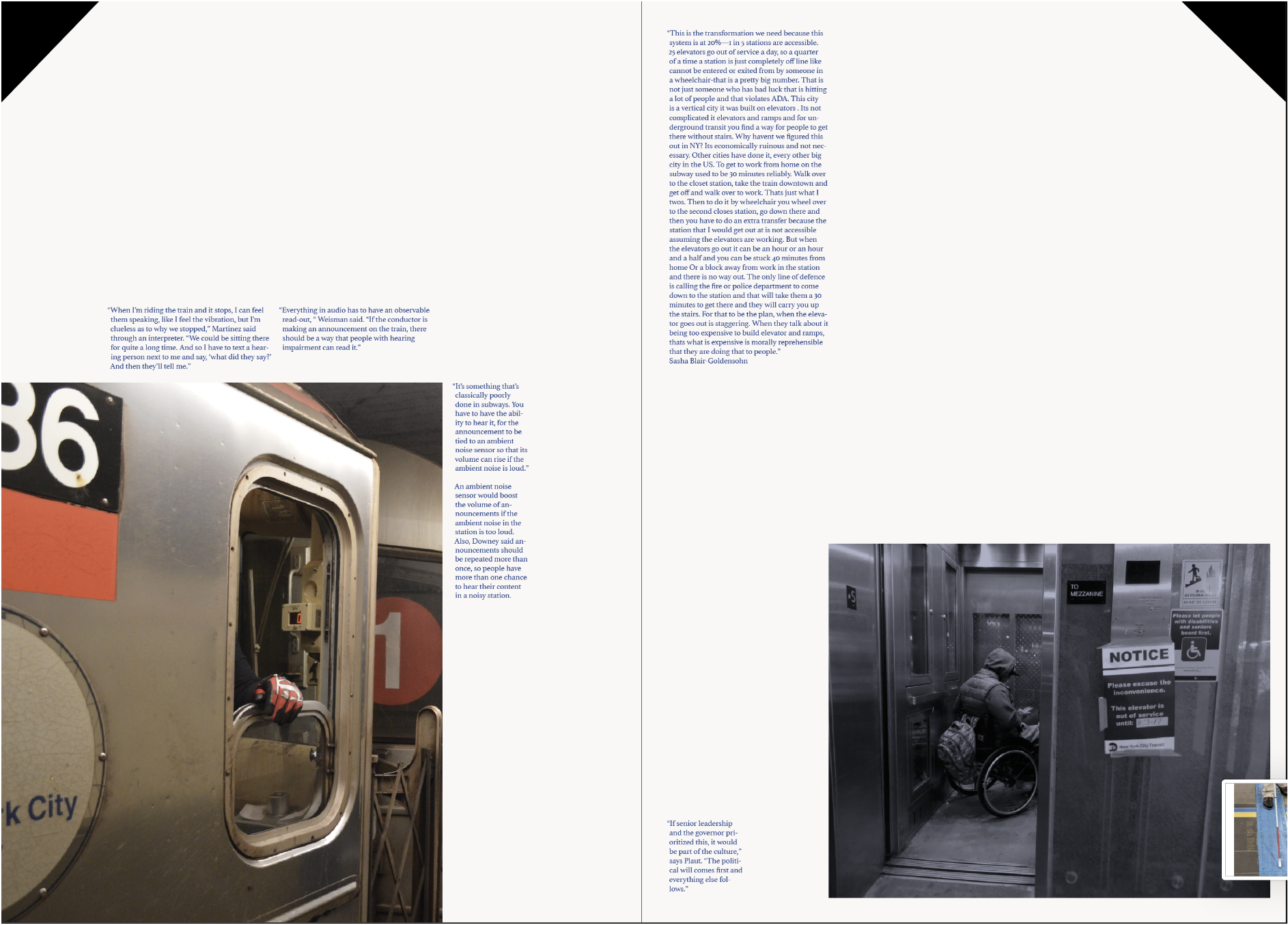


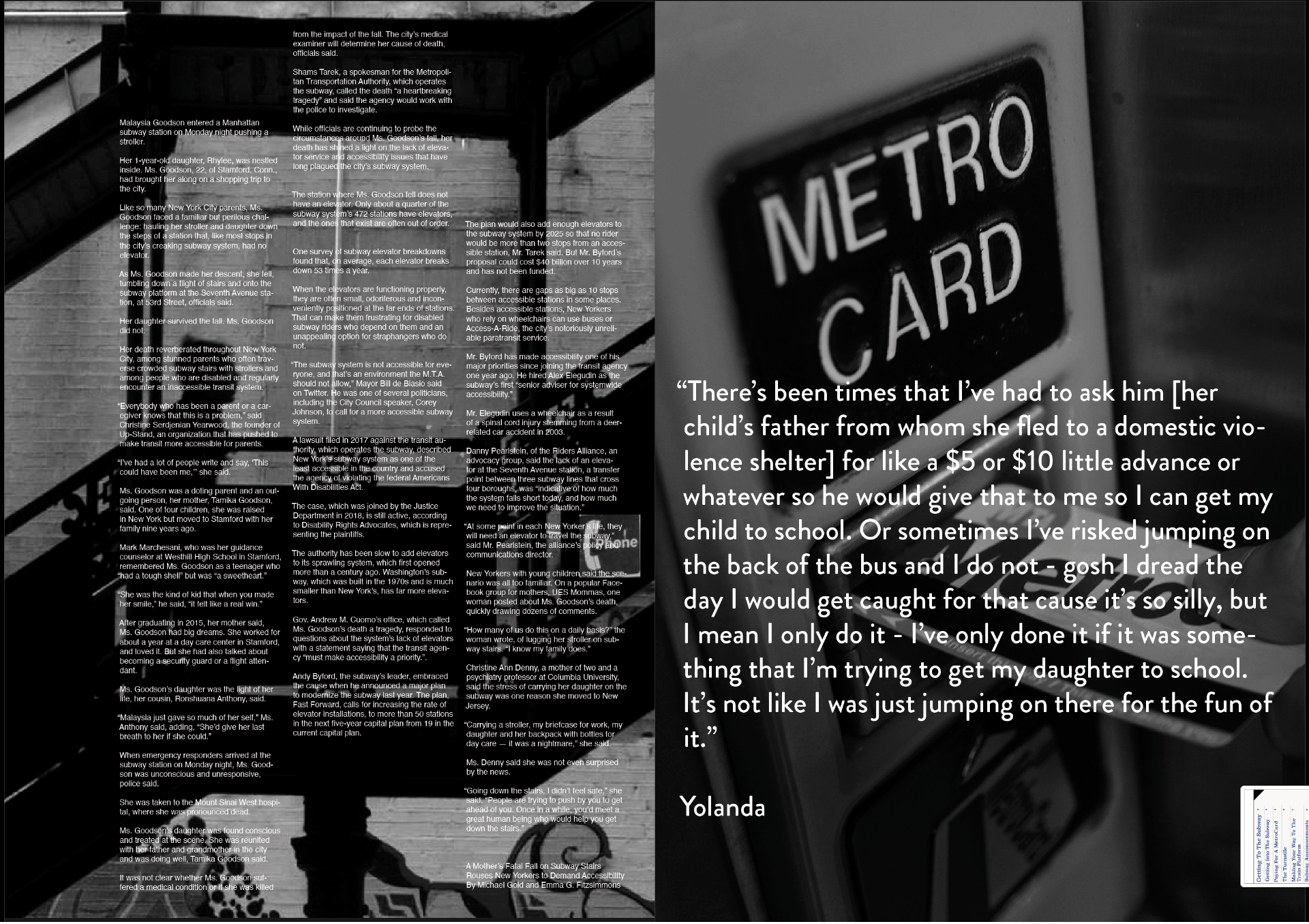
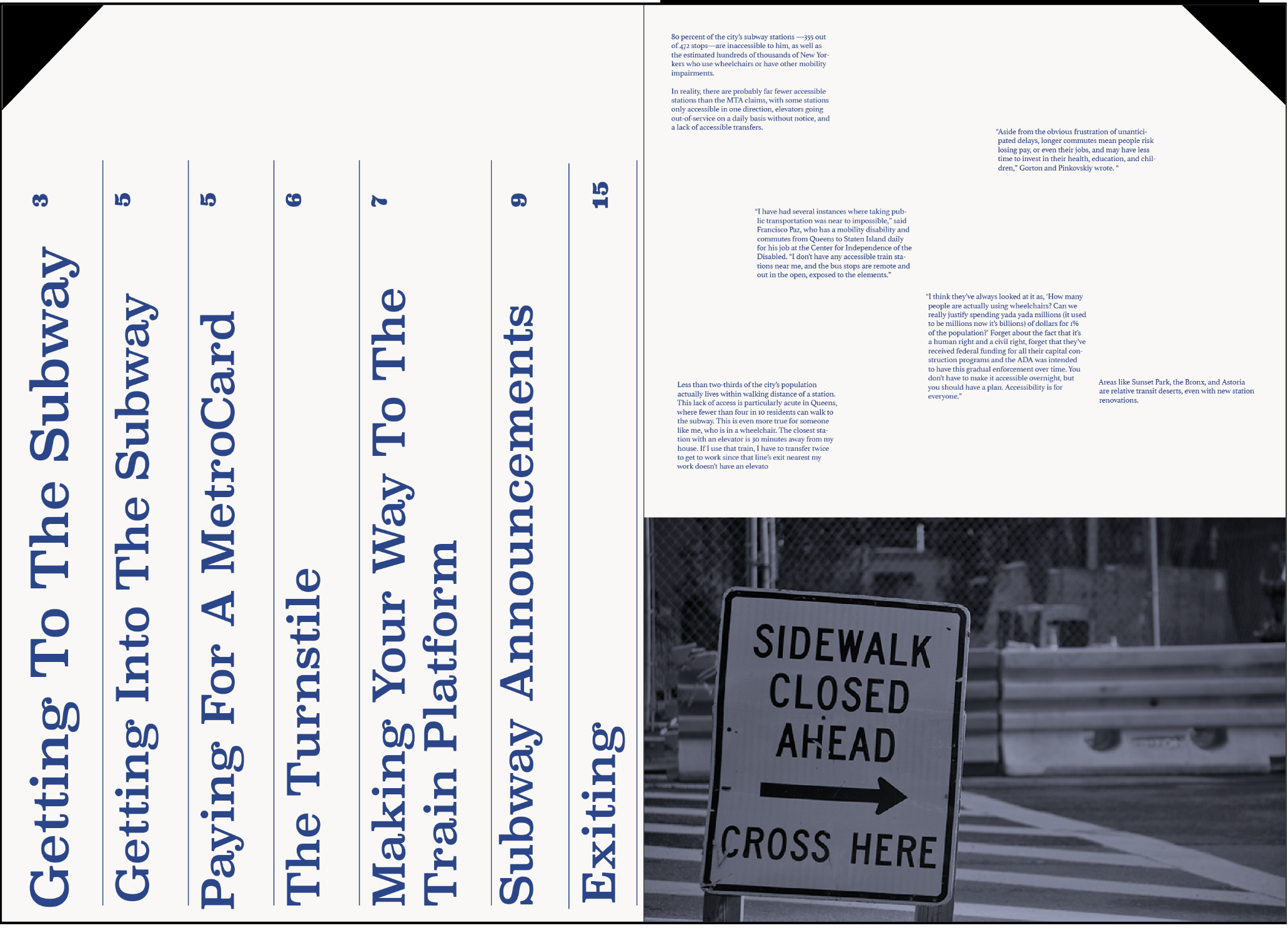

Typeface selection process:
(images just from first spread, but tested throughout the publication)
(images just from first spread, but tested throughout the publication)



Data on fare evasion and summons taken from New York City Police Department website. The information was broken down by race, gender and age by the station and line.
NEXT STEPS
I hope to distribute this publication and start raising awareness about the subway system and what must be done to change how inaccessible it is.
I hope to distribute this publication and start raising awareness about the subway system and what must be done to change how inaccessible it is.