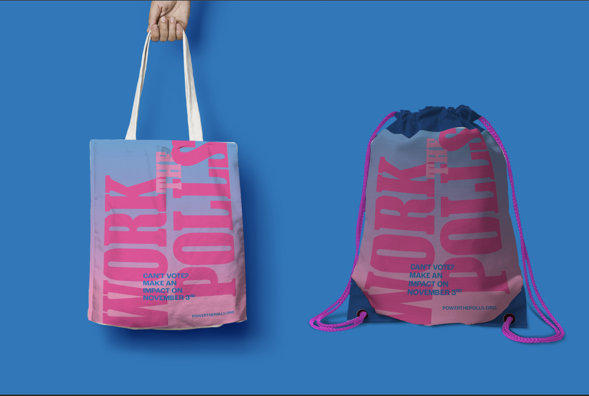
WORK THE POLLS
Political Design / Campaign Design
ROLE: Designer & Creative Direction
COMPLETED: Fall 2020
PRINTED ON: Risograph
SPEACIAL THANKS: Ben Kiel
COMPLETED: Fall 2020
PRINTED ON: Risograph
SPEACIAL THANKS: Ben Kiel
BRIEF
Call to action focused on how type communicates and compels. Considering: How does the reader process my message? What is the 2 second read, the 1 minute read? How can text and image work as one? What action do I want the viewer to take?
SOLUTION
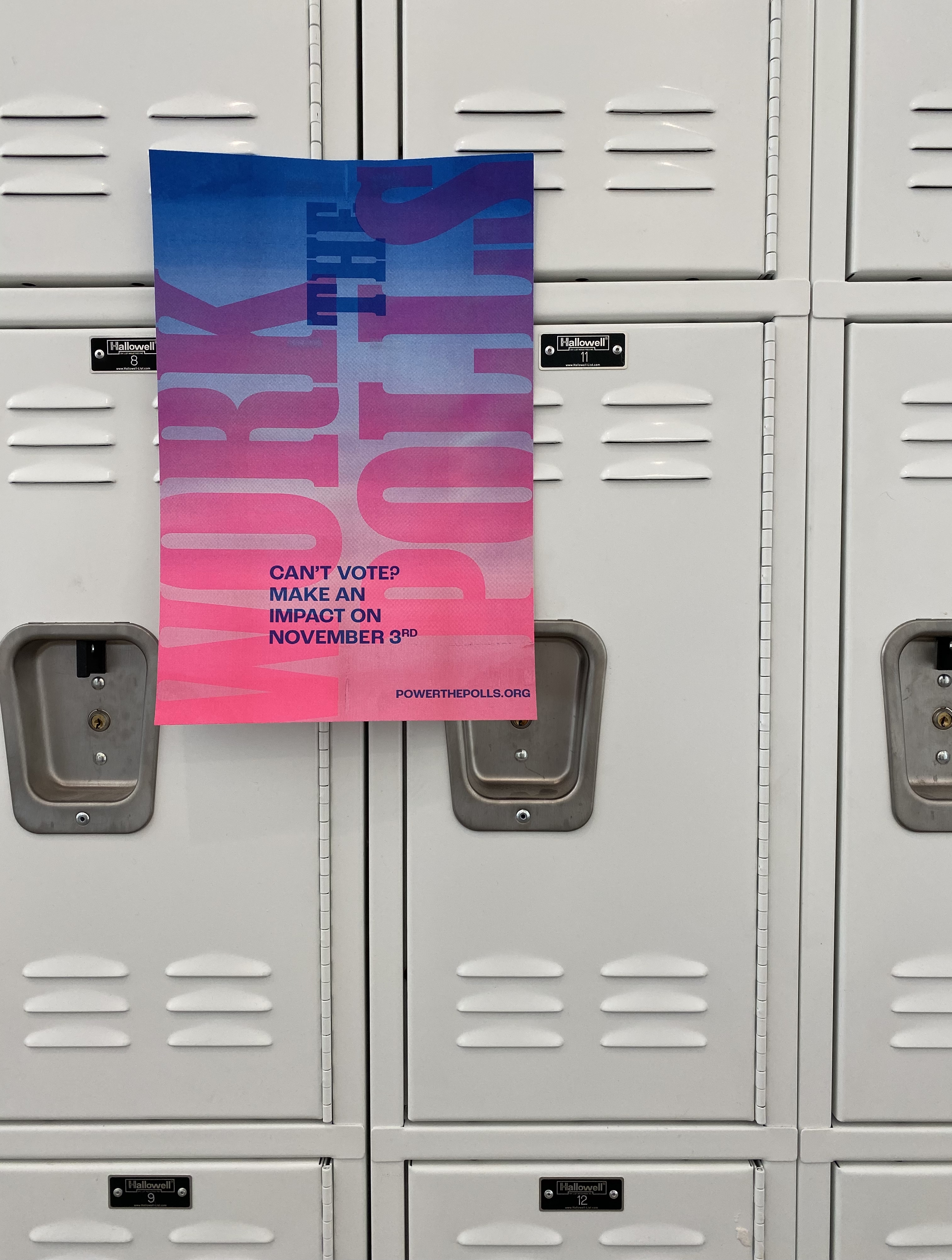
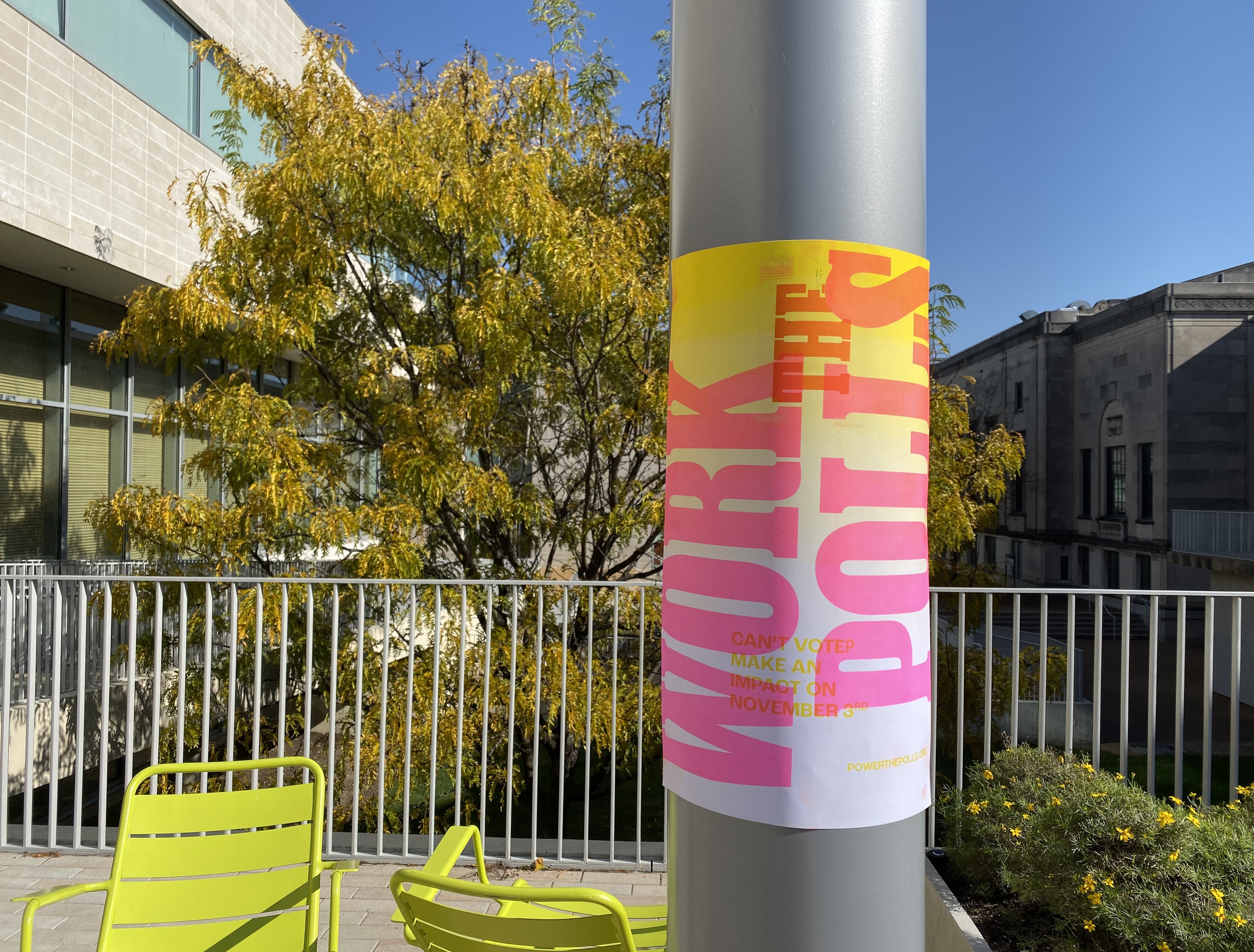
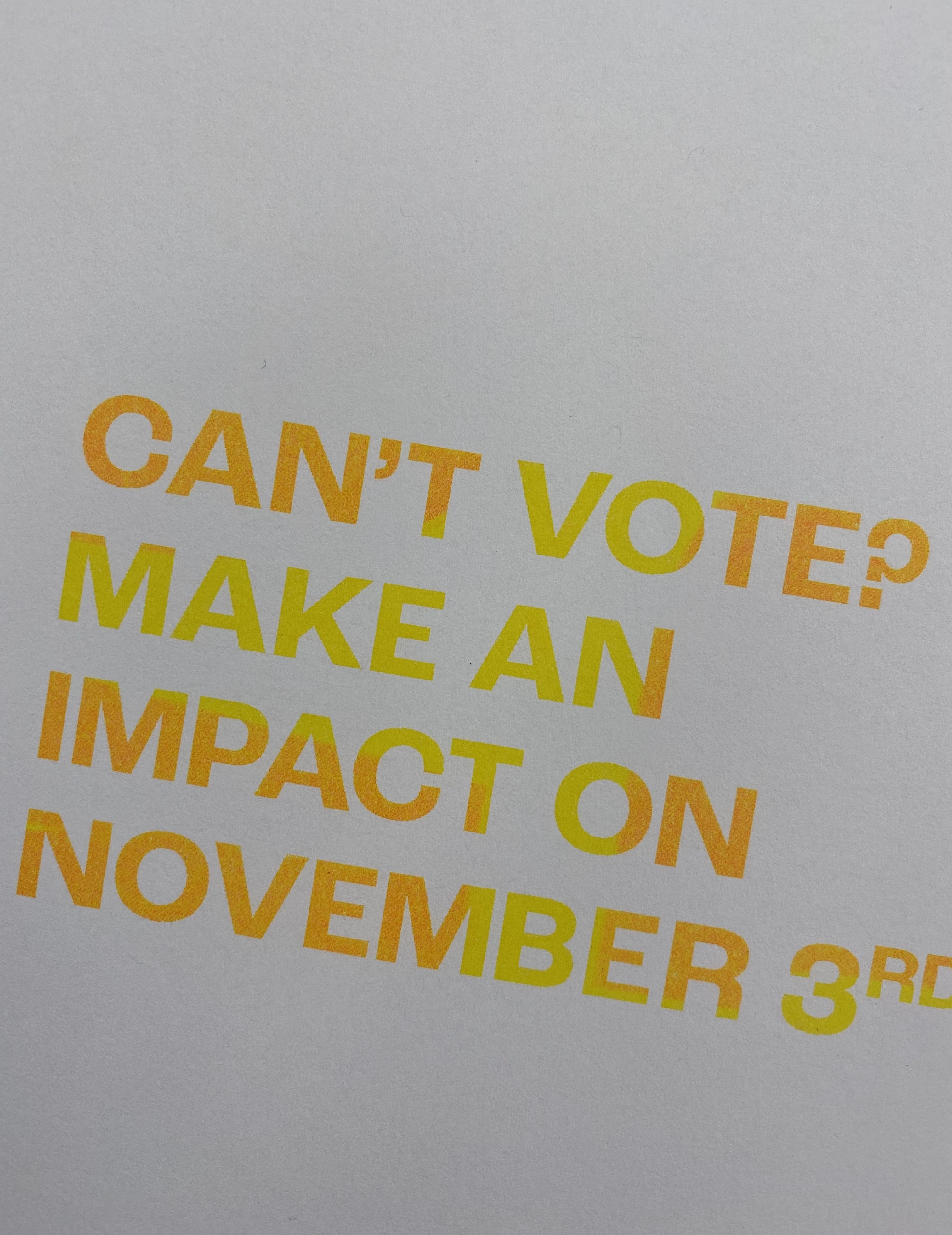
I created a work the polls campaign aimed at high schoolers who weren’t eligible to vote, but could still work the polls. In 2020, America faced a record shortage of poll workers due to the coronavirus. At the same time, there was a frustration among students who were under the age of 18. They werent eligible to vote, but wanted to help. This campaign met those frustrations and offered students a way to get involved.
![]()
Call to action focused on how type communicates and compels. Considering: How does the reader process my message? What is the 2 second read, the 1 minute read? How can text and image work as one? What action do I want the viewer to take?
SOLUTION
I created a work the polls campaign aimed at high schoolers who weren’t eligible to vote, but could still work the polls. In 2020, America faced a record shortage of poll workers due to the coronavirus. At the same time, there was a frustration among students who were under the age of 18. They werent eligible to vote, but wanted to help. This campaign met those frustrations and offered students a way to get involved.
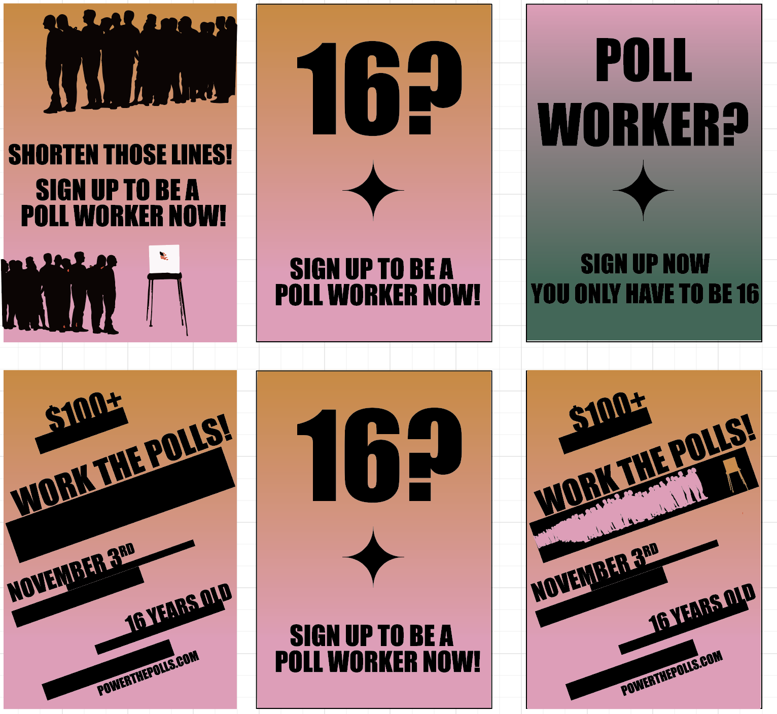
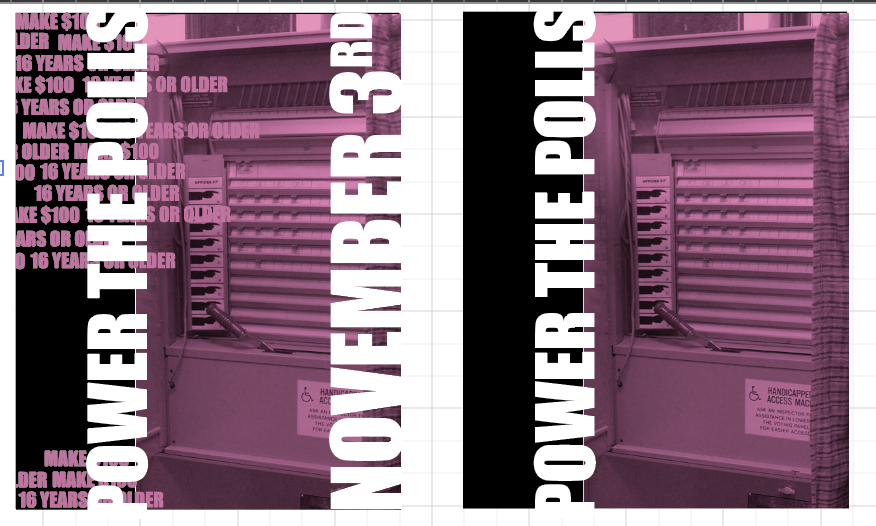
The posters were posted around campus like the one shown to the right. The poster directs viewers to go to powerthepolls.com to sign up to be poll workers.

COLOR
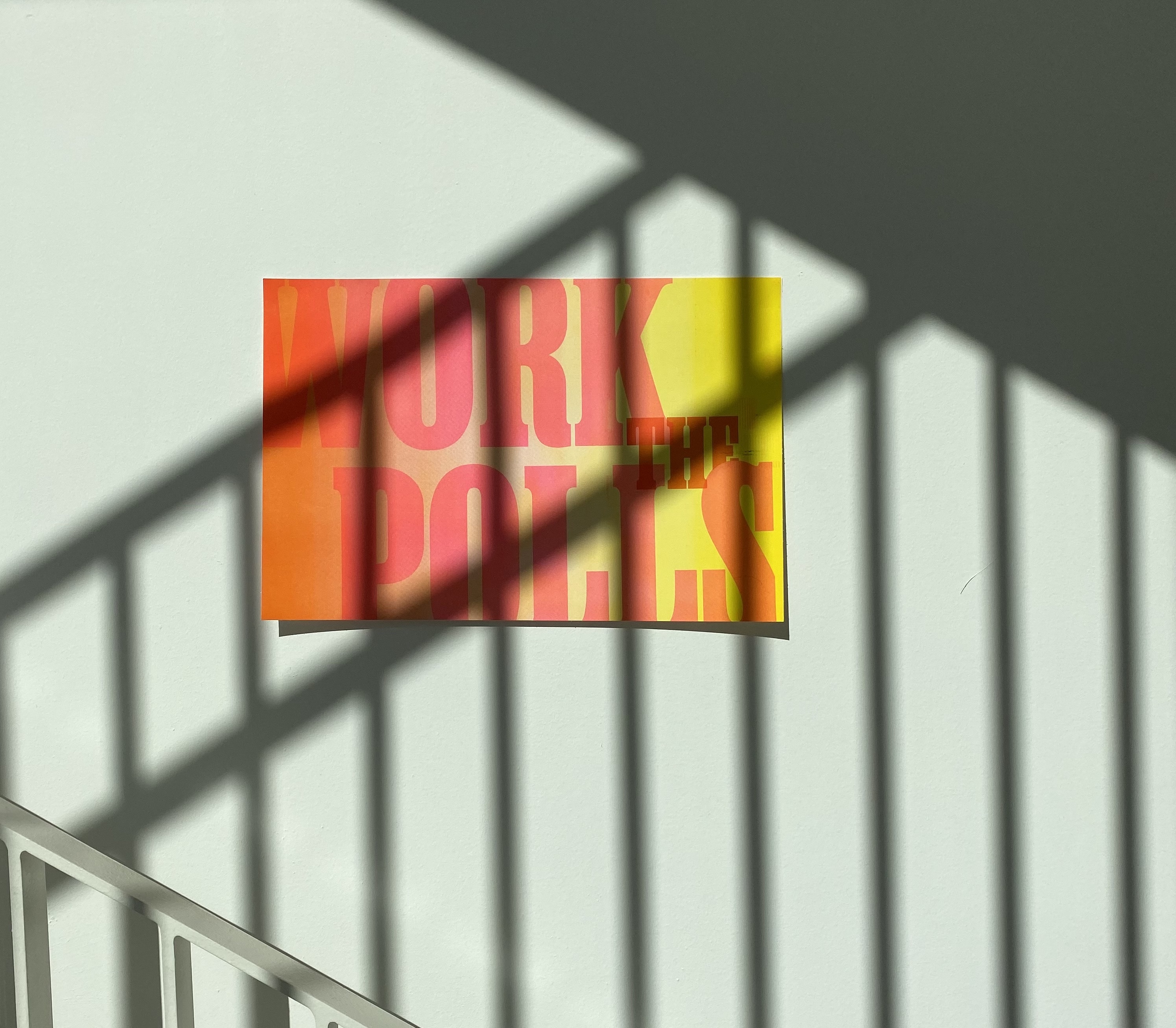
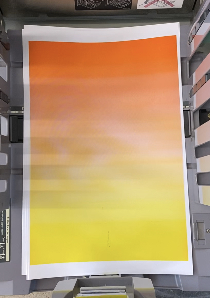
The campaign is based around two gradients — one pink to blue and the other orange to yellow. Both give nods to the classic politcal colors, but with a new modern take. Gradients provide a new and fresh take on the classic politcal graphics. 
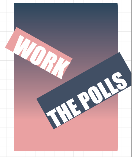
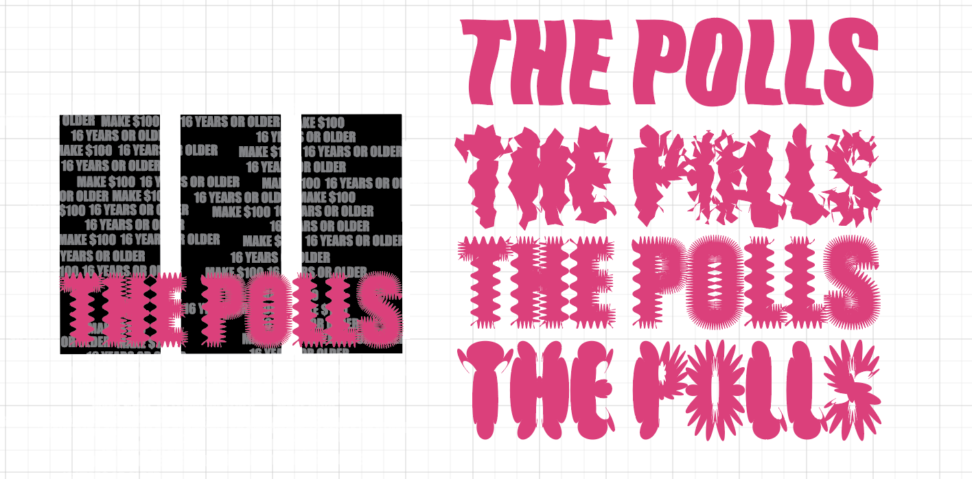
TYPE
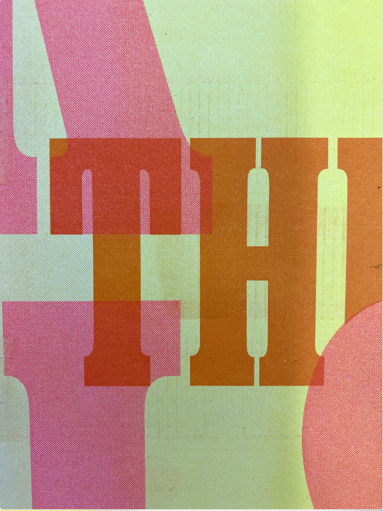
Ballast by XYZ Type is the display type and Roc Grotesk is the secondary typeface.
Ballast by XYZ Type is the display type and Roc Grotesk is the secondary typeface.

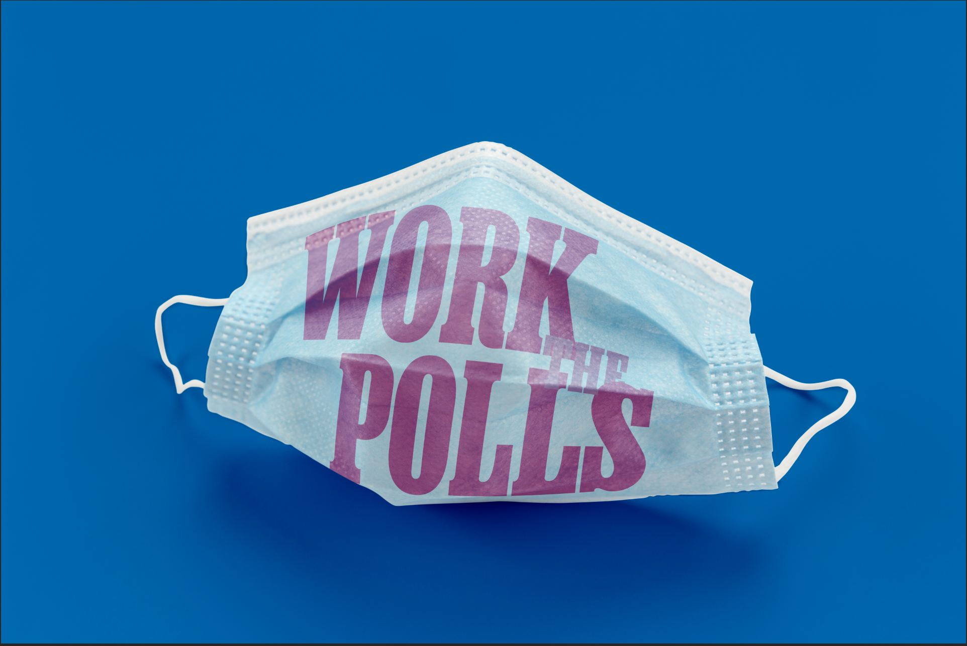
Collatoral for students to sport around campus. Being civically engaged is now the “cool” thing on campus.

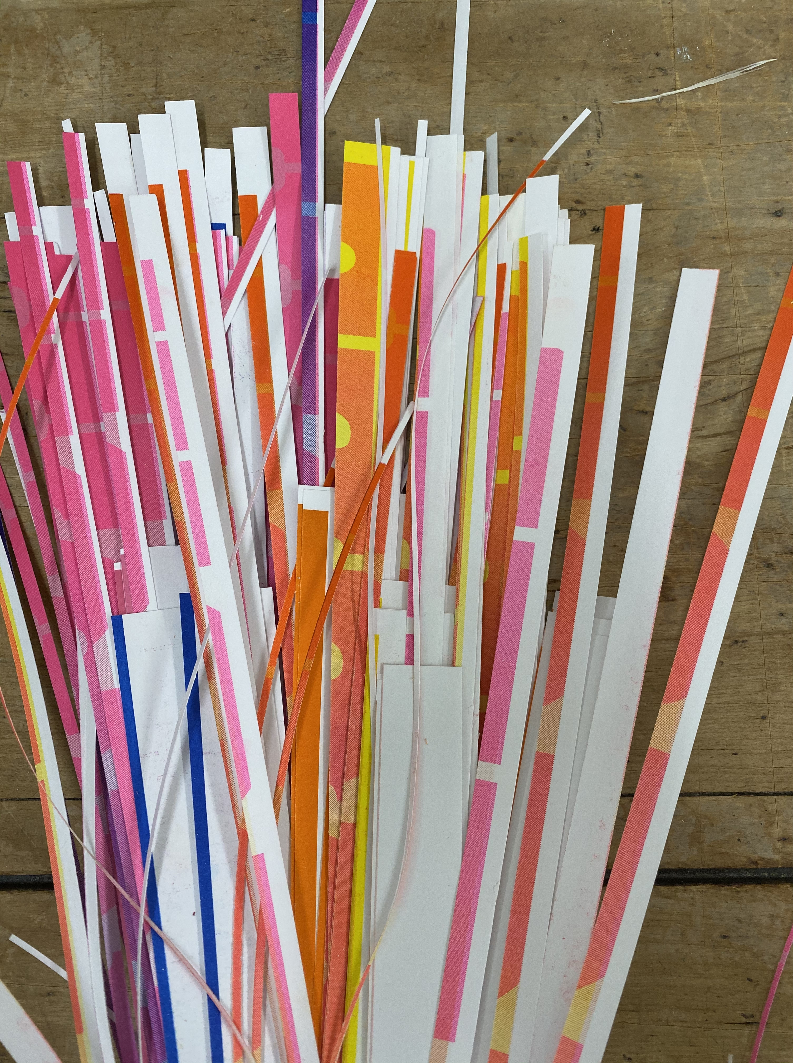
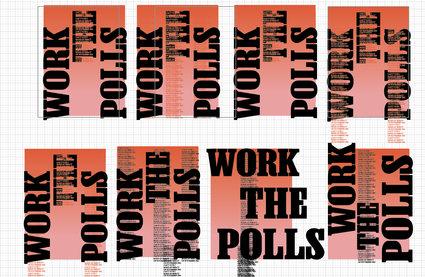
PROCESS


NEXT STEPS
I hope to work with schools, community centers, and communities to implement these posters in time for the next election.
I hope to work with schools, community centers, and communities to implement these posters in time for the next election.