RE— TEA
Branding / Identity / Packaging Design / Tea
ROLE: Designer & Creative Direction
COMPLETED: Spring 2019
COMPLETED: Spring 2019
BRIEF
Visual identity for hypothetical tea brand—limiting myself to 2 colors and 2 typefaces.
SOLUTION
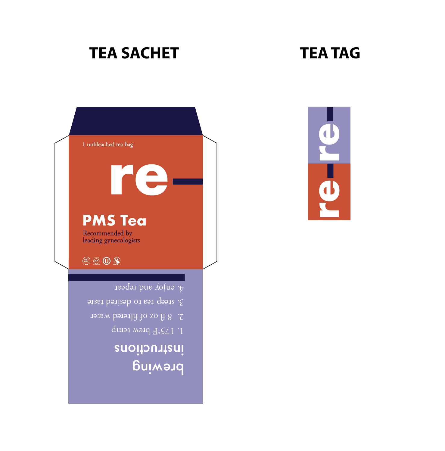
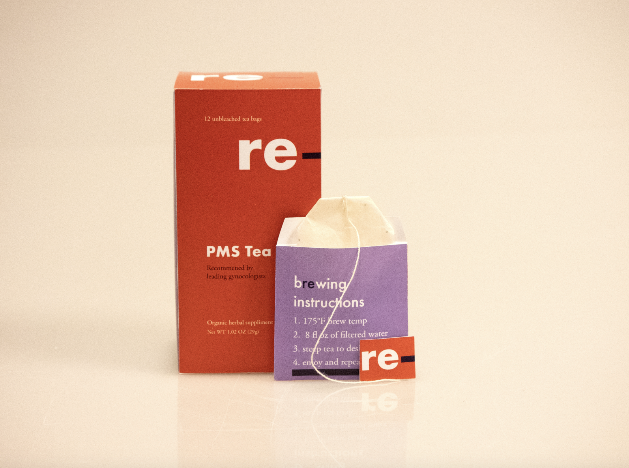
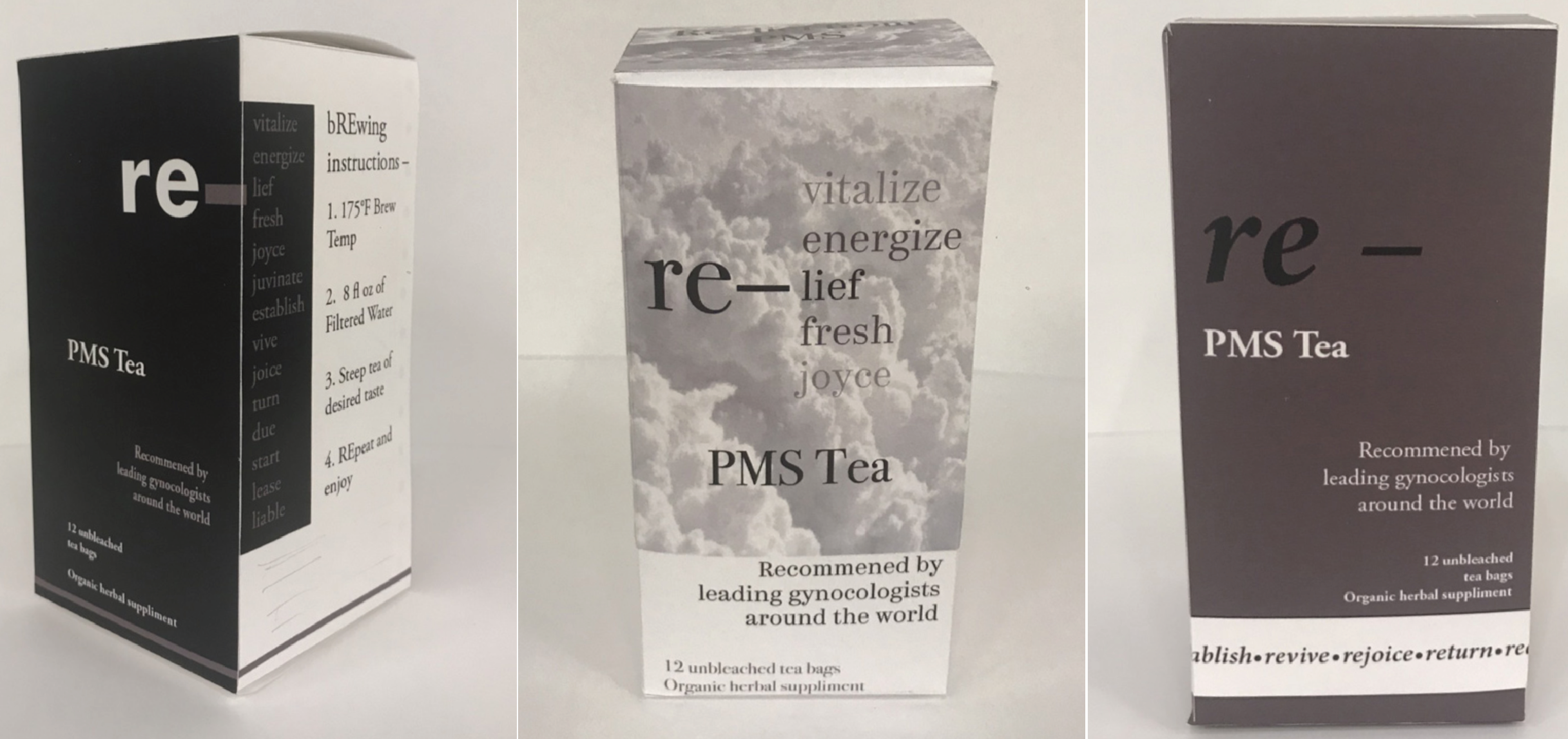
Re–tea is a medicinal tea brand designed to aid people experiencing menstrual pain and discomfort. The process included research, interviews, and design elements.
![]()
Visual identity for hypothetical tea brand—limiting myself to 2 colors and 2 typefaces.
SOLUTION
Re–tea is a medicinal tea brand designed to aid people experiencing menstrual pain and discomfort. The process included research, interviews, and design elements.


RESEARCH
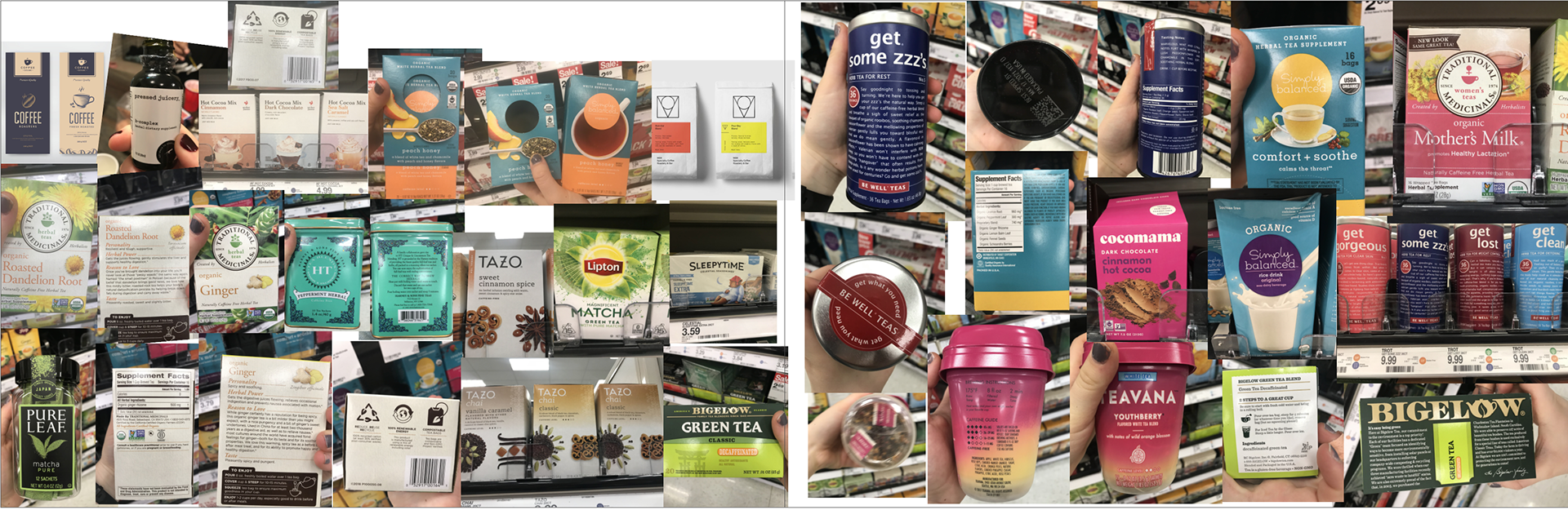
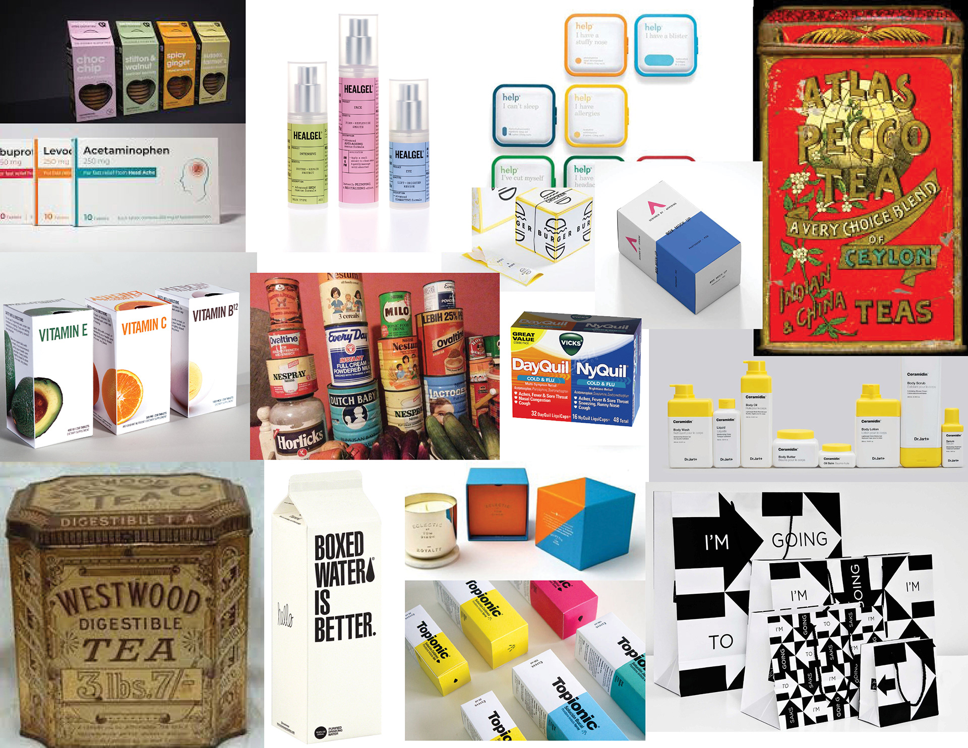
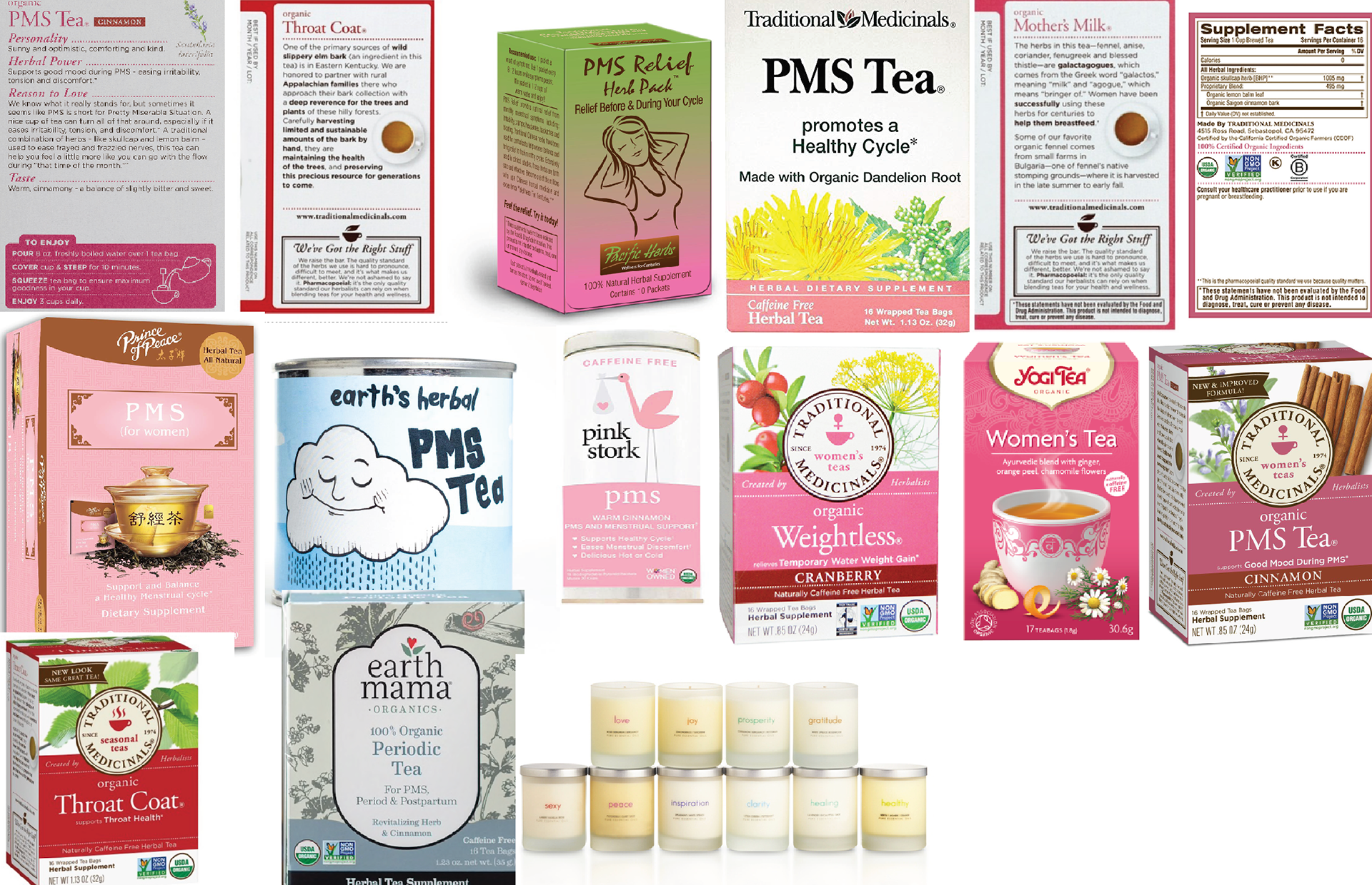
My first step was to collect research. I went countless grocery stores and took note of anything and all things that were packaged. I continued my research at the local library looking at packaging design through the ages and how it has evolved.
Designs with simple shapes and bold colors stood out to me. Additionally I was drawn to packaging designs that activated all sides of the box (wrapped around the corner) and linking the sides together.
INTERVIEWS & NAMING
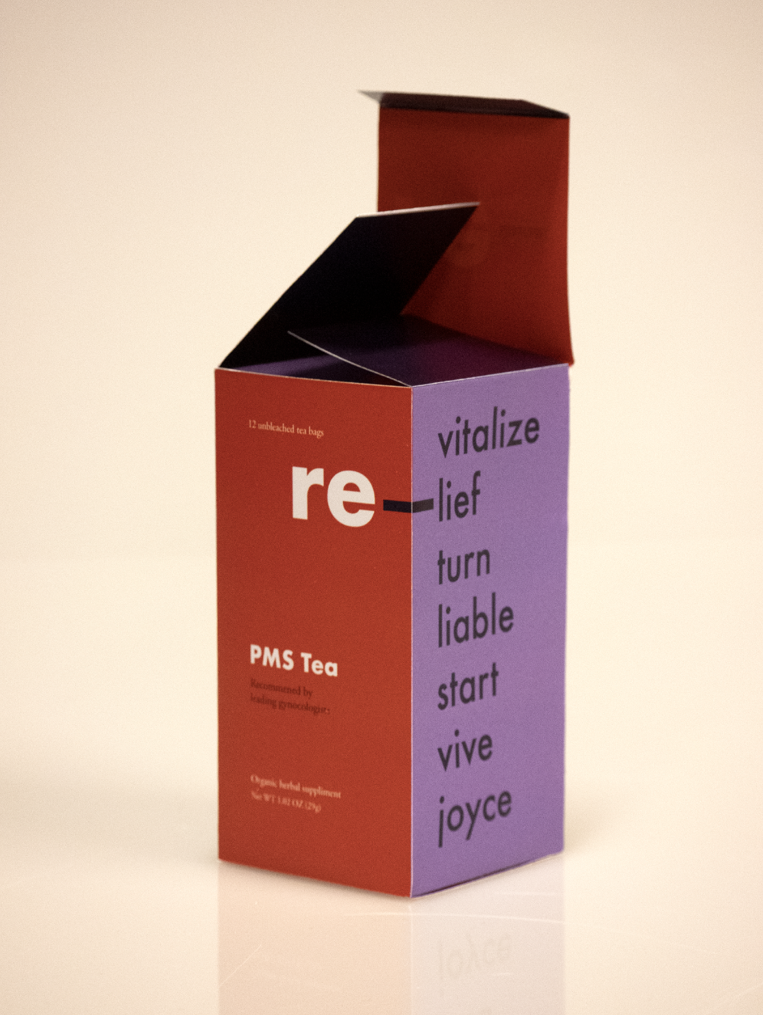
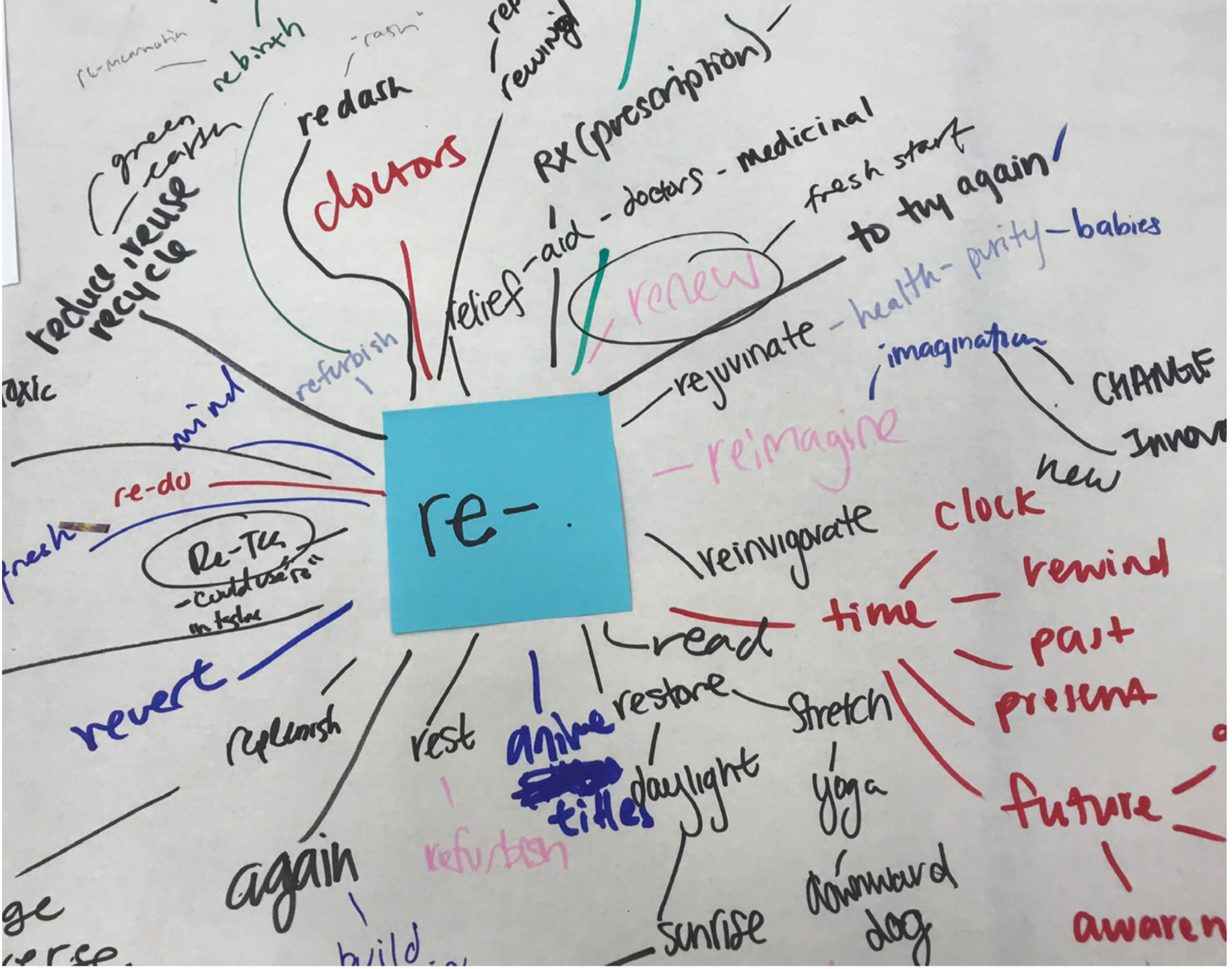
After deciding to do PMS tea, I conducted 8 long form interviews. I was curious how people felt when they had their periods. When asking the interviewees how they wanted to feel while on their period the list included almost every word that started with “re” (revived, refreshed, revitalized, ect). They all shared the sentiment of wanting to go back to how they normally felt. I created a word cloud of words shared with me in the interviews and added to it.
After deciding to do PMS tea, I conducted 8 long form interviews. I was curious how people felt when they had their periods. When asking the interviewees how they wanted to feel while on their period the list included almost every word that started with “re” (revived, refreshed, revitalized, ect). They all shared the sentiment of wanting to go back to how they normally felt. I created a word cloud of words shared with me in the interviews and added to it.
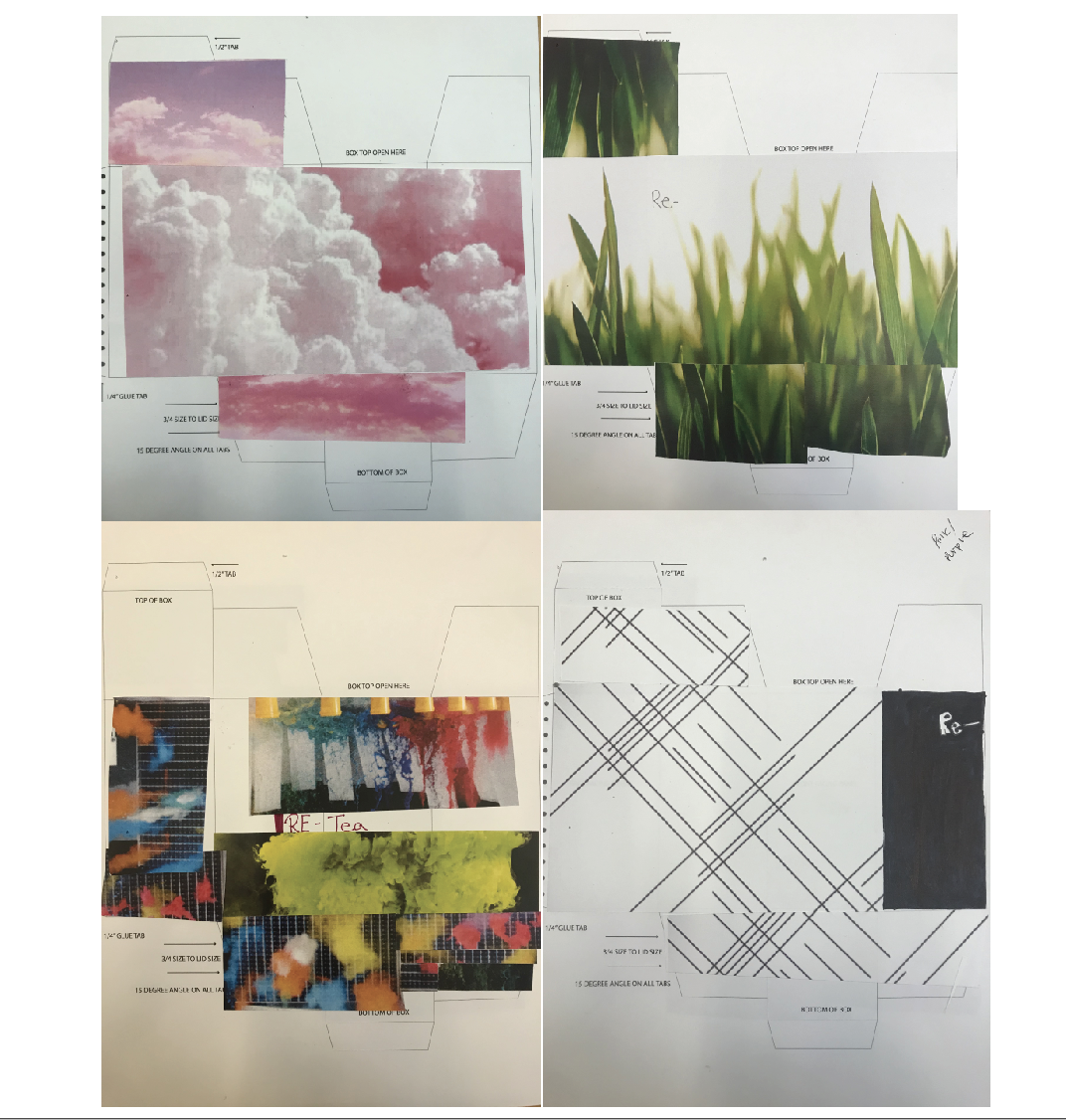
I then started doing physical iterations. I made collages from found images. I thought it was important to work away from the computer at first and focus on quick iterations. Then, I started on my computer in grayscale. I took elements from the collages and put them into 3 dimensional form. Going from hard, tangible work to making digital creations allowed me to think outside of the box.I believe the most successful products are ones that activate the corners and draw the user to all sides of the box.

COLOR & TYPOGRAPHY
The majority of designs related to womxns’ products used light pink. I did not want to play into gender constructs and use pink. After many color tests, I chose orange and purple because they balance each other out well.
I used Futura and Adobe Garmond Pro. The geometric sans serif offered a goobalance for the serifed text. Futura was used in brand elements, while Adobe Garamond was used for body text.