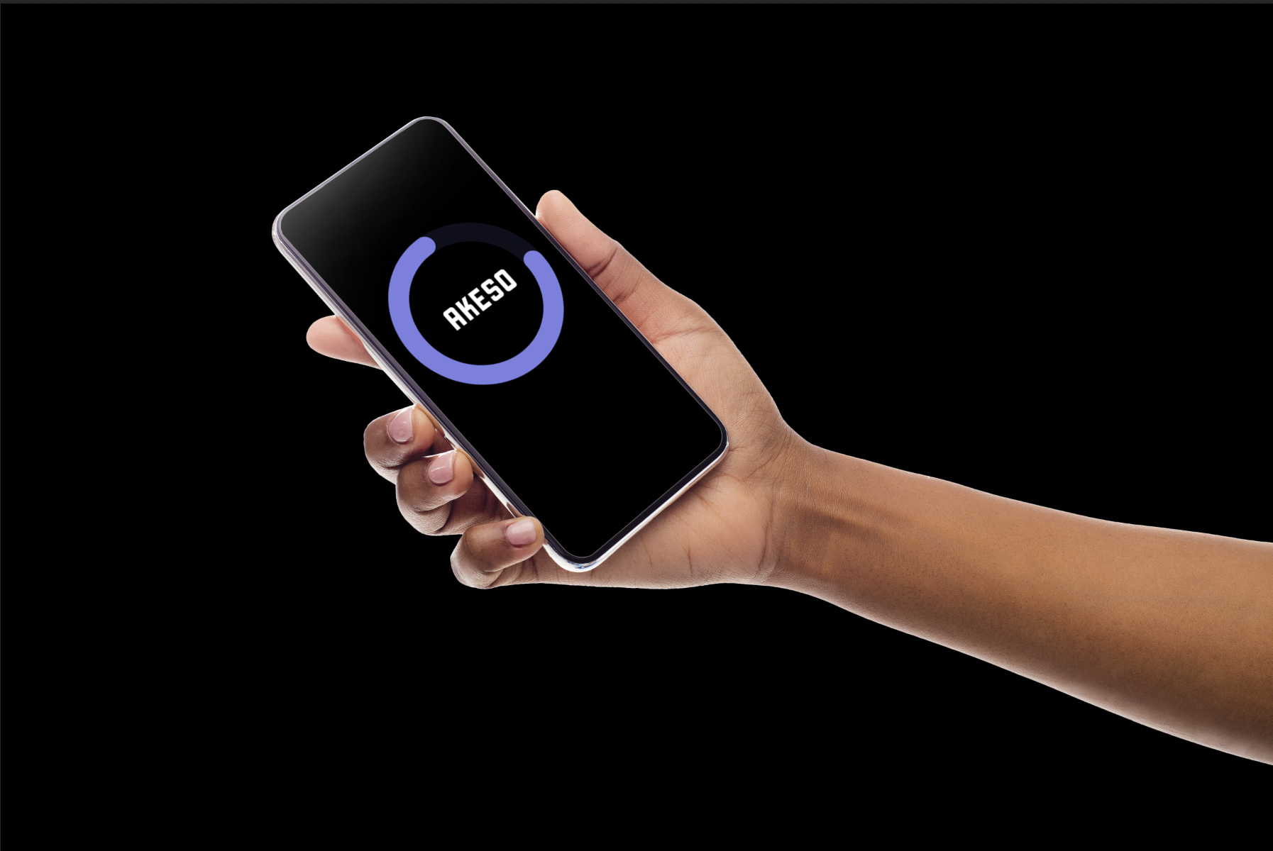
AKESO
Healthcare / UX Design / App Design / Human Centered Design / Design Research / Branding / Social Impact
ROLE: Visual Designer, UX Researcher, UX Designer
COMPLETED: Fall 2019
COLLABORATED WITH: Ashley Lin and Nick Blake
SPECIAL THANKS TO: Cigna Health, Express Scripts, Capacity AI, and Enrique Von Rohr for all of their feedback and guidance throughout this project.
COMPLETED: Fall 2019
COLLABORATED WITH: Ashley Lin and Nick Blake
SPECIAL THANKS TO: Cigna Health, Express Scripts, Capacity AI, and Enrique Von Rohr for all of their feedback and guidance throughout this project.
PROBLEM
My team decided to scope down and focus on diabetes, and in particular diabetic foot ulcers. A diabetic foot ulcer is an open sore or wound that occurs in approximately 15 percent of patients with diabetes and is commonly located on the bottom of the foot. If the ulcer does not heal, an amputation may be required.
25% of patients with diabetes who develop a foot ulcer will require an amputation. 82,000 amputations are performed every year on diabetic patients due to ulceration and infection. Foot ulceration precedes 85% of diabetic related ulcerations. Two-thirds of medication-related hospital admissions are due to non-adherence, costing our healthcare system approximately $100 billion a year.
Initial How Might We: HMW create wearable technology that helps consumers manage their health adherence over time?
HMW after scoping: HMW help those with diabetic ulcers track and maintain the healing of their ulcers?
SOLUTION
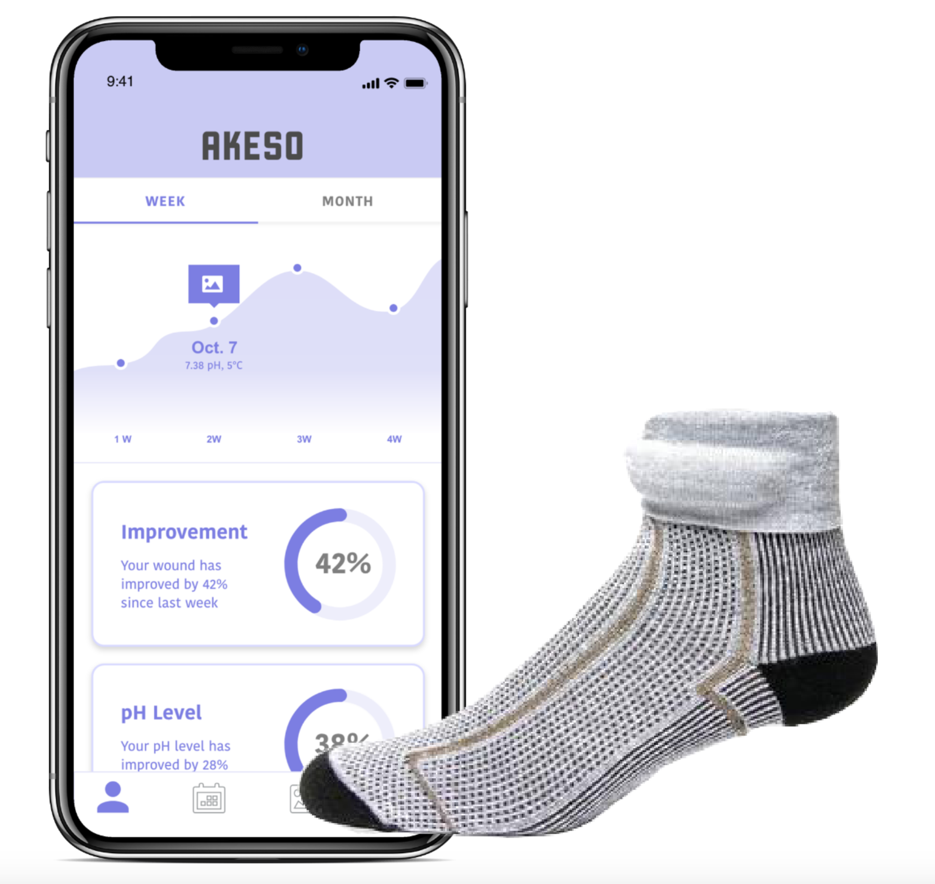
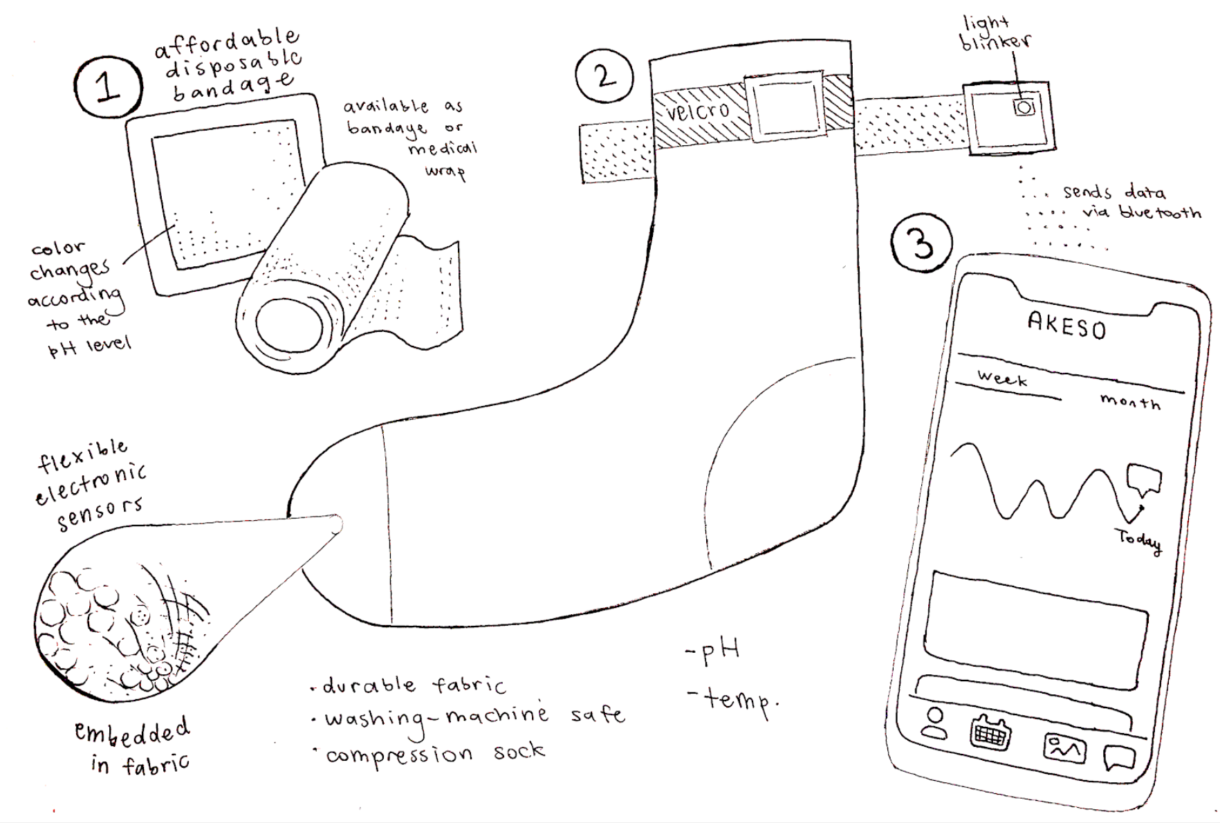
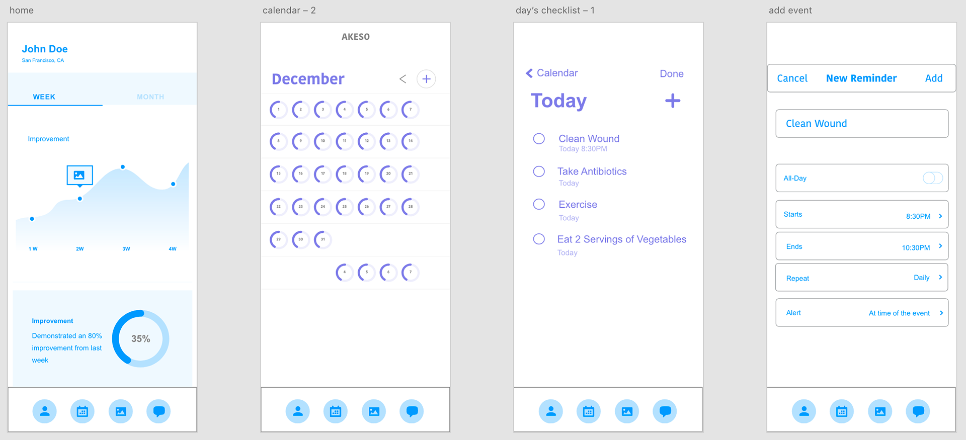
AKESO includes both a “smart sock” and an app that addresses the issue of amputation resulting from prolonged infection of diabetic ulcers. The “Smart Sock” is worn comfortably around the foot and keeps diabetic patients informed about the healing progress of their ulcers by tracking pH, temperature, and diameter using recently developed microtechnology. This information is linked to the application and helps the patient, physician, and caretaker track the healing of the wound.
My team decided to scope down and focus on diabetes, and in particular diabetic foot ulcers. A diabetic foot ulcer is an open sore or wound that occurs in approximately 15 percent of patients with diabetes and is commonly located on the bottom of the foot. If the ulcer does not heal, an amputation may be required.
25% of patients with diabetes who develop a foot ulcer will require an amputation. 82,000 amputations are performed every year on diabetic patients due to ulceration and infection. Foot ulceration precedes 85% of diabetic related ulcerations. Two-thirds of medication-related hospital admissions are due to non-adherence, costing our healthcare system approximately $100 billion a year.
Initial How Might We: HMW create wearable technology that helps consumers manage their health adherence over time?
HMW after scoping: HMW help those with diabetic ulcers track and maintain the healing of their ulcers?
SOLUTION
AKESO includes both a “smart sock” and an app that addresses the issue of amputation resulting from prolonged infection of diabetic ulcers. The “Smart Sock” is worn comfortably around the foot and keeps diabetic patients informed about the healing progress of their ulcers by tracking pH, temperature, and diameter using recently developed microtechnology. This information is linked to the application and helps the patient, physician, and caretaker track the healing of the wound.

FEASIBILITY
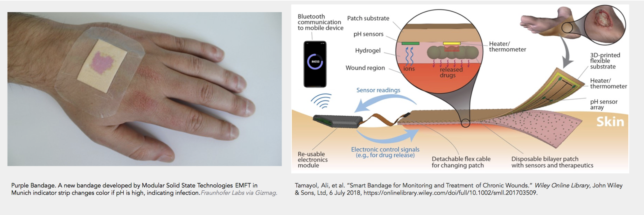
In 2018, a team of researchers from Tufts University, Harvard Medical School, and Purdue University created a prototype for a “Smart Bandage.” One feature of the bandage’s technology is that it uses flexible electronics and is embedded with pH and temperature sensors that monitor the wearer’s wound in real time. AKESO applies this new technology.
In 2018, a team of researchers from Tufts University, Harvard Medical School, and Purdue University created a prototype for a “Smart Bandage.” One feature of the bandage’s technology is that it uses flexible electronics and is embedded with pH and temperature sensors that monitor the wearer’s wound in real time. AKESO applies this new technology.
PROCESS/RESEARCH
We started the project with doing research on diabetes, the tools that exist to treat it, and by conducting interviews with doctors, nurses, caretakers, and others affected by diabetes. We conducted 8 qualitative guided interviews that were 1 hour each. After conducting interviews we created User Personas and starting gathering and synthesizing our observations.
We started the project with doing research on diabetes, the tools that exist to treat it, and by conducting interviews with doctors, nurses, caretakers, and others affected by diabetes. We conducted 8 qualitative guided interviews that were 1 hour each. After conducting interviews we created User Personas and starting gathering and synthesizing our observations.


We then created journey maps, and narrowed in on our HMW to make it more specific. Then, we did a "Crazy 8" sprint—that I learned at a prototyping workshop with UX designers and researches from Google. It is an idea generating activity in which you have 4 minutes to generate 8 ideas. From doing this exercise, we narrowed in on our concept from taking aspects from all of our different ideas.
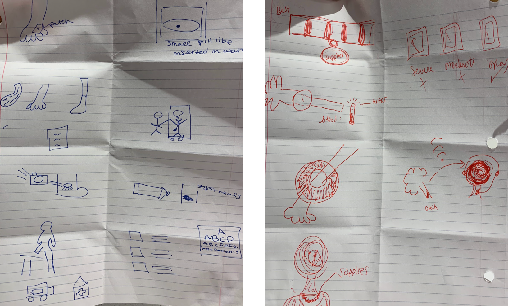
Then, we created a site architecture for our app and sketched the initial idea.

Our initial sketch of the product:
Initial wireframes for the app:

TEAM
Nick Blake, Ashley Lin and I. And a big thank you to Express Scripts, Cigna, Capacity, and Enrique Von Rohr, for their generous feedback throughout the process.
Nick Blake, Ashley Lin and I. And a big thank you to Express Scripts, Cigna, Capacity, and Enrique Von Rohr, for their generous feedback throughout the process.
NEXT STEPS:
I look forward to conducting more interviews and refining the product. We will conduct interviews to gain insights on usability and effectivness of the app & sock.
I look forward to conducting more interviews and refining the product. We will conduct interviews to gain insights on usability and effectivness of the app & sock.
Venmo Together
Mutual Aid / Strategy
ROLE: UX Researcher
COMPLETED: Spring 2021
COLLABORATED WITH: Alex Koehl and Miles Lee
SPECIAL THANKS TO: Erika Harano
COMPLETED: Spring 2021
COLLABORATED WITH: Alex Koehl and Miles Lee
SPECIAL THANKS TO: Erika Harano
PROBLEM
We sought to better understand the unique needs, goals, pain points, frustrations and areas of opportunity for people who engage with mutual aid funds. Mutual aid has become very important in the Covid-19 pandemic and the most recent wave of BLM. People are struggling with uncertainty and loss at much higher rates. With so many platforms, the process of receiving and/or providing aid can be confusing and convoluted for many. Although the term “mutual aid” is becoming more frequently used, many people still do not know what it means exactly, causing confusion. The process of engaging with mutual aid is disjointed, not centralized, and many who engage, especially via social media, see it as charity and not solidarity.
SOLUTION
After conducting in depth research, we created Venmo Together. We discovered Venmo is the most common location for monetary transactions within Mutual Aid .As a result, we developed a secondary platform within the app called venmo: together. Within this sub feature, users can discover Mutual Aid funds, manage recurring contributions, request monetary, request friends contribute to a fund, and more.
View the entire case study here.
View the entire case study here.
GOALS
First, we listed our assumptions about mutual aid/giving before diving into the project. We sought to understand the variety of existing mutual aid platforms and platforms not used exclusively for mutual aid. In addition, we examined how platforms work together and other streamlined ways for people to give back. On a more high level, we discovered barriers to giving mutual aid and how people decide if they should give mutual aid or not.
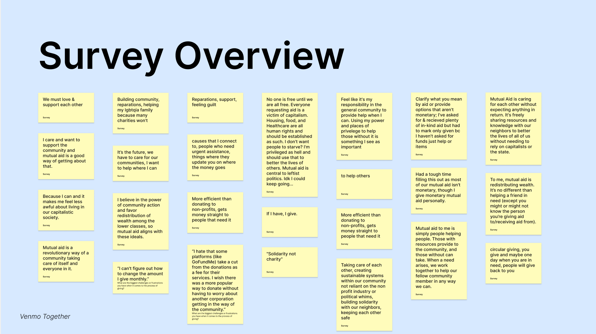
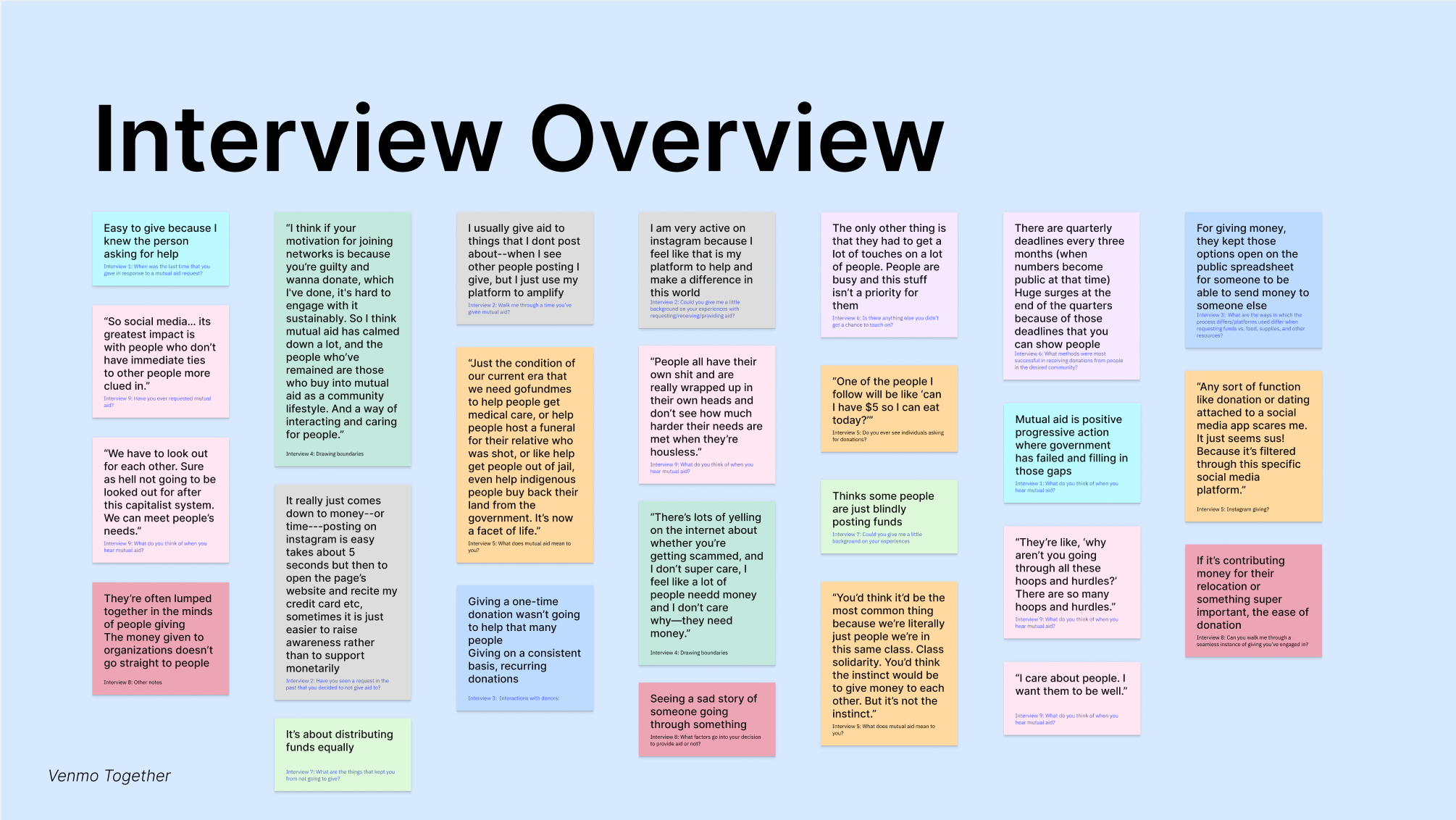
RESEARCH
9 User Interviews
38 Survey Respondents
9 Competitive Analyses
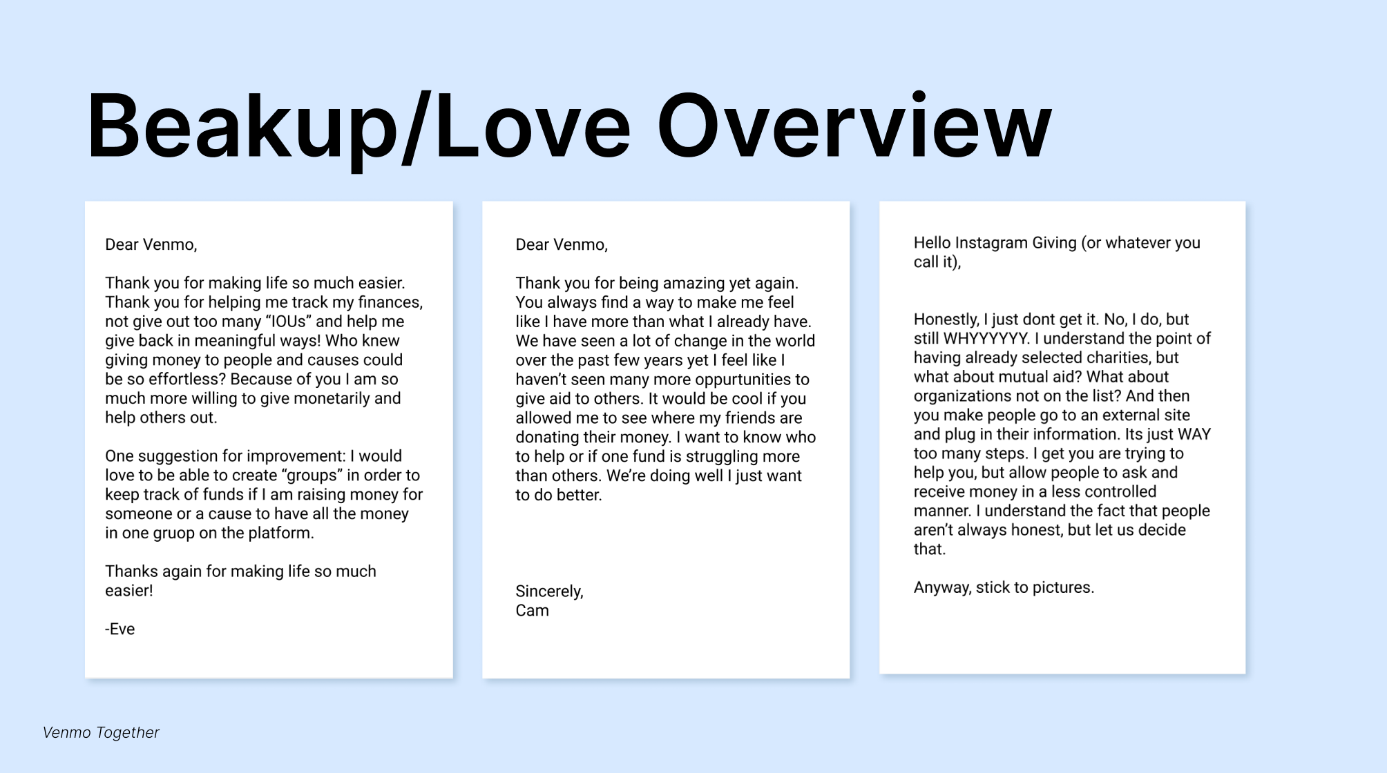
6 Breakup/Love Letters
We started by looking at the broad topic of mutual aid for our interviews and survey. After analyzing some of our responses, we then narrowed in on digital platforms of mutual aid engagement. Through Break Up/Love Letters we were able to get a better sense of what platforms people used and what their favorite parts or major pain points were with them. We found that people want networks or groups of specific types of mutual aid (ie. pregnant mothers in St. Louis) and more control over where their funds went, in order to have more equitable reach.
Read about our research takeaways in the case study PDF.
First, we listed our assumptions about mutual aid/giving before diving into the project. We sought to understand the variety of existing mutual aid platforms and platforms not used exclusively for mutual aid. In addition, we examined how platforms work together and other streamlined ways for people to give back. On a more high level, we discovered barriers to giving mutual aid and how people decide if they should give mutual aid or not.
RESEARCH
9 User Interviews
38 Survey Respondents
9 Competitive Analyses
6 Breakup/Love Letters
We started by looking at the broad topic of mutual aid for our interviews and survey. After analyzing some of our responses, we then narrowed in on digital platforms of mutual aid engagement. Through Break Up/Love Letters we were able to get a better sense of what platforms people used and what their favorite parts or major pain points were with them. We found that people want networks or groups of specific types of mutual aid (ie. pregnant mothers in St. Louis) and more control over where their funds went, in order to have more equitable reach.
Read about our research takeaways in the case study PDF.
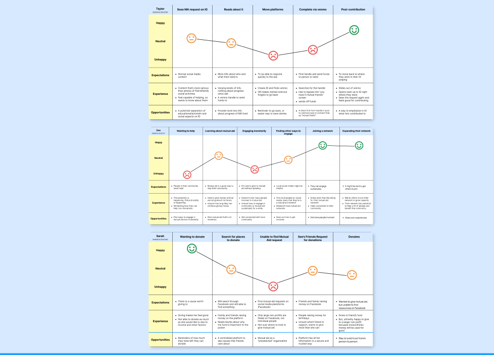
SYNTHESIS
Affinity Map
3 Empathy Maps
3 User Journeys
3 User Need Statements
3 8-Box Brainstorms
Through affinity mapping, empathy maps, journey maps, and user need statements, we synthesized all of the varied forms of data from our initial research. Major themes that arose were: perceptions of mutual aid, successful fundraising, mutual aid request strategies, and the ways in which people decide how much and where to engage their funds with. This led to the user need statements of:
“People who give mutual aid need a consolidated way to give so that they are not deterred from the many times multi-step process.”


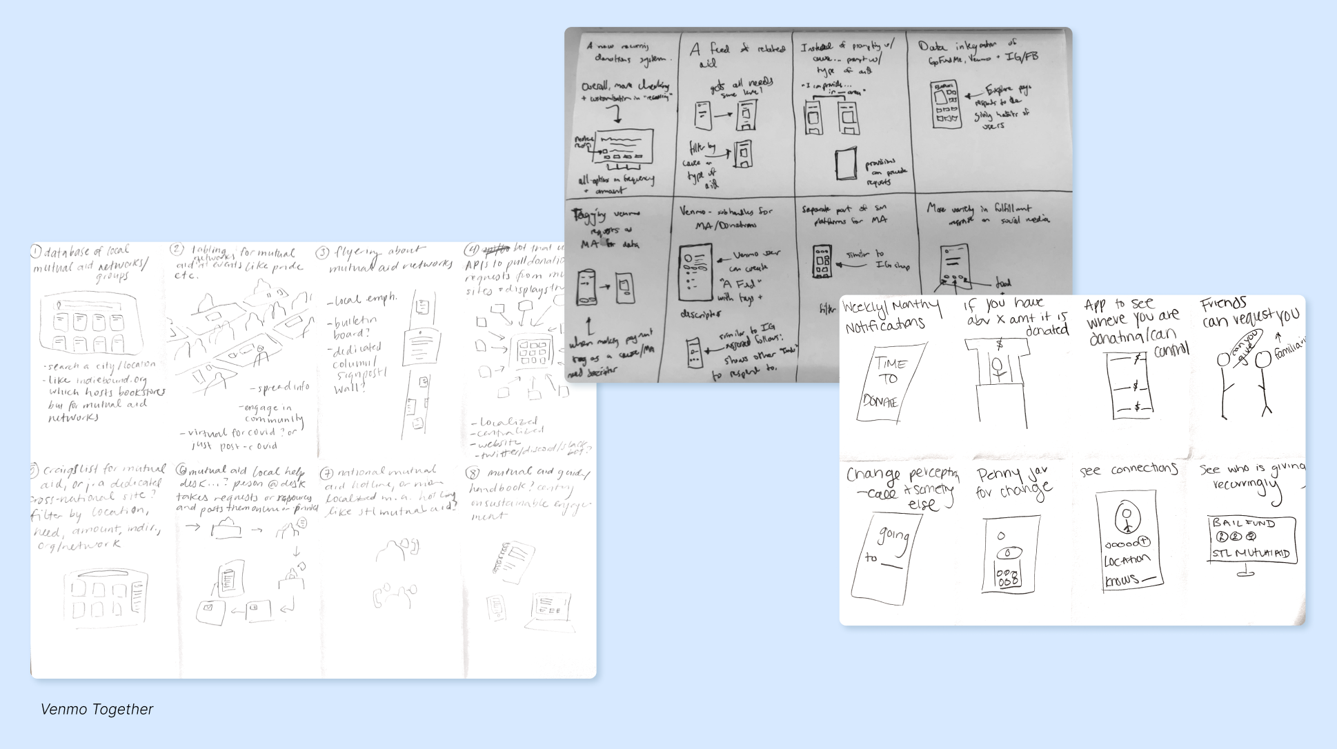
IDEATION
My teammates and I completed an independent 8-box brainstorm to generate ideas for how to best fulfill our user-need statements .
Centering on the Design Justice Principle 10 of looking to what is already being used and working, we decided to re-design an existing platform currently in use: Venmo. After discussing our solutions, we settled on the idea of revamping Venmo with a new product feature. Venmo: Together would use several of the ideas we generated (customizable recurring contributions, requesting friends contribute, mutual aid networks, and a discover a fund feed) to create a robust mutual aid engagement platform in the digital space.
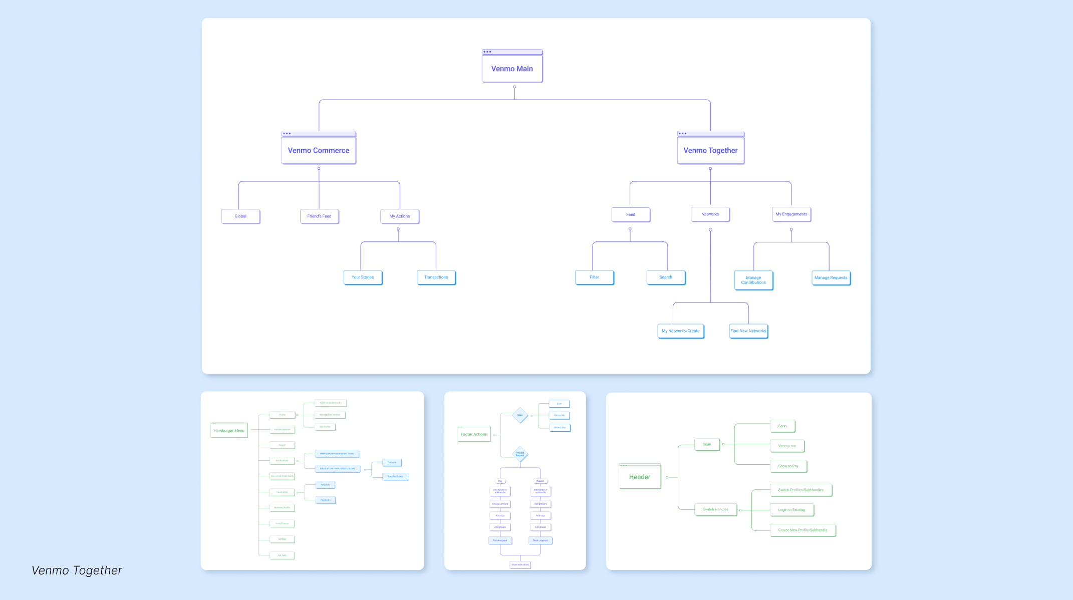
BUILDING OUT THE APP
To visually communicate our ideas, we created a Project Roadmap (with the list of 10 core features and their respective priority in development), an App Map (showcasing the underlying structure of the app as a whole), and an example User Flow Diagram (displaying the steps a user would take in the app to complete a contribution).
To visually communicate our ideas, we created a Project Roadmap (with the list of 10 core features and their respective priority in development), an App Map (showcasing the underlying structure of the app as a whole), and an example User Flow Diagram (displaying the steps a user would take in the app to complete a contribution).
TAKEAWAYS
—Start broad and embrace ambiguity
—Further rounds of research help to refine and narrow in
—Range in primary research methods are exciting and insightful
—Collaboration increased our output
—More minds and varied ways of attacking problems elevated the project
—Start broad and embrace ambiguity
—Further rounds of research help to refine and narrow in
—Range in primary research methods are exciting and insightful
—Collaboration increased our output
—More minds and varied ways of attacking problems elevated the project

BARRIERS TO ENTRY
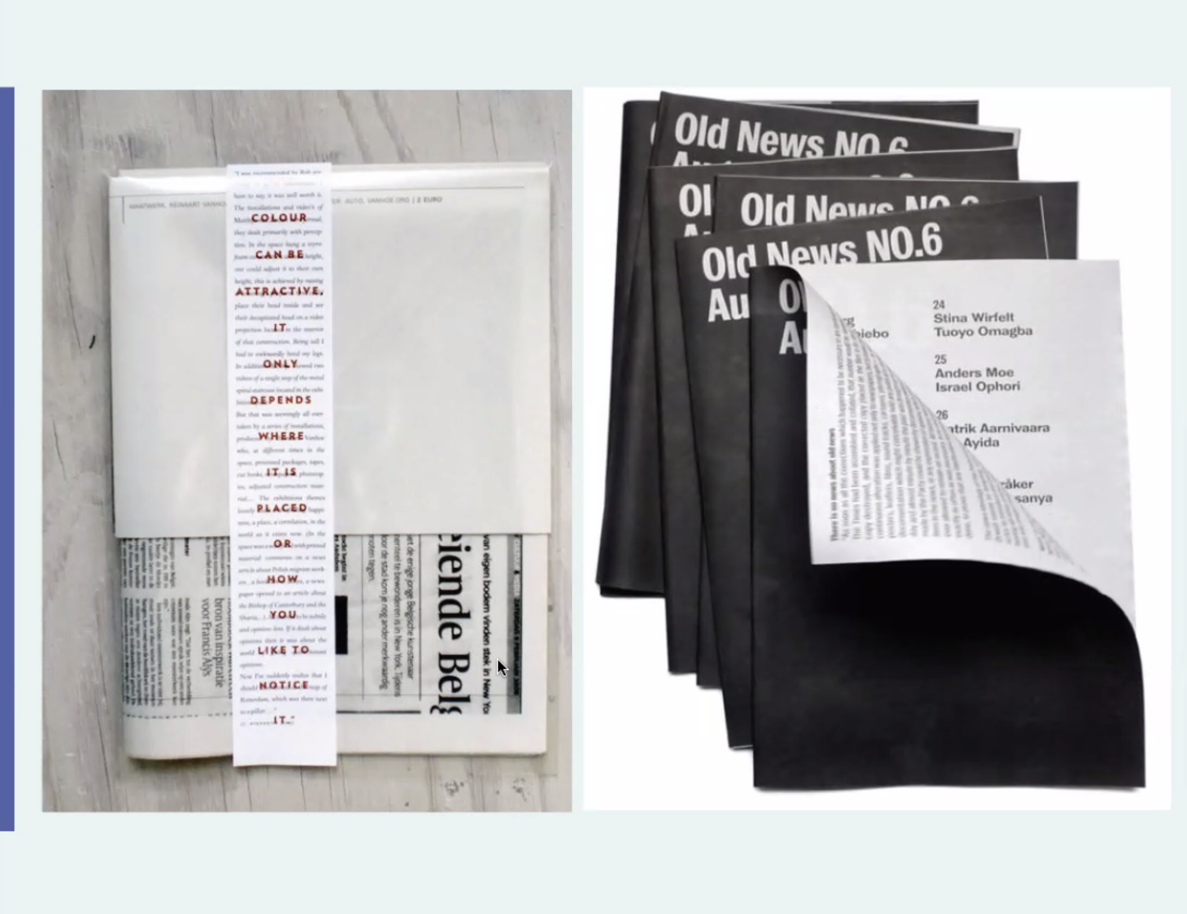
Print / Publication / Accessibility
ROLE: Designer & Creative Direction
COMPLETED: Fall 2020
PRINTED ON: 70gsm Bright Newsprint
SPEACIAL THANKS: Audra Hubbell
COMPLETED: Fall 2020
PRINTED ON: 70gsm Bright Newsprint
SPEACIAL THANKS: Audra Hubbell
BRIEF
With today’s constant news coverage it has become increasingly difficult to navigate the barrage of breaking stories and social media commentary. From the global stage to local news, it is overwhelming to sift through the never ending stream of content, let alone take the time to consider your own stance in relationship to alternate viewpoints. How as designers do we use our skills to present the content we care about in an empathetic way? How do we connect information to the audience that needs it most? Design a publication that presents a current topic or relevant subject of your choosing.
SOLUTION
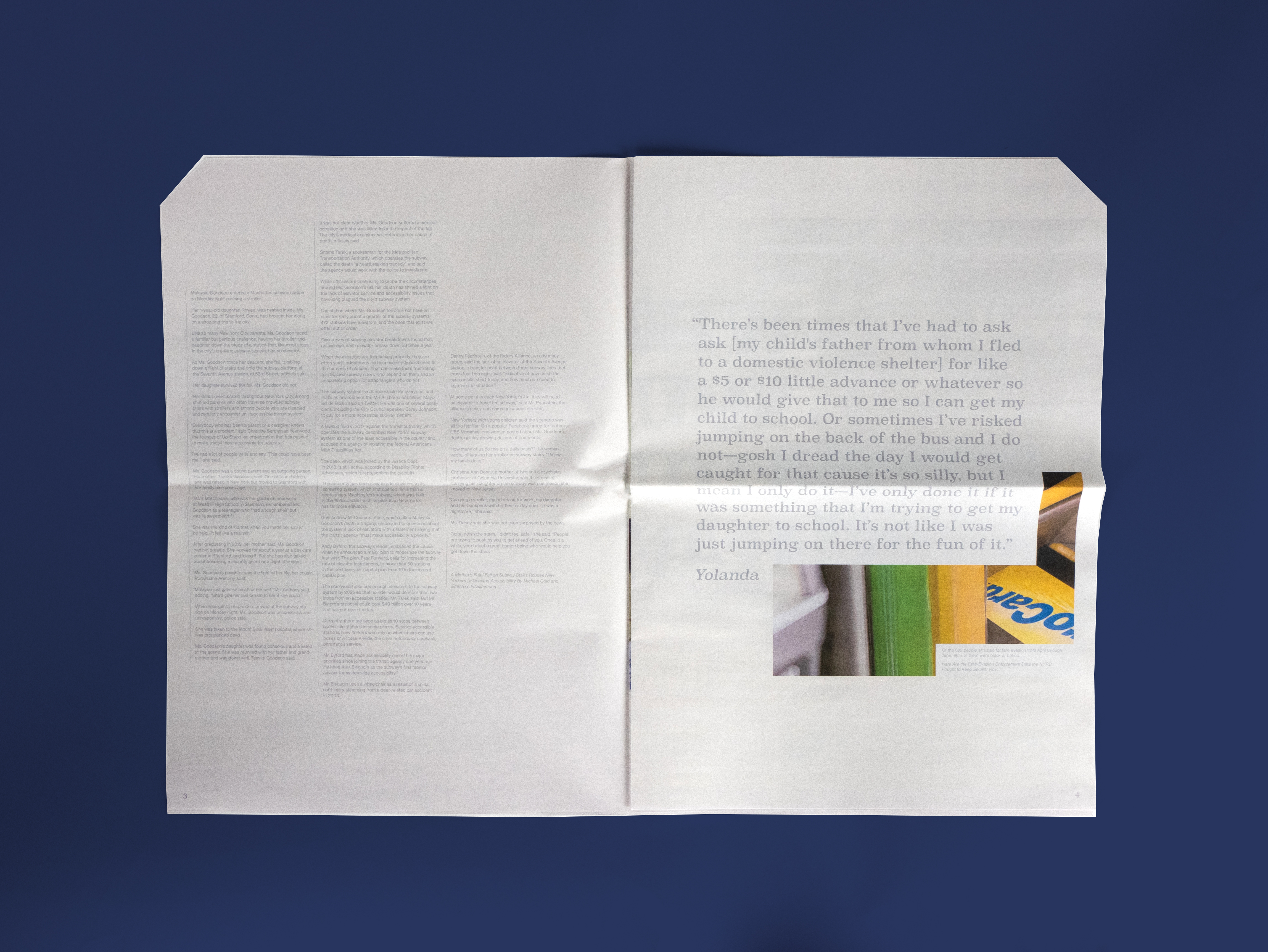
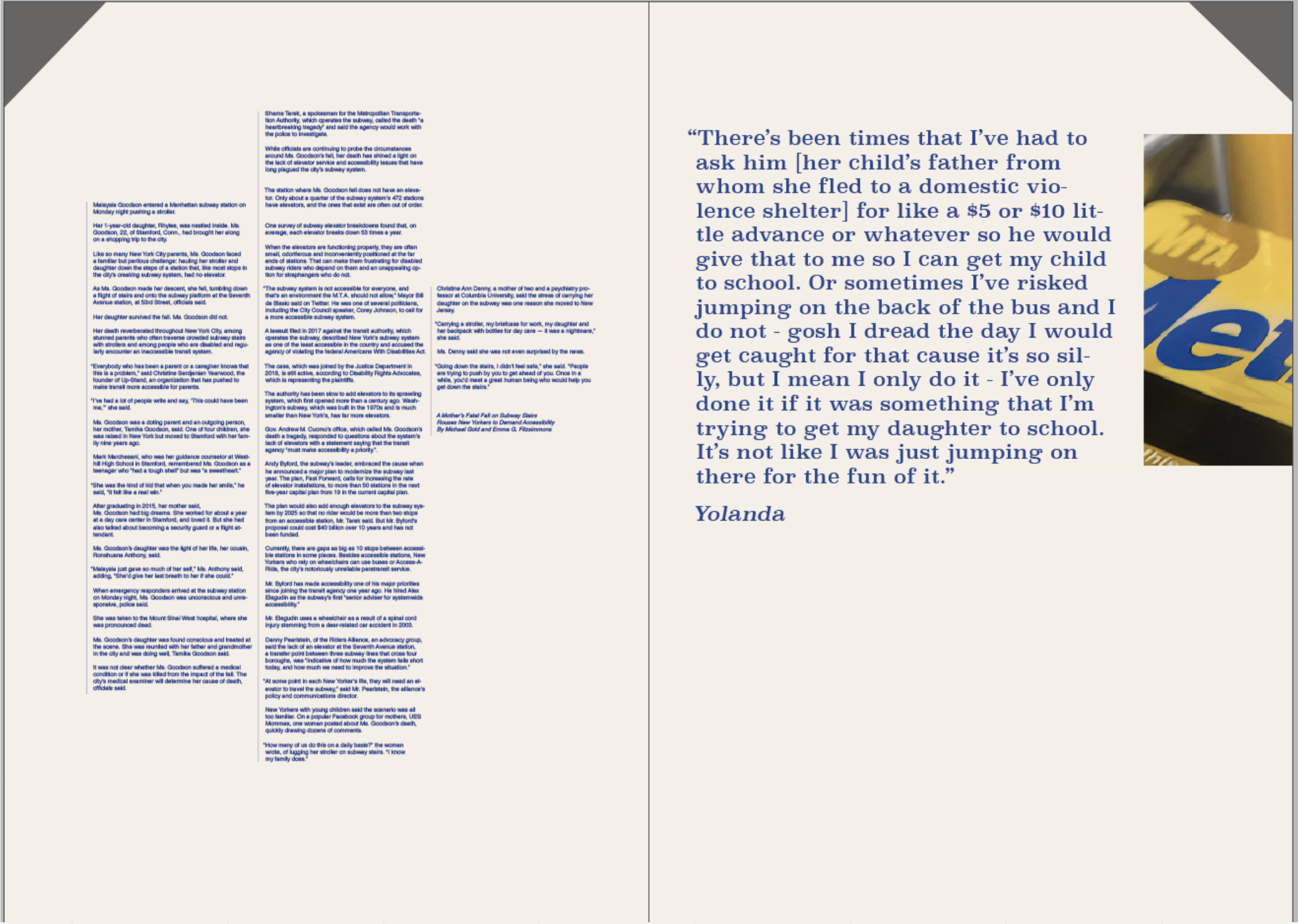
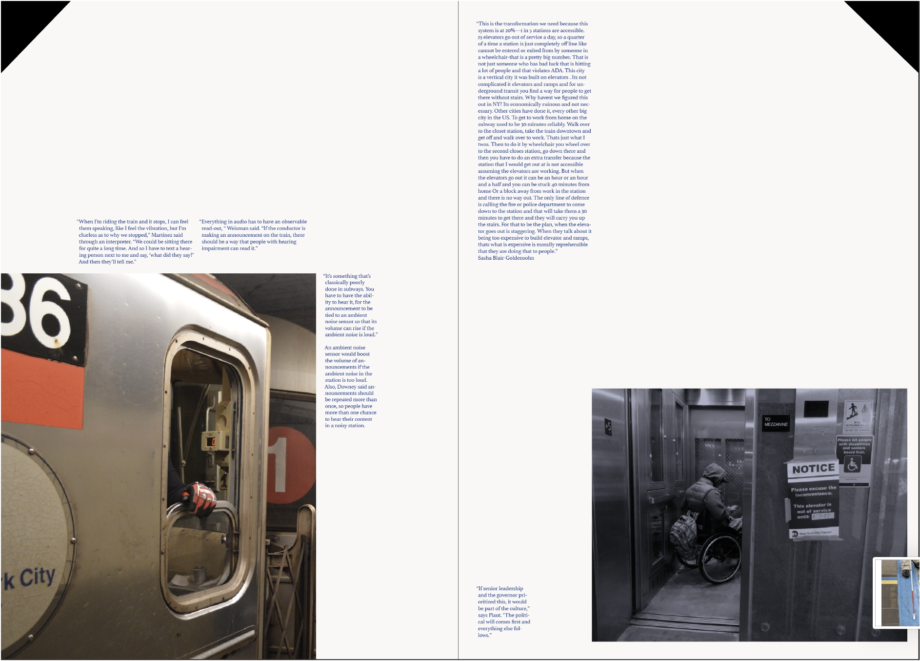
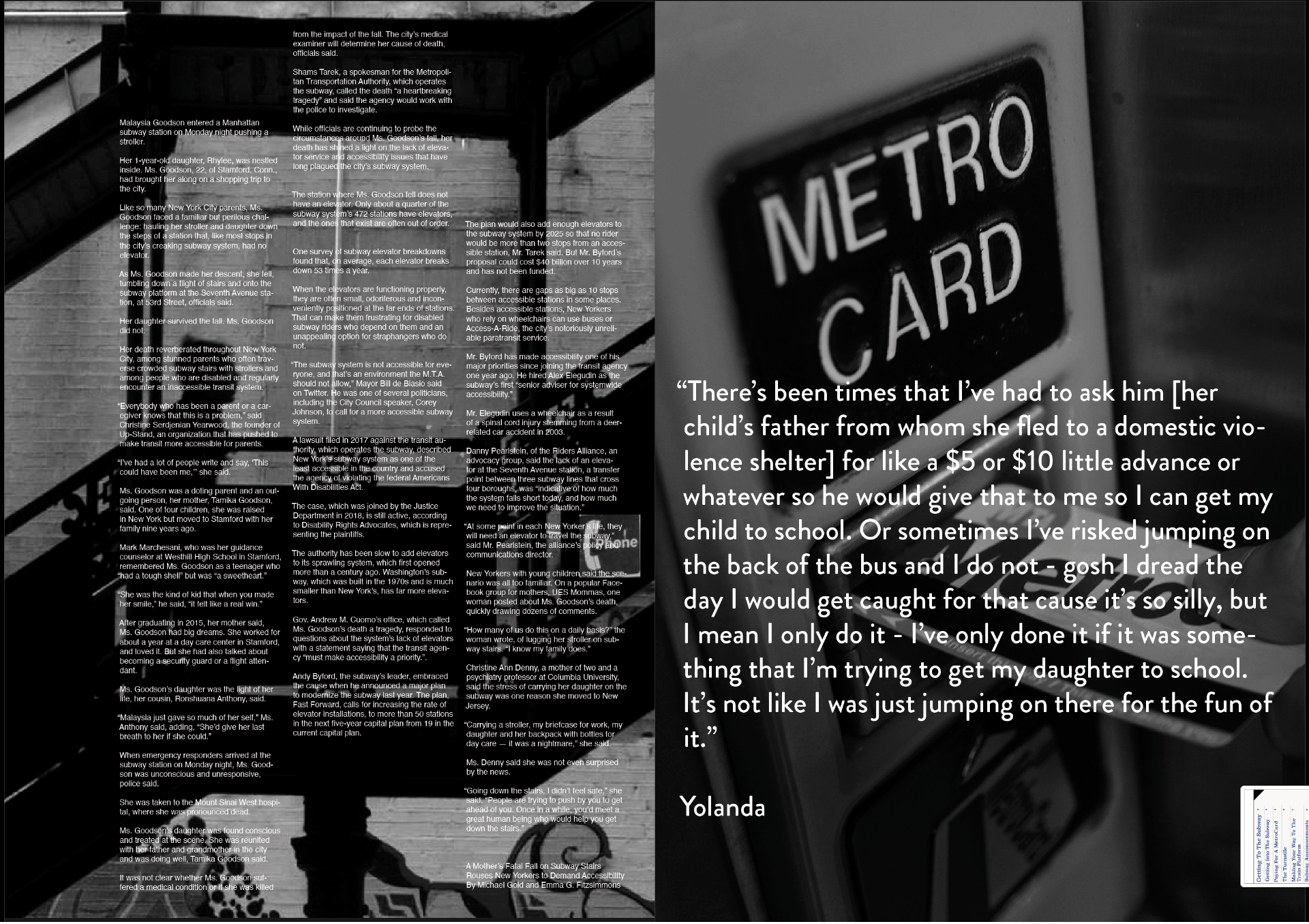
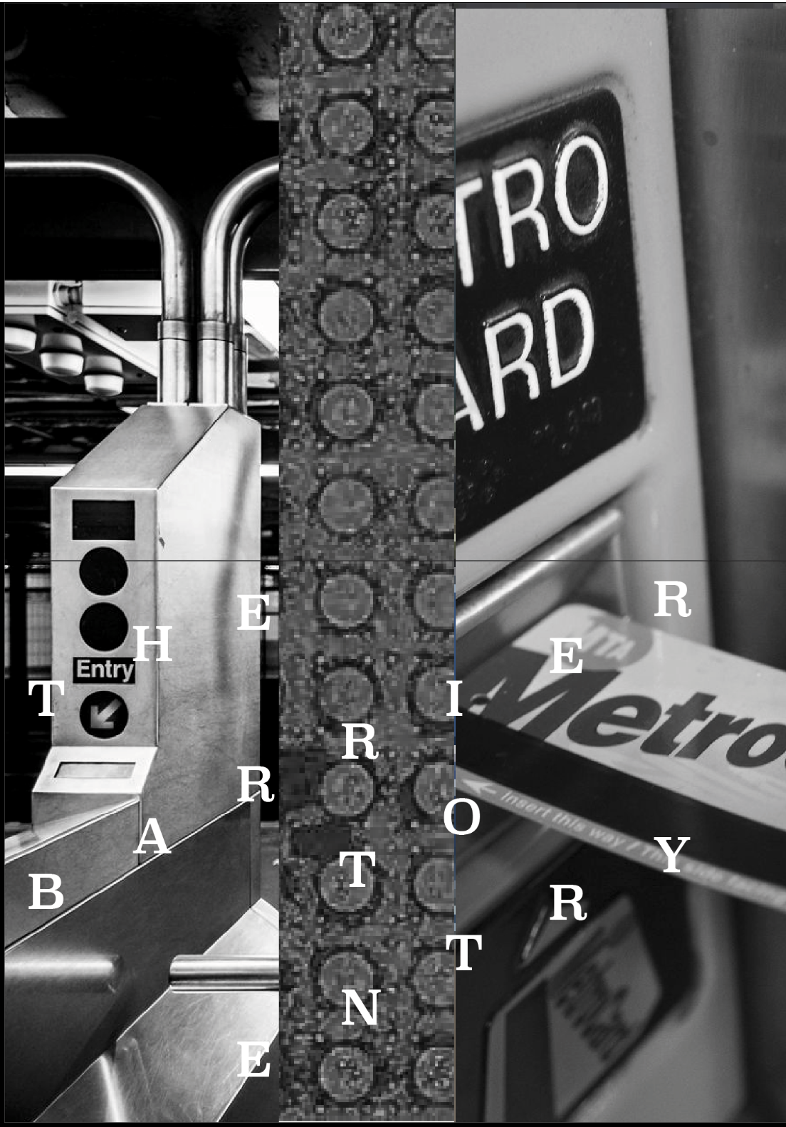
A newsprint publication containing excerpts of New Yorker’s first hand experiences navigating the New York City Subway system. The newspaper uncovers the many ways the subway system is inaccessible—physically, visually, audibly, and financially. Growing up in New York, I have seen firsthand how the NYC subway is not “the great social equalizer”. These obstructions have real impacts for its users from getting arrested for not having fare money, to calling the fire department to get lifted up the stairs, to not being able to hear announcements on the train. Pull quotes and first hand accounts aim to build empathy and compassion between the readers and the stories told.
With today’s constant news coverage it has become increasingly difficult to navigate the barrage of breaking stories and social media commentary. From the global stage to local news, it is overwhelming to sift through the never ending stream of content, let alone take the time to consider your own stance in relationship to alternate viewpoints. How as designers do we use our skills to present the content we care about in an empathetic way? How do we connect information to the audience that needs it most? Design a publication that presents a current topic or relevant subject of your choosing.
SOLUTION
A newsprint publication containing excerpts of New Yorker’s first hand experiences navigating the New York City Subway system. The newspaper uncovers the many ways the subway system is inaccessible—physically, visually, audibly, and financially. Growing up in New York, I have seen firsthand how the NYC subway is not “the great social equalizer”. These obstructions have real impacts for its users from getting arrested for not having fare money, to calling the fire department to get lifted up the stairs, to not being able to hear announcements on the train. Pull quotes and first hand accounts aim to build empathy and compassion between the readers and the stories told.

Cut corners resembling metrocards and colors picked from the subway line, the publication sends readers on a journey while learning about how the subway line is inaccessible to so many.

The slanted corner is to help the visually impaired swipe or dip the card in the proper orientation.

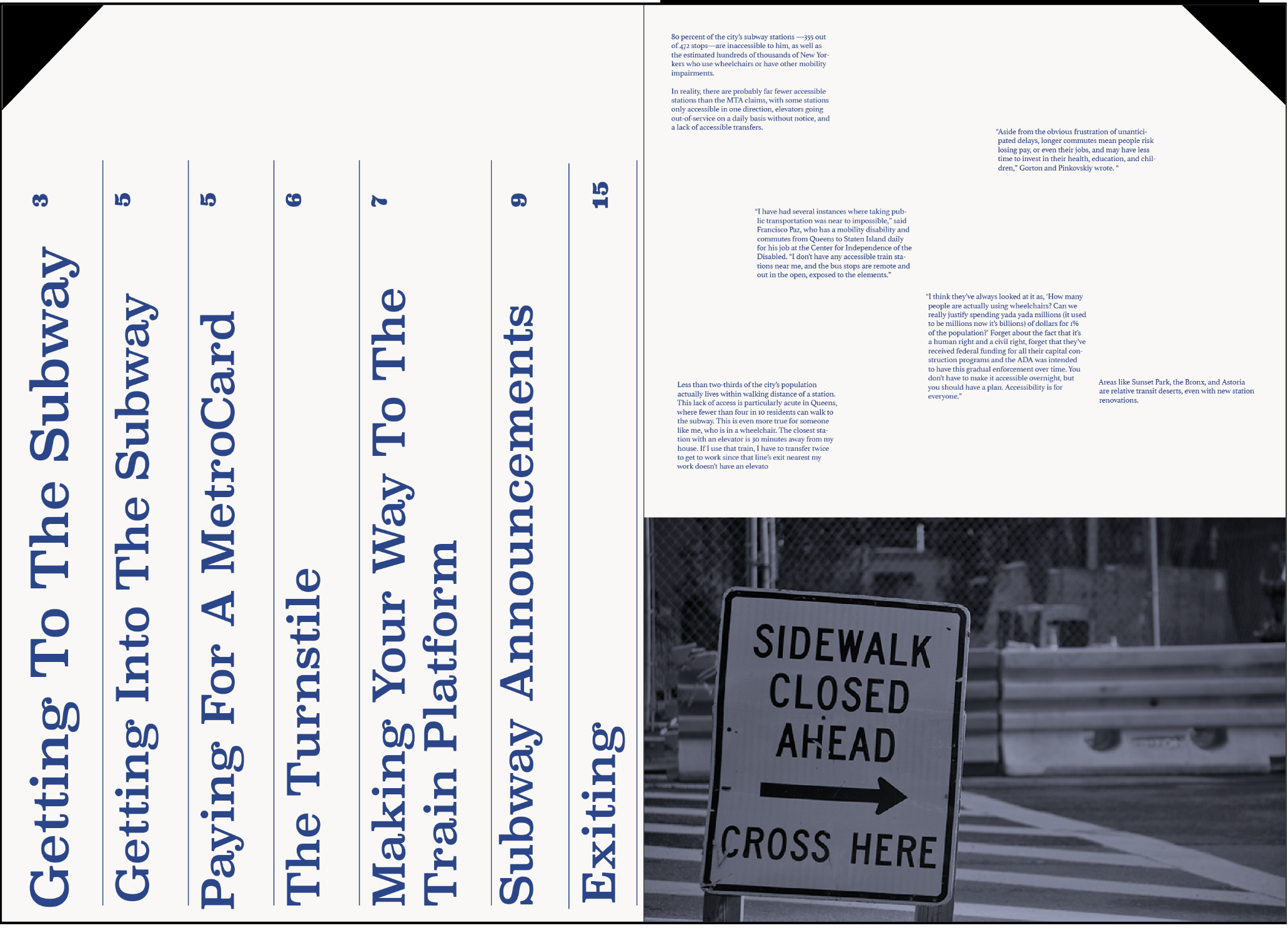
The table of contents provides the reader a glimpse of the journey they will be following while reading. These “stops” act as main pain points for riders.

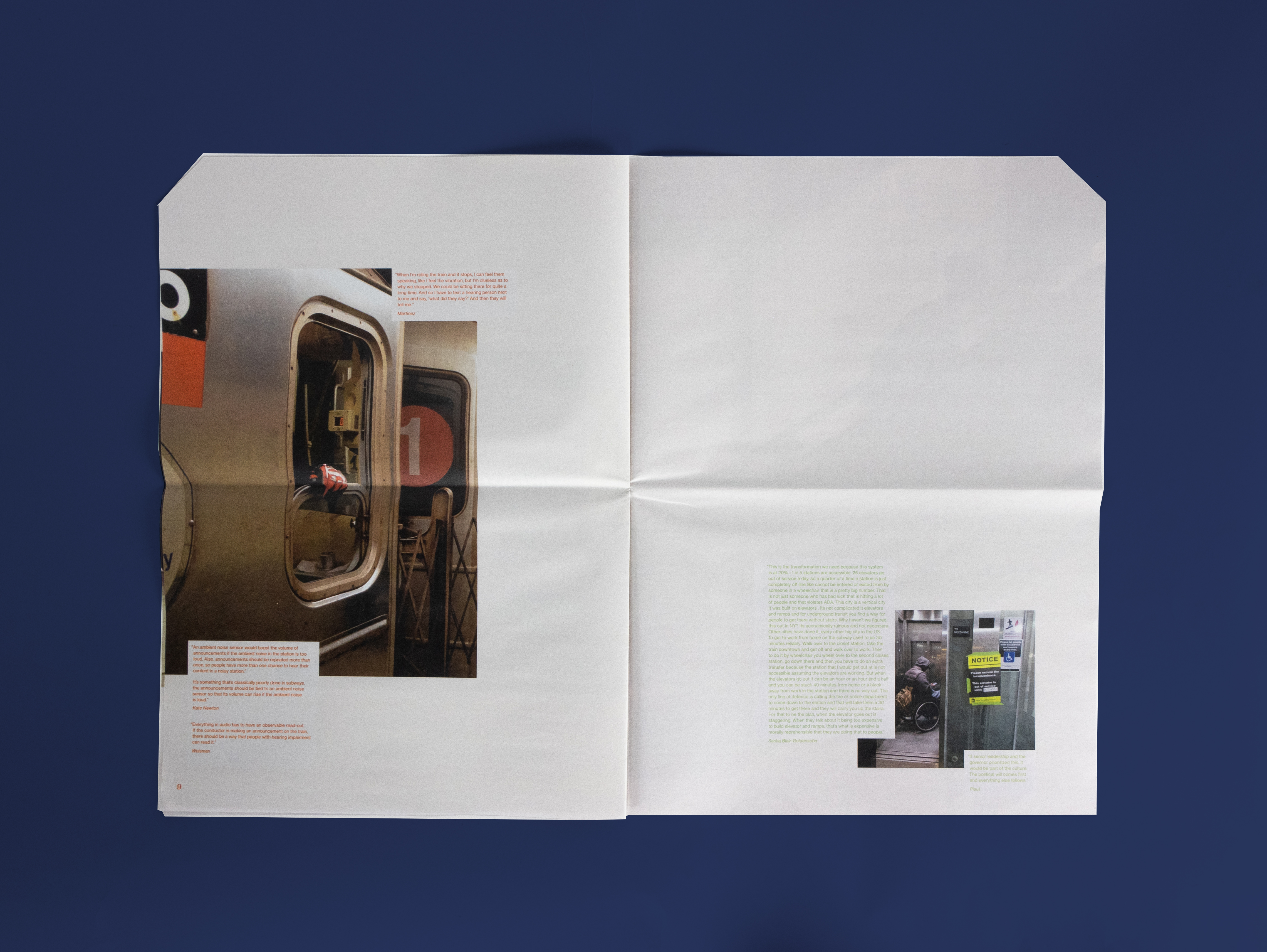
Throughout the publication, quotations cut into the images to heighten the feeling of obstruction and interference. Reading about these stories, readers gain empathy and an understanding for what people not like them experience everyday.
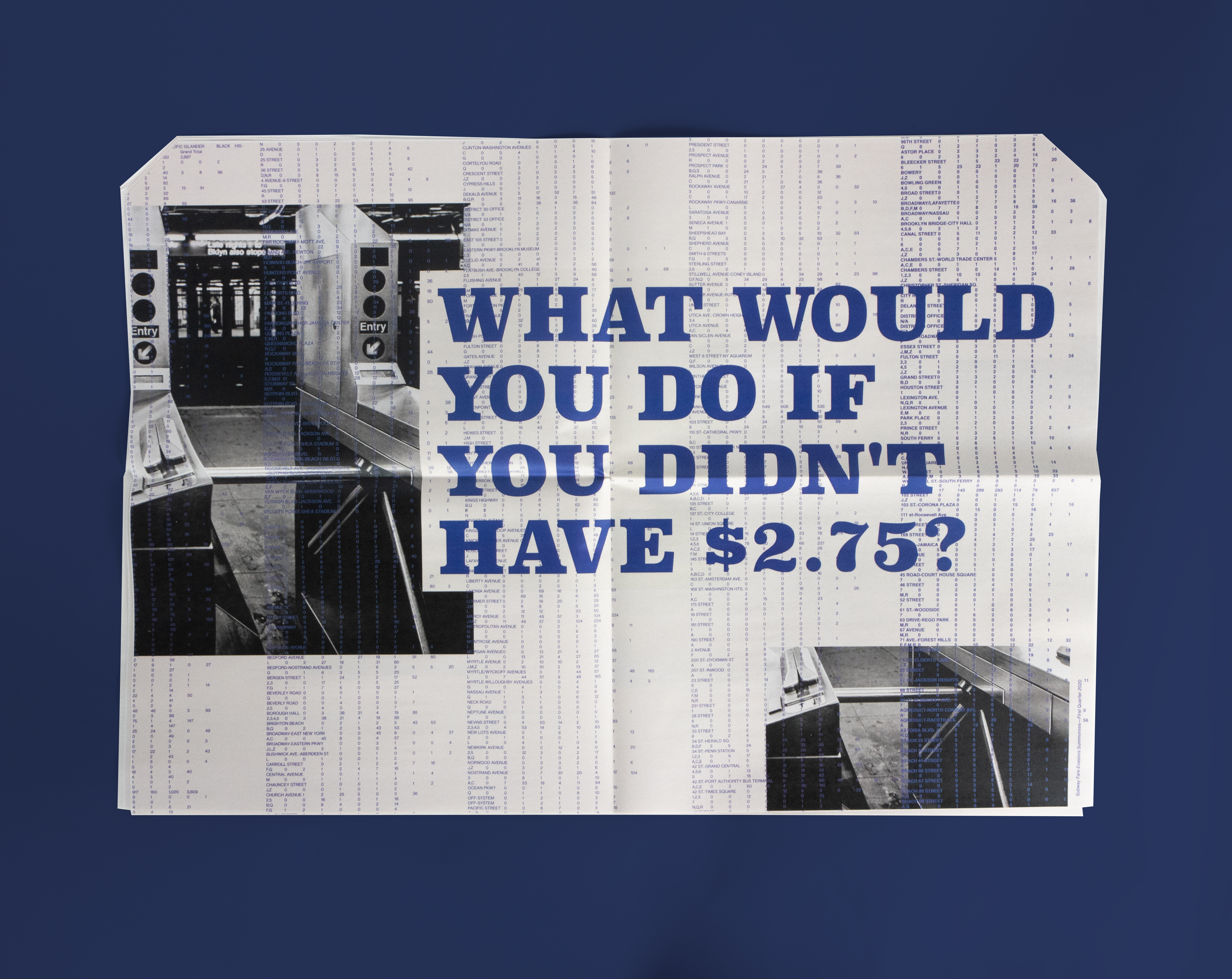
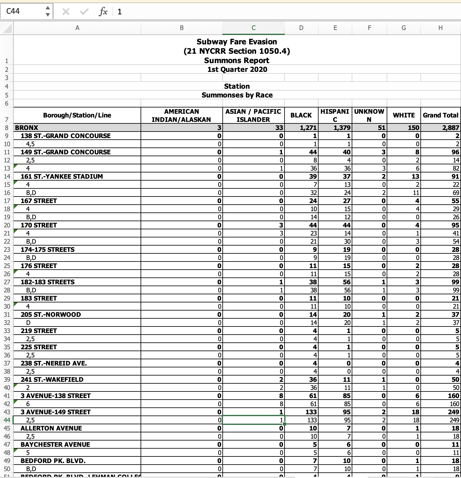
The typographic pattern on the center spread displays the striking data on how many people were arrested and received summons for fare evasion in the first quarter of 2020.
This spread was also intended to be a stand alone poster.
This spread was also intended to be a stand alone poster.
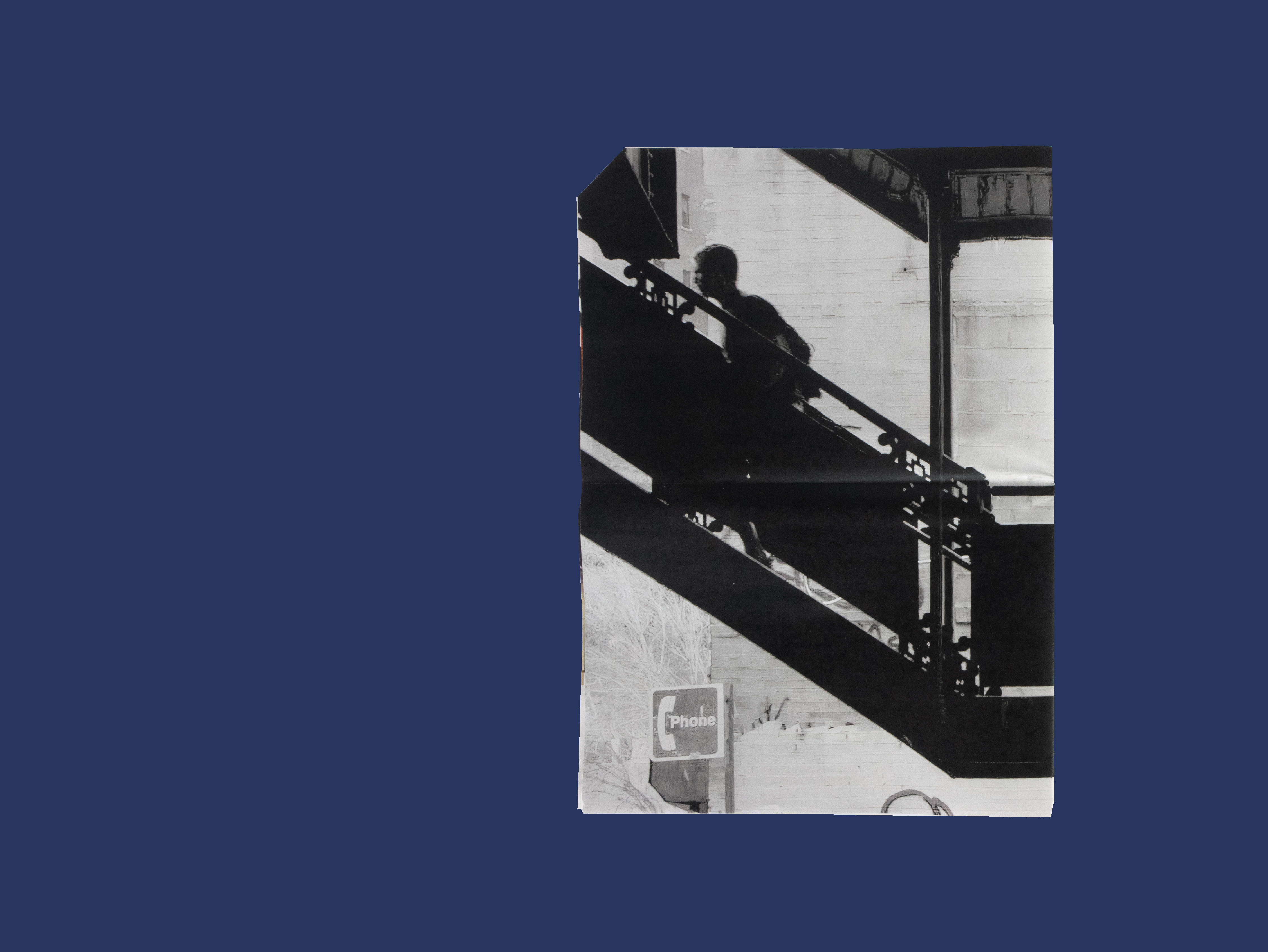
The images provide a glimpse into these obstacles by providing snippets of everyday life.

The majority of images used, are photographs I have on while riding the subway.
The negative space provides heightens the dramatic background while also giving the reader room to reflect on the stories they just read.
The negative space provides heightens the dramatic background while also giving the reader room to reflect on the stories they just read.
TYPEFACES
I chose Neue Haas Grotesk as an ode to Helvetica that is used throughout the system. Additionally, I used Superclarendon as the display type for its wood-type feel. The mixture of the two makes the topics discussed feel modern, but also signal to the deep roots of these injustices.
I chose Neue Haas Grotesk as an ode to Helvetica that is used throughout the system. Additionally, I used Superclarendon as the display type for its wood-type feel. The mixture of the two makes the topics discussed feel modern, but also signal to the deep roots of these injustices.
This publication is meant to be distributed on the subway and around New York. It seeks to provide those unaware of these obstacles a new perspective in an attempt to make New York a more empathetic city.

PROCESS
I started by gathering newsprint publications and gaining inspiration.
Thanks to Audra Hubbell.
I started by gathering newsprint publications and gaining inspiration.
Thanks to Audra Hubbell.


The quotations were found from articles, videos, and interviews online.


Typeface selection process:
(images just from first spread, but tested throughout the publication)
(images just from first spread, but tested throughout the publication)


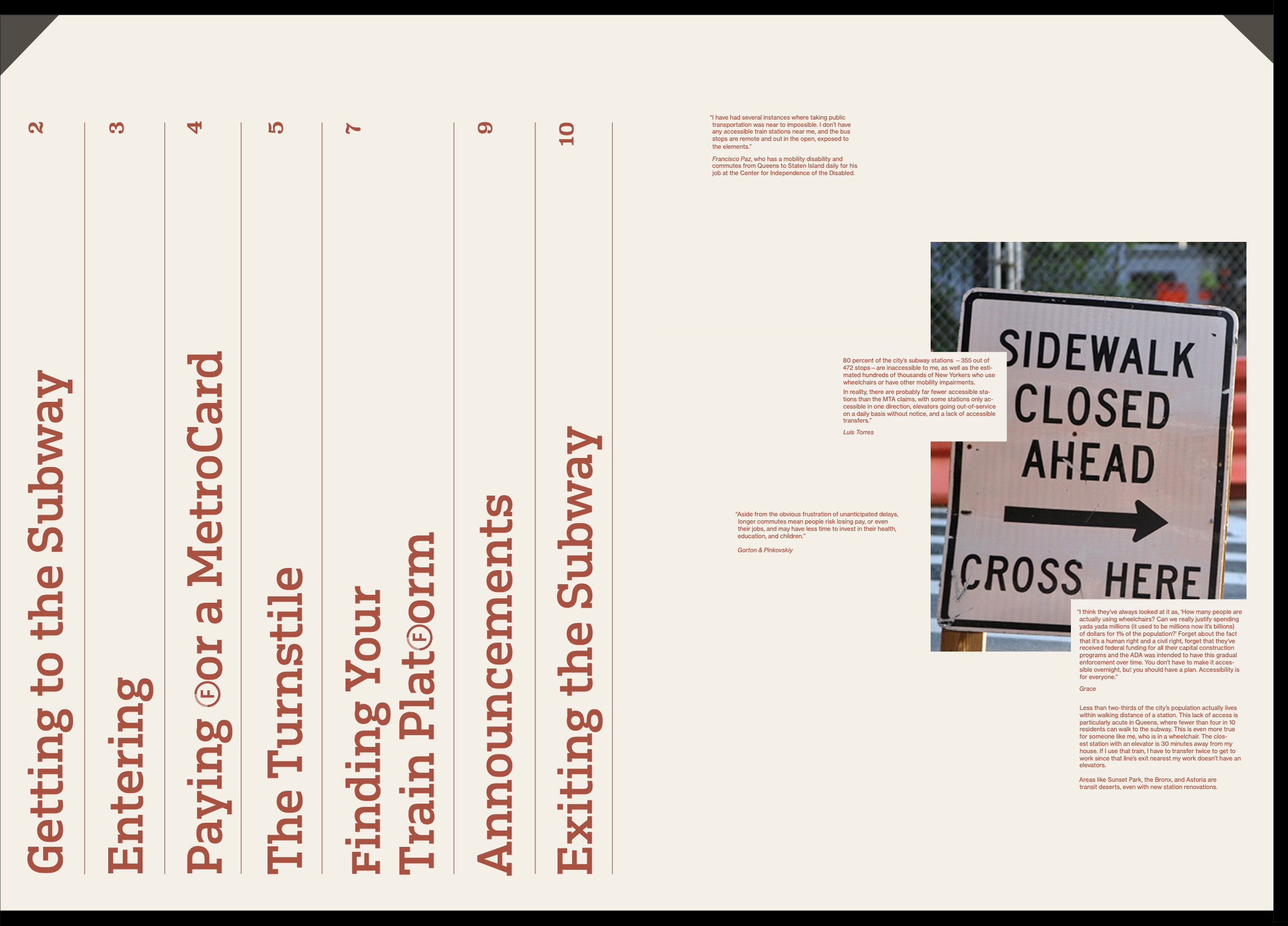
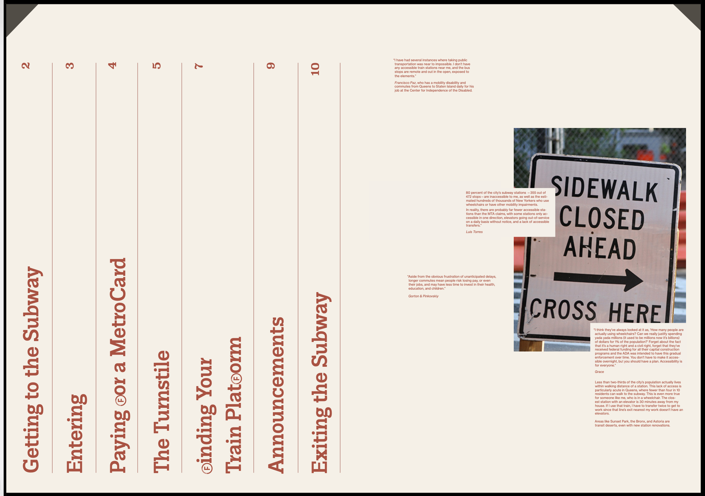

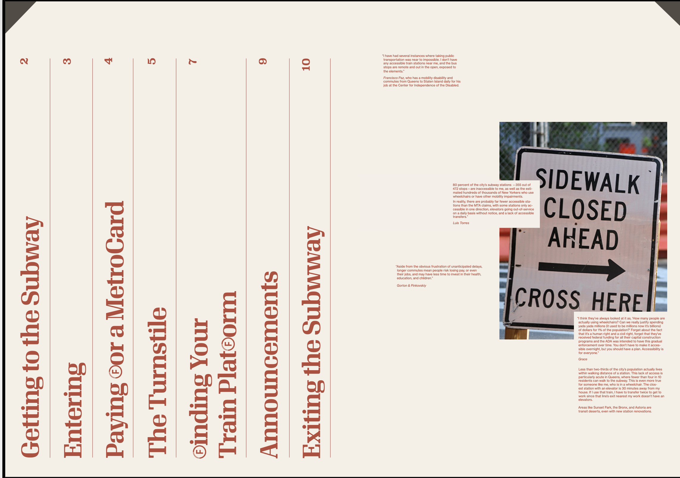
Data on fare evasion and summons taken from New York City Police Department website. The information was broken down by race, gender and age by the station and line.
NEXT STEPS
I hope to distribute this publication and start raising awareness about the subway system and what must be done to change how inaccessible it is.
I hope to distribute this publication and start raising awareness about the subway system and what must be done to change how inaccessible it is.
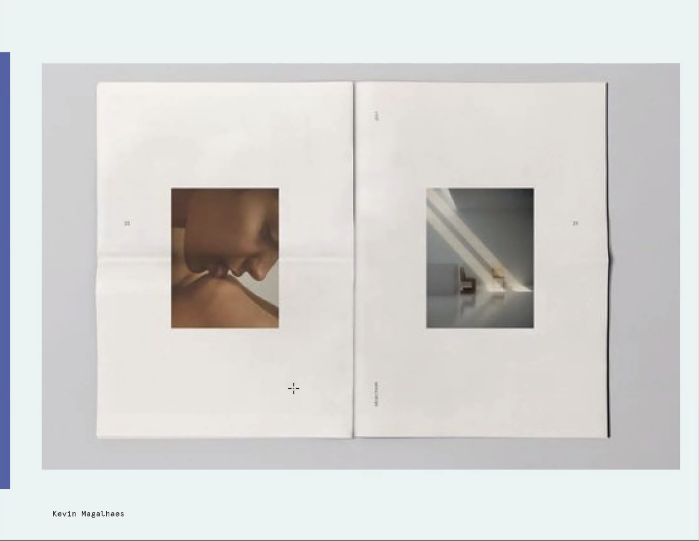
Black-Jewish Relations in the U.S.
Publication / Print Design
ROLE: Designer
COMPLETED: Fall 2020
SPEACIAL THANKS: Ben Kiel
COMPLETED: Fall 2020
SPEACIAL THANKS: Ben Kiel
BRIEF
Display a sequence of events.
SOLUTION
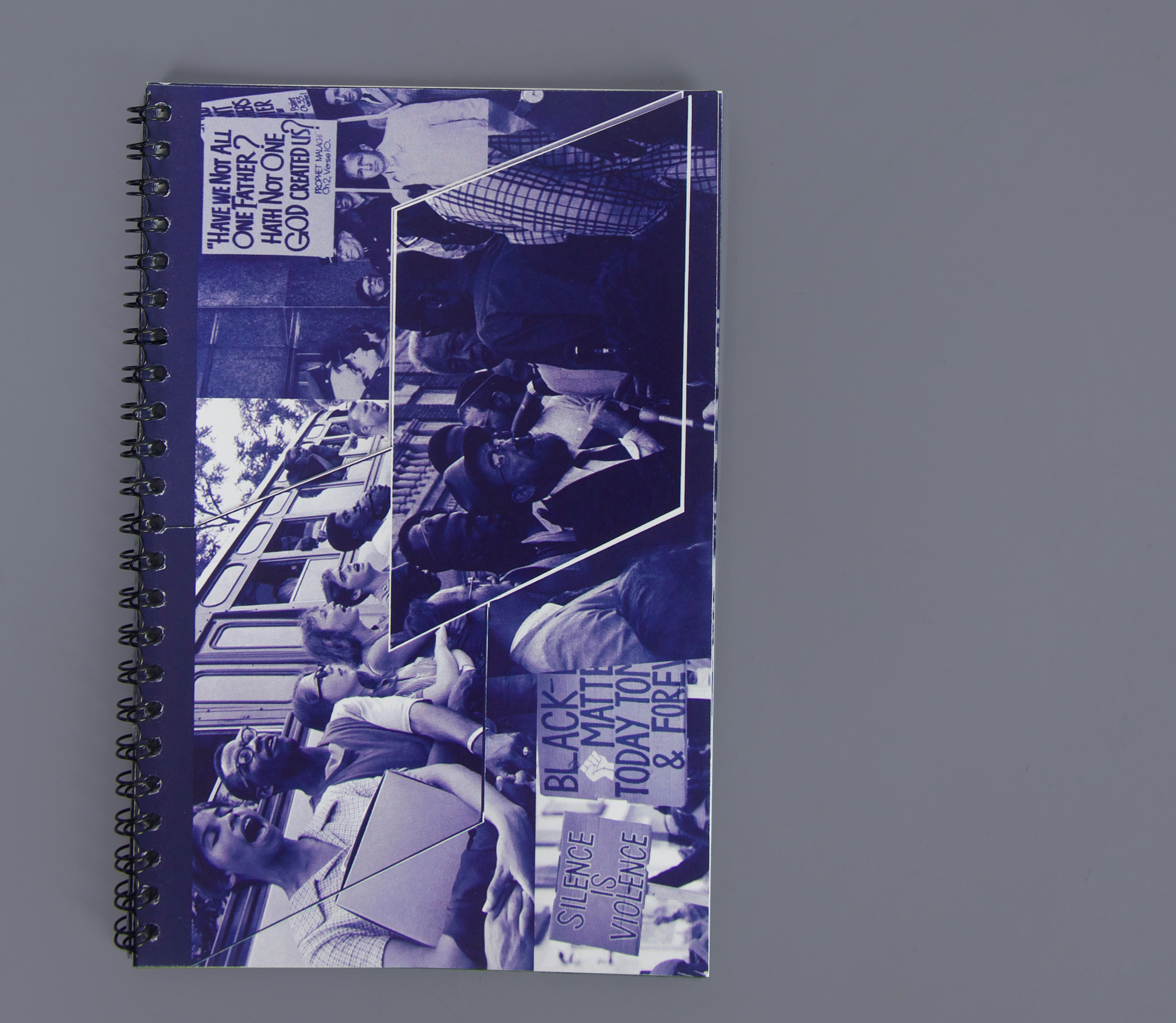
A publication that explores Black-Jewish Relations in the United States. The book focuses on the uncomfortable, often times, oppositional relationship the two groups have and the power they have when they come together. The book is spiral bound to reinforce that history is changing and this story is being added to everyday.
![]()
Display a sequence of events.
SOLUTION
A publication that explores Black-Jewish Relations in the United States. The book focuses on the uncomfortable, often times, oppositional relationship the two groups have and the power they have when they come together. The book is spiral bound to reinforce that history is changing and this story is being added to everyday.

The front flap reveals the title of the book.

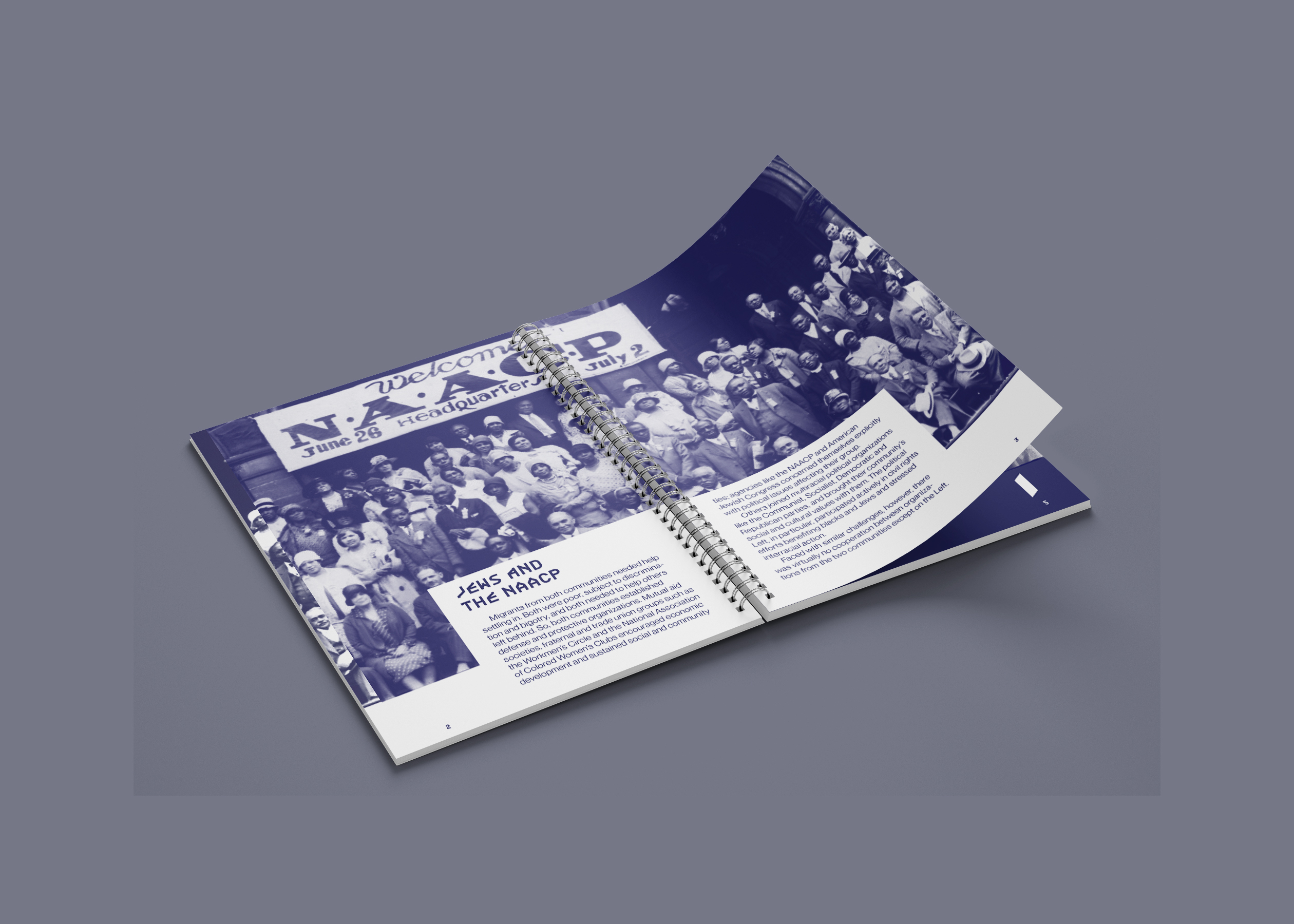
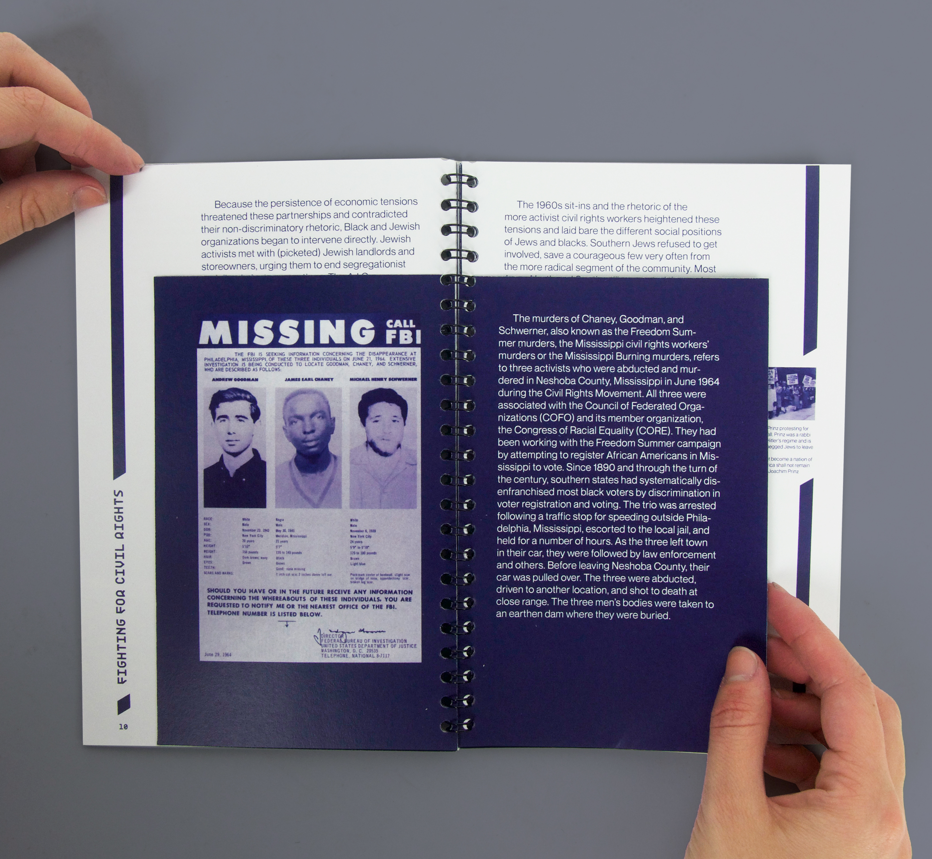
Selected spreads from the book:
Throughout the book, diagonals are used as a motif. They are used in the timeline as well the shape on the cover of the book. The shape represents the sharp overlap between the two groups and its effects on groups around it and on each other. The lines imitate the uncomfortable and unsettling interactions in life throughout the pages and the timeline.
Throughout the book, diagonals are used as a motif. They are used in the timeline as well the shape on the cover of the book. The shape represents the sharp overlap between the two groups and its effects on groups around it and on each other. The lines imitate the uncomfortable and unsettling interactions in life throughout the pages and the timeline.
The last spread contains the image citations.

Scattered within the book, there are mini pages to add depth and information to the complex content.

This call out quotaions is juxtaposed with the infamous Crown Heights riots on the back.

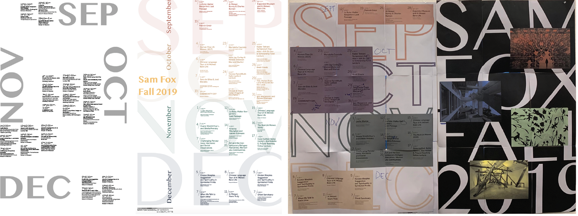
SAM FOX CALENDAR
Poster Design / Informational Design
ROLE: Designer
COMPLETED: Fall 2019
PRINTED ON: 25” x 35” on cardstock
SPECIAL THANKS: Chrissi Cowhey
COMPLETED: Fall 2019
PRINTED ON: 25” x 35” on cardstock
SPECIAL THANKS: Chrissi Cowhey
BRIEF
Work with the Washington University in St. Louis communications office to ensure create collateral prromoting lectures and events.
SOLUTION
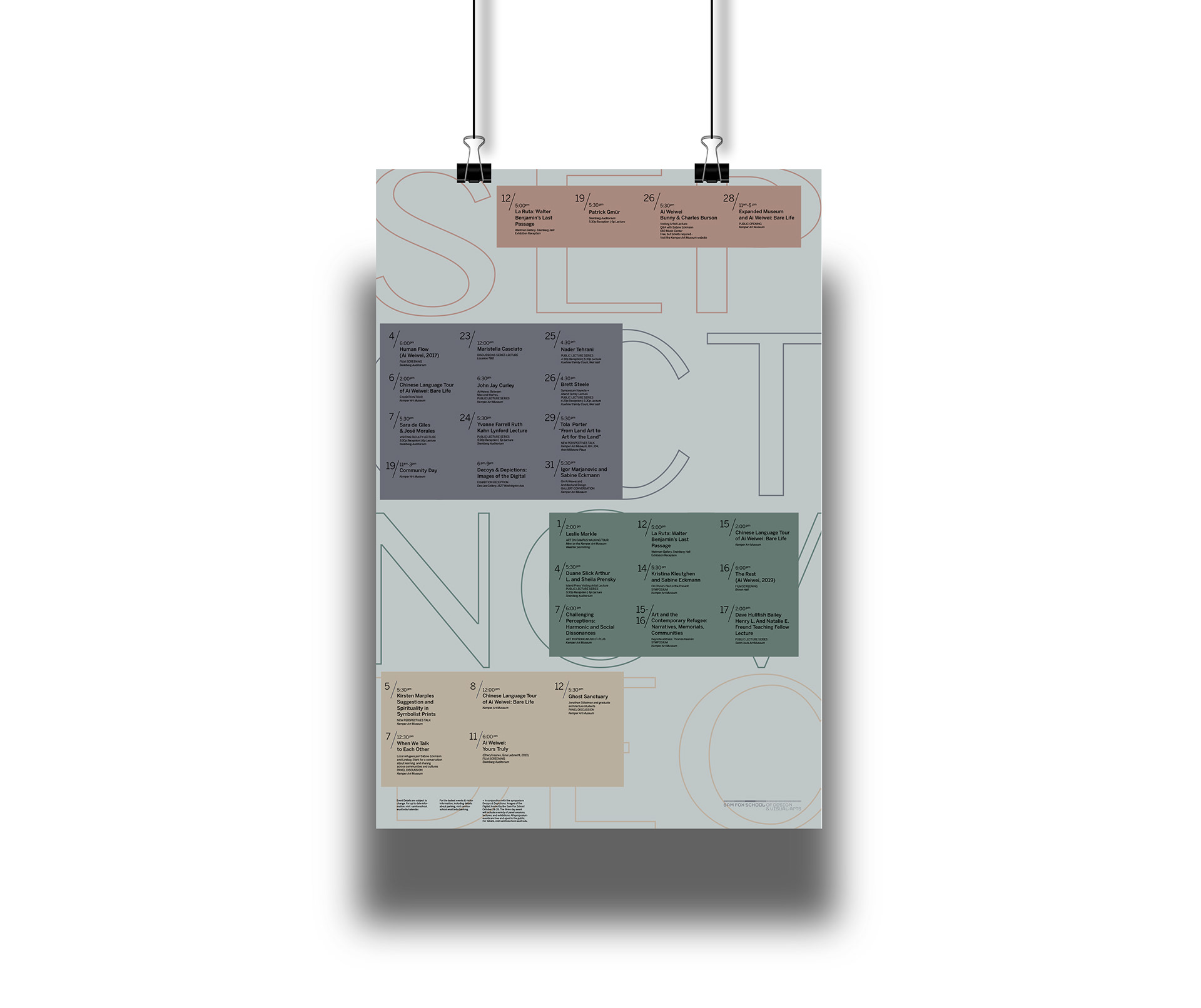
A double-sided poster displaying events, lectures and workshops held by the Sam Fox School of Design & Visual Arts at Washington University in St. Louis during fall 2019. The calendar functioned as both a source of information and as a poster to advertise and call attention to the school’s programming.
Work with the Washington University in St. Louis communications office to ensure create collateral prromoting lectures and events.
SOLUTION
A double-sided poster displaying events, lectures and workshops held by the Sam Fox School of Design & Visual Arts at Washington University in St. Louis during fall 2019. The calendar functioned as both a source of information and as a poster to advertise and call attention to the school’s programming.
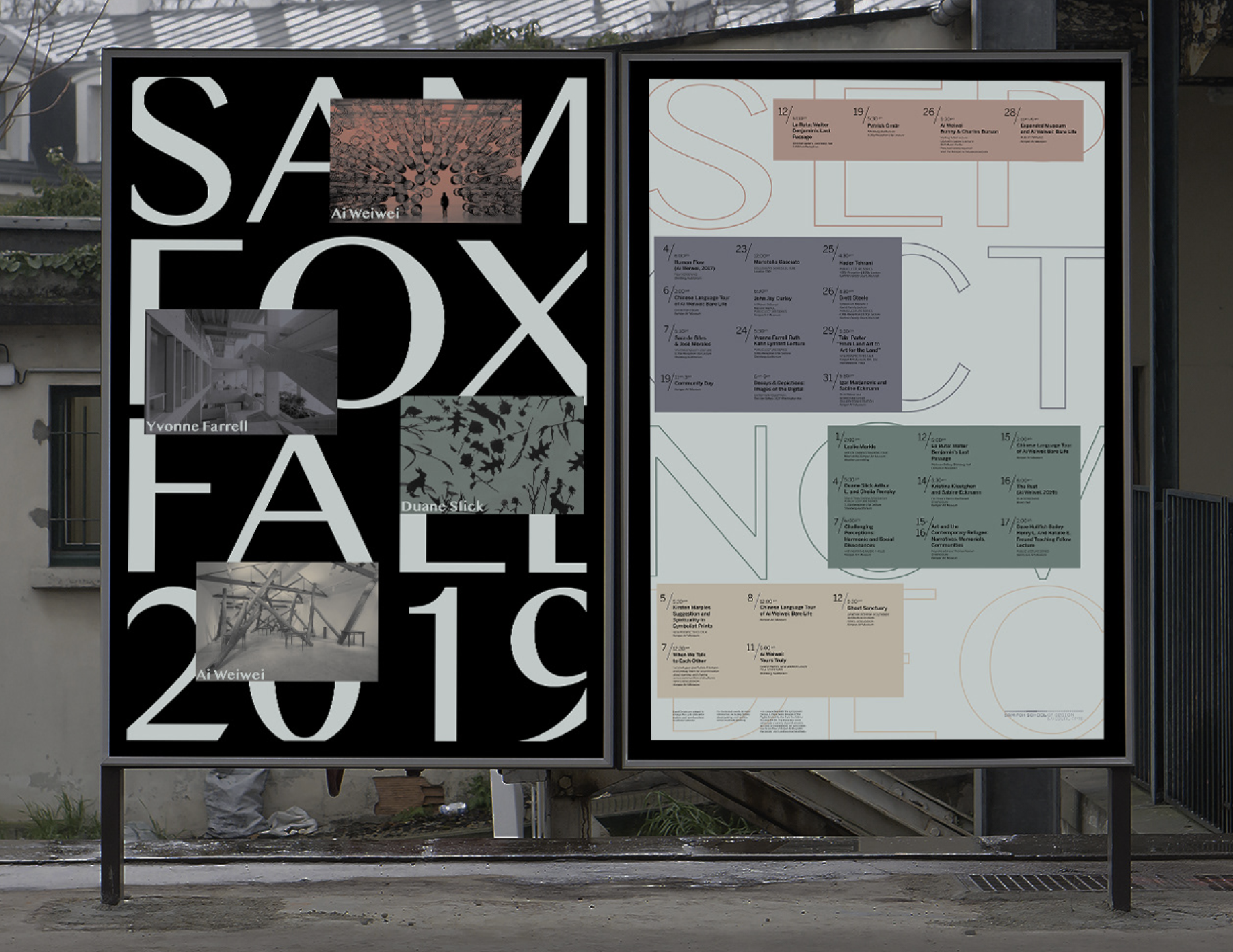
Large typography was used to draw in viewers from a distance and both engage and excite them for upcoming events.

PROCESS
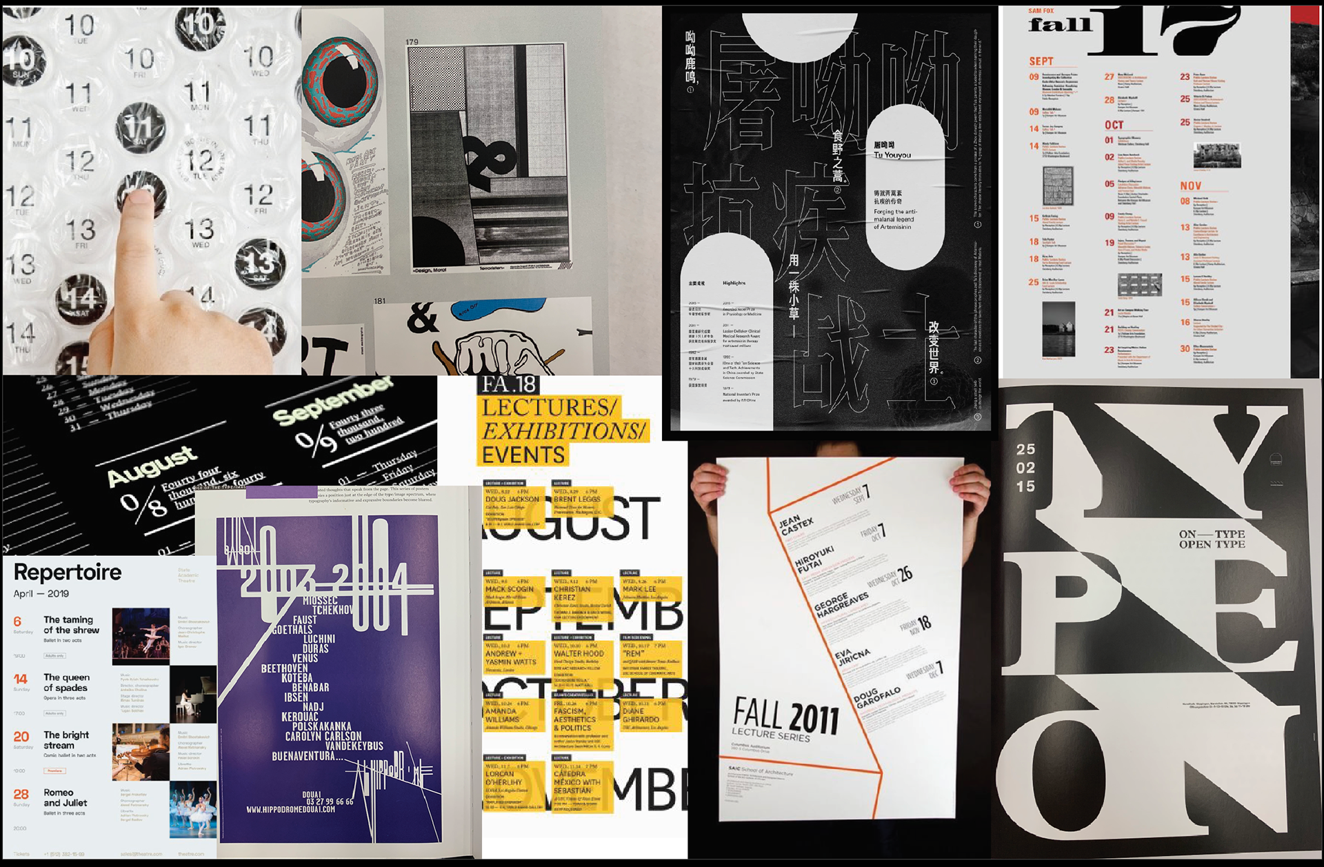
I started by collecting images of calendars and other sources of telling time and how information is categorized. I also looked at old Sam Fox calendar posters. I was in particular drawn to posters that had large expressive type, which is something I emulated in my work.
I started by collecting images of calendars and other sources of telling time and how information is categorized. I also looked at old Sam Fox calendar posters. I was in particular drawn to posters that had large expressive type, which is something I emulated in my work.
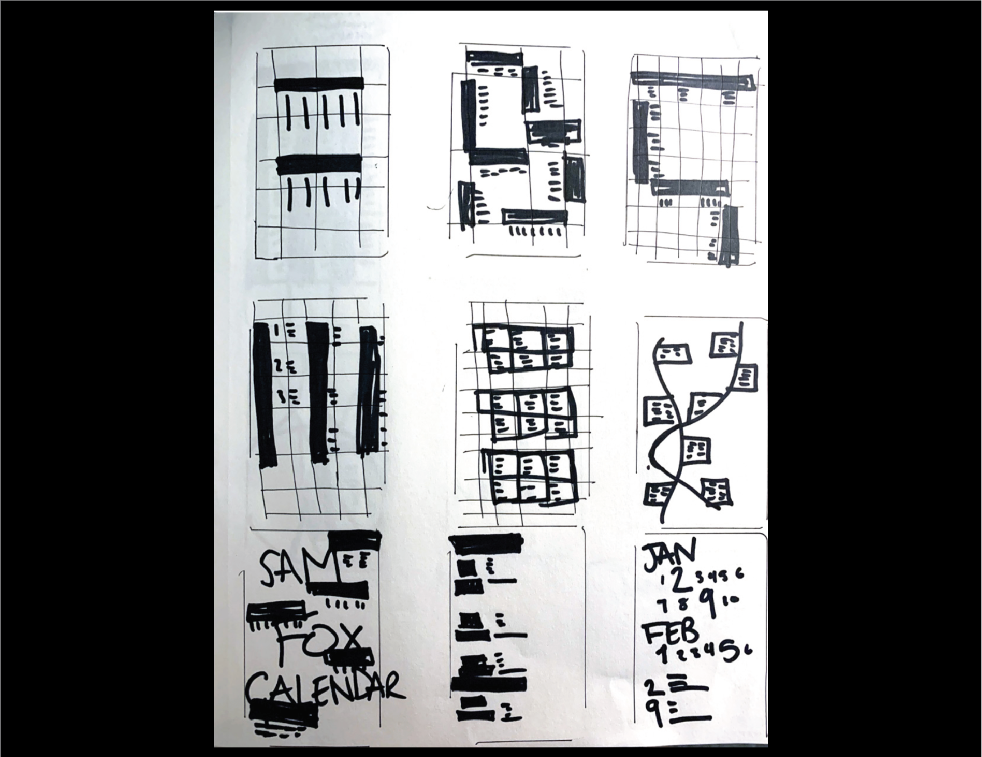
THUMBNAILING
My thumbnails included grids, hierarchy of text and the placement of that text.
At this step, I started focusing on the micro-typography in the poster as well. Limiting the number of ways I emphasize important information was crucial. This was done by being selective space, type size, and font weight.
At this step, I started focusing on the micro-typography in the poster as well. Limiting the number of ways I emphasize important information was crucial. This was done by being selective space, type size, and font weight.
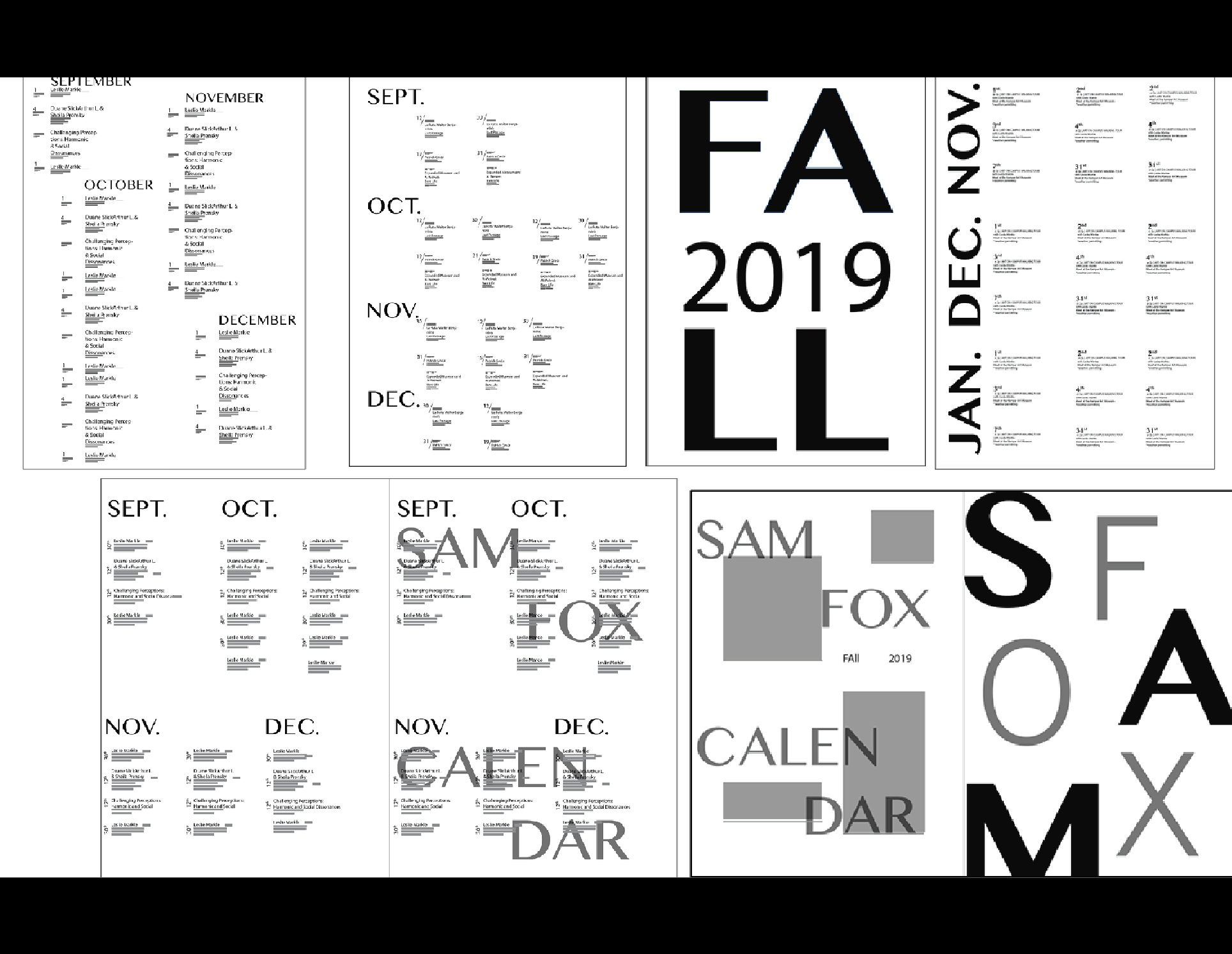
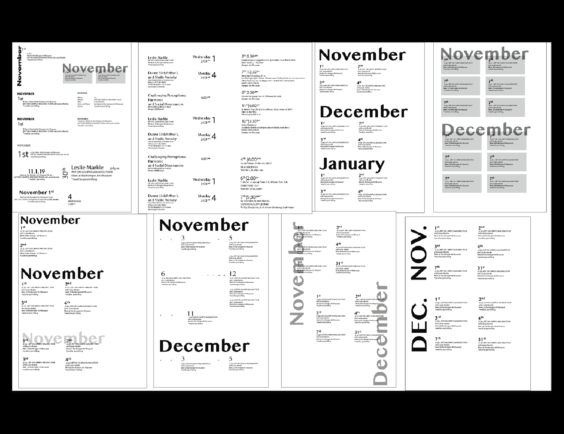
COLOR & TYPOGRAPHY
Since the calendar was for the fall, I used colors that would evoke the feeling of fall and the turning of seasons. I went for a muted color pallet with desaturated colors that are more earthy. I had to do many test prints to ensure the color printed matched the hue on the computer.
I chose two san serif typefaces: Malayalam MN and Benton Sans. I also made the weight of the outline of the months lighter as to put the emphasis on the events rather than the bold months.