SAM FOX CALENDAR
Poster Design / Informational Design
ROLE: Designer
COMPLETED: Fall 2019
PRINTED ON: 25” x 35” on cardstock
SPECIAL THANKS: Chrissi Cowhey
COMPLETED: Fall 2019
PRINTED ON: 25” x 35” on cardstock
SPECIAL THANKS: Chrissi Cowhey
BRIEF
Work with the Washington University in St. Louis communications office to ensure create collateral prromoting lectures and events.
SOLUTION
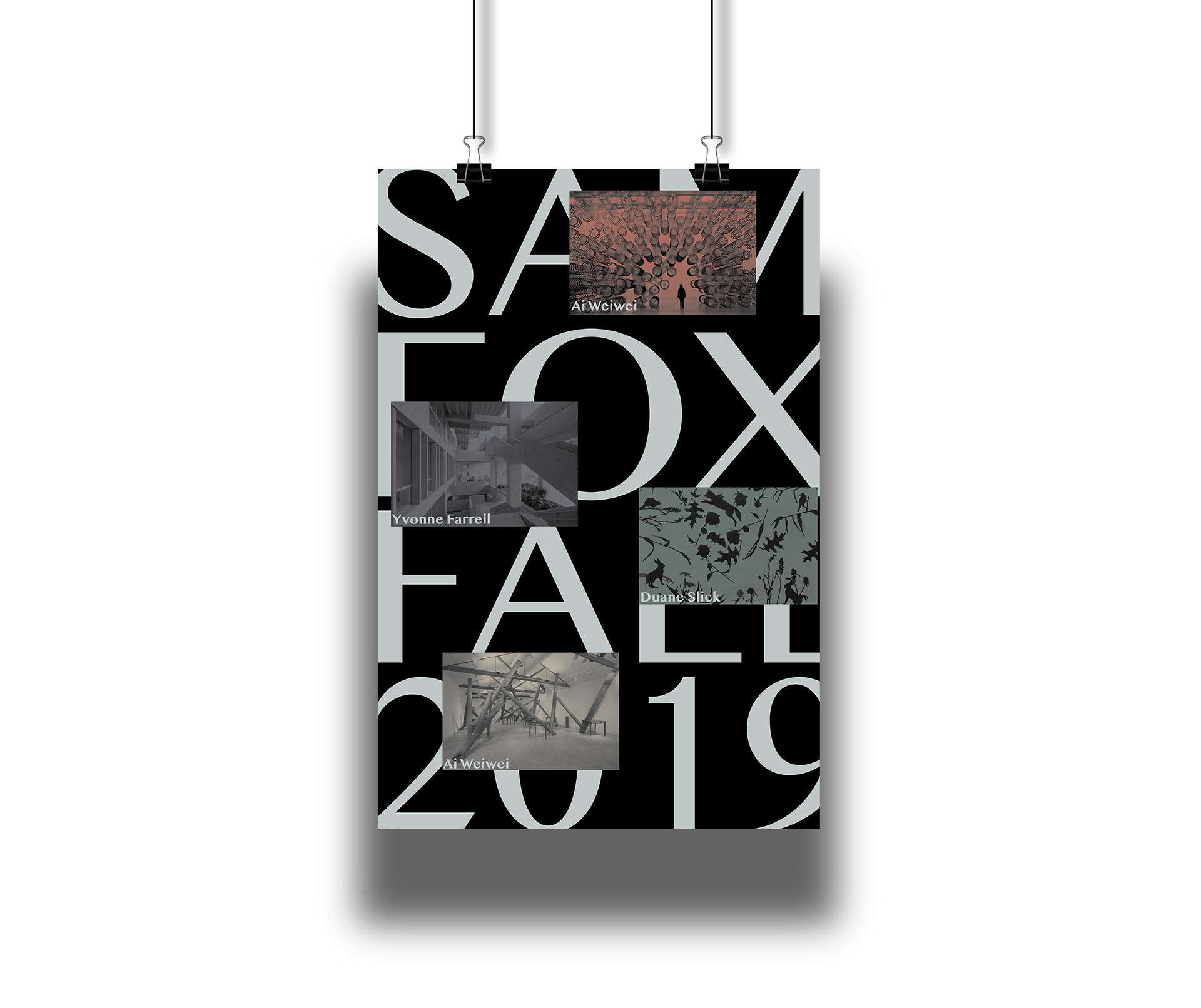
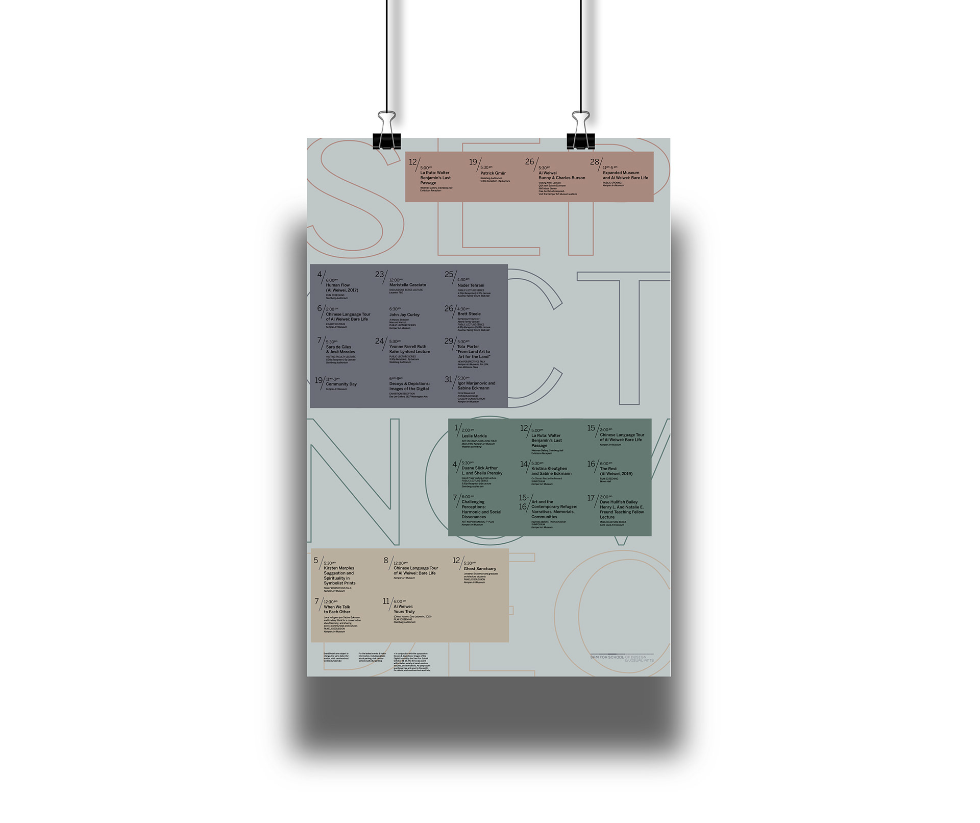
A double-sided poster displaying events, lectures and workshops held by the Sam Fox School of Design & Visual Arts at Washington University in St. Louis during fall 2019. The calendar functioned as both a source of information and as a poster to advertise and call attention to the school’s programming.
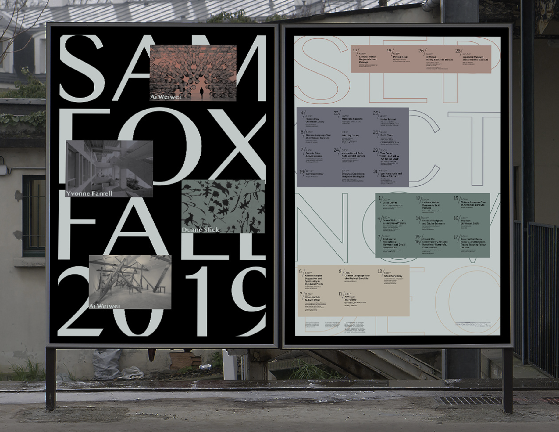
Large typography was used to draw in viewers from a distance and both engage and excite them for upcoming events.
PROCESS
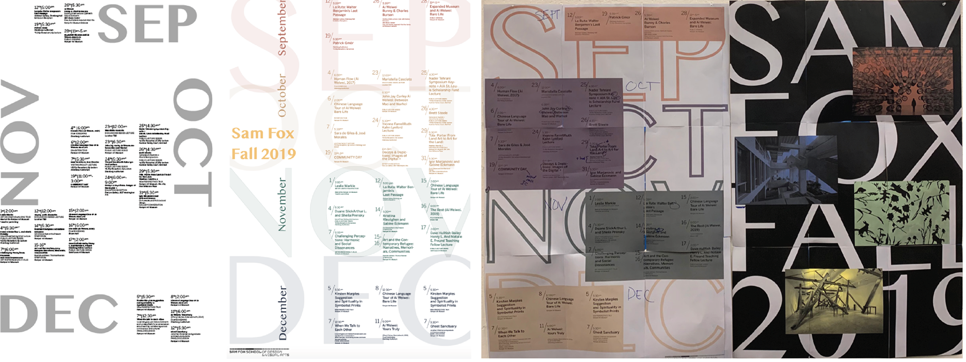
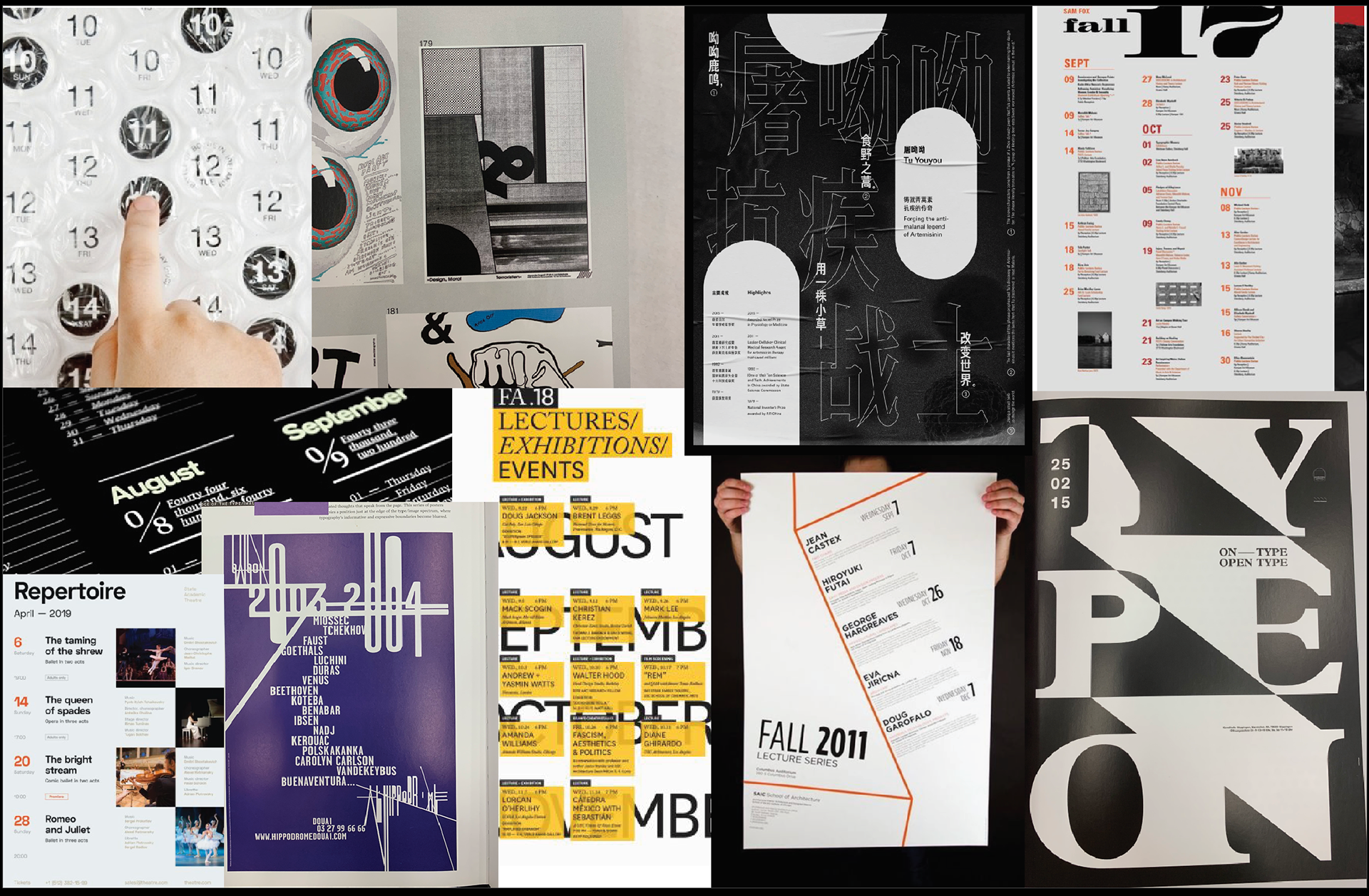
I started by collecting images of calendars and other sources of telling time and how information is categorized. I also looked at old Sam Fox calendar posters. I was in particular drawn to posters that had large expressive type, which is something I emulated in my work.
I started by collecting images of calendars and other sources of telling time and how information is categorized. I also looked at old Sam Fox calendar posters. I was in particular drawn to posters that had large expressive type, which is something I emulated in my work.
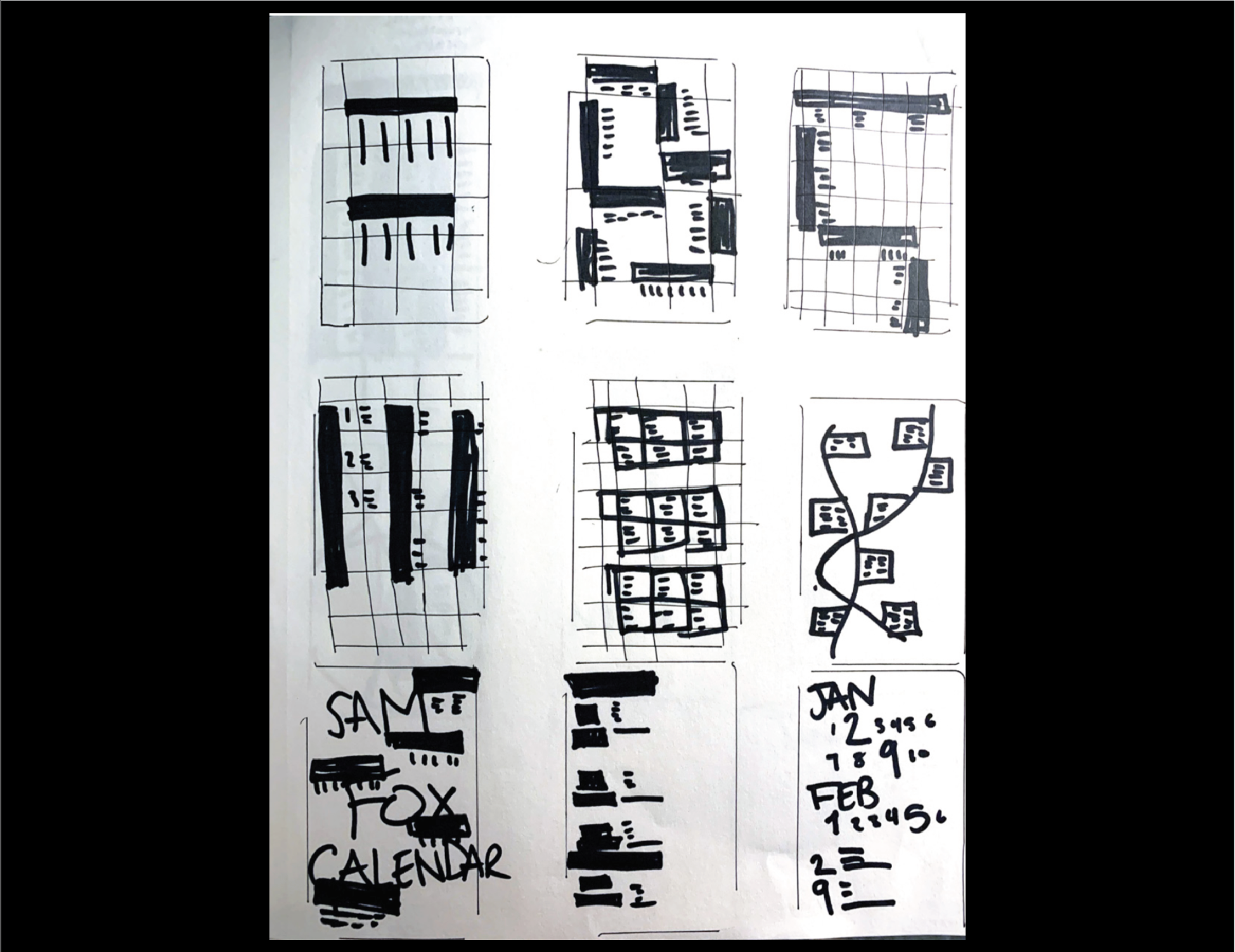
THUMBNAILING
My thumbnails included grids, hierarchy of text and the placement of that text.
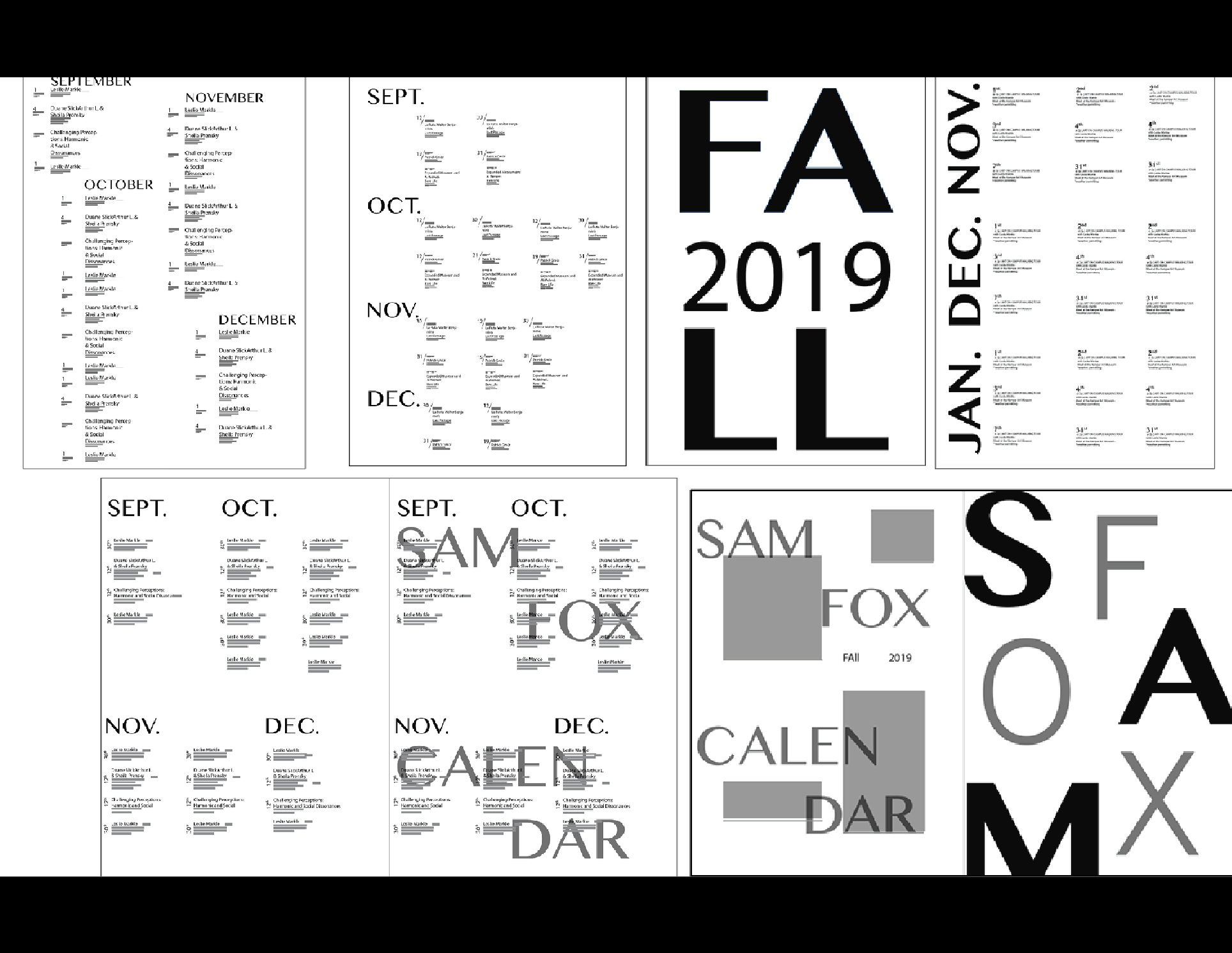
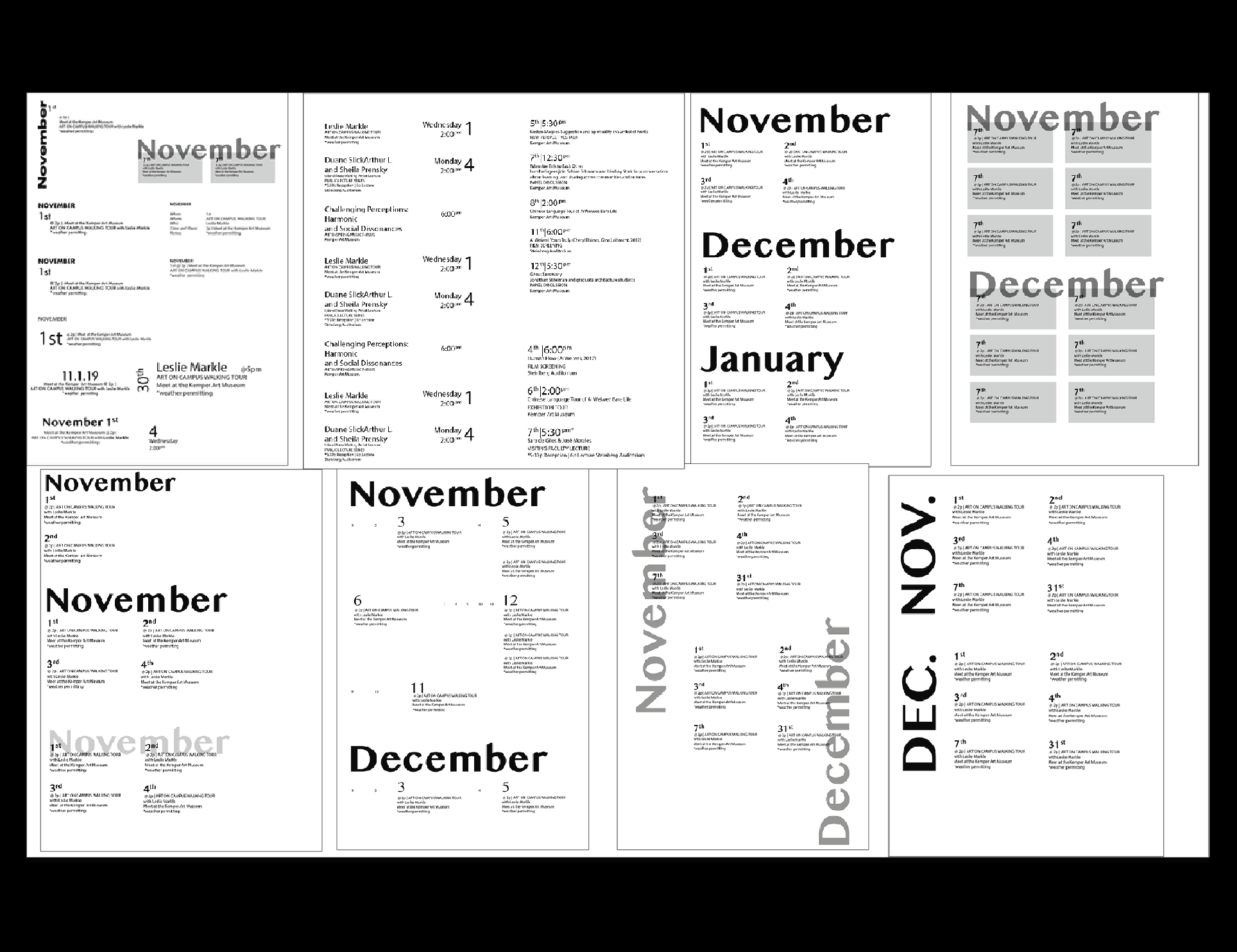
At this step, I started focusing on the micro-typography in the poster as well. Limiting the number of ways I emphasize important information was crucial. This was done by being selective space, type size, and font weight.
At this step, I started focusing on the micro-typography in the poster as well. Limiting the number of ways I emphasize important information was crucial. This was done by being selective space, type size, and font weight.
COLOR & TYPOGRAPHY
Since the calendar was for the fall, I used colors that would evoke the feeling of fall and the turning of seasons. I went for a muted color pallet with desaturated colors that are more earthy. I had to do many test prints to ensure the color printed matched the hue on the computer.
I chose two san serif typefaces: Malayalam MN and Benton Sans. I also made the weight of the outline of the months lighter as to put the emphasis on the events rather than the bold months.
